︎ Once Upon A Time
Once Upon A Time is always used as a conventional opening of a story. Here it is used to tell stories in an unconventional way. This publication is a documentation of a trip to the Chihuahuan Desert and a specimen poster collection of four experimental typefaces inspired by this desert trip. One side of each sheet tells the story of what we learned from this unique desert experience, and the other side shows using design as a response to environmental factors.
The Desert environment is alien to most people, so this publication is dedicated to bringing familiarity to unfamiliarity while using the novel perspective to make a narrative in-between reality and illusionary unreality by using experimental typefaces to change the legibility.
Collaborator: Sabrina Ji (MFA, GD, 2022)
Photography: Zeyuan Ren (MFA, PH, 2023)

︎ A Clockwork Orange Newspaper
Although the Clockwork Orange movie and novel are very similar in many plots, the different treatments of the ending by Burgess and Kubrick represent their different opinions on the final judgment of mankind.
Text face: Selene
︎ The Geography of Happiness
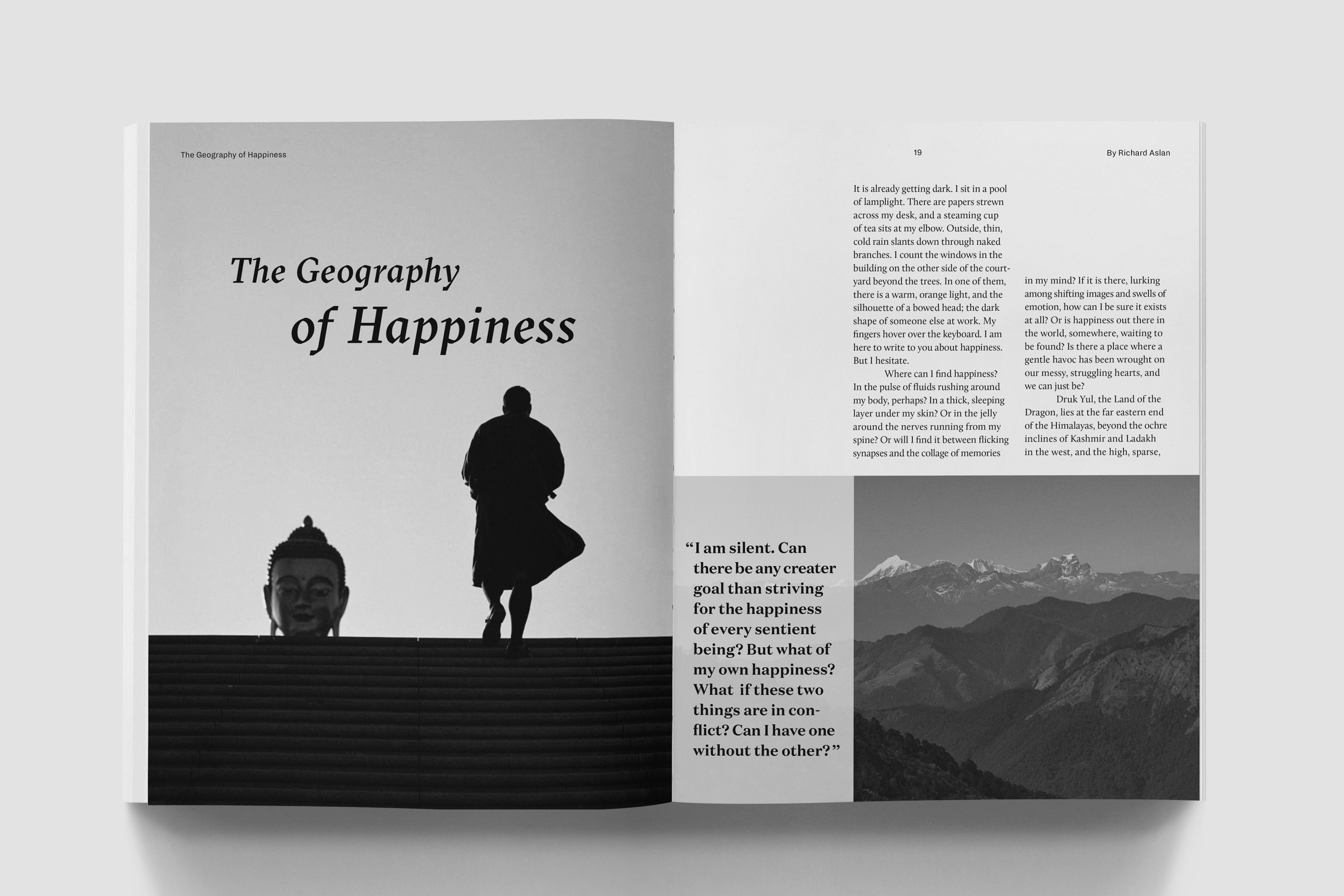
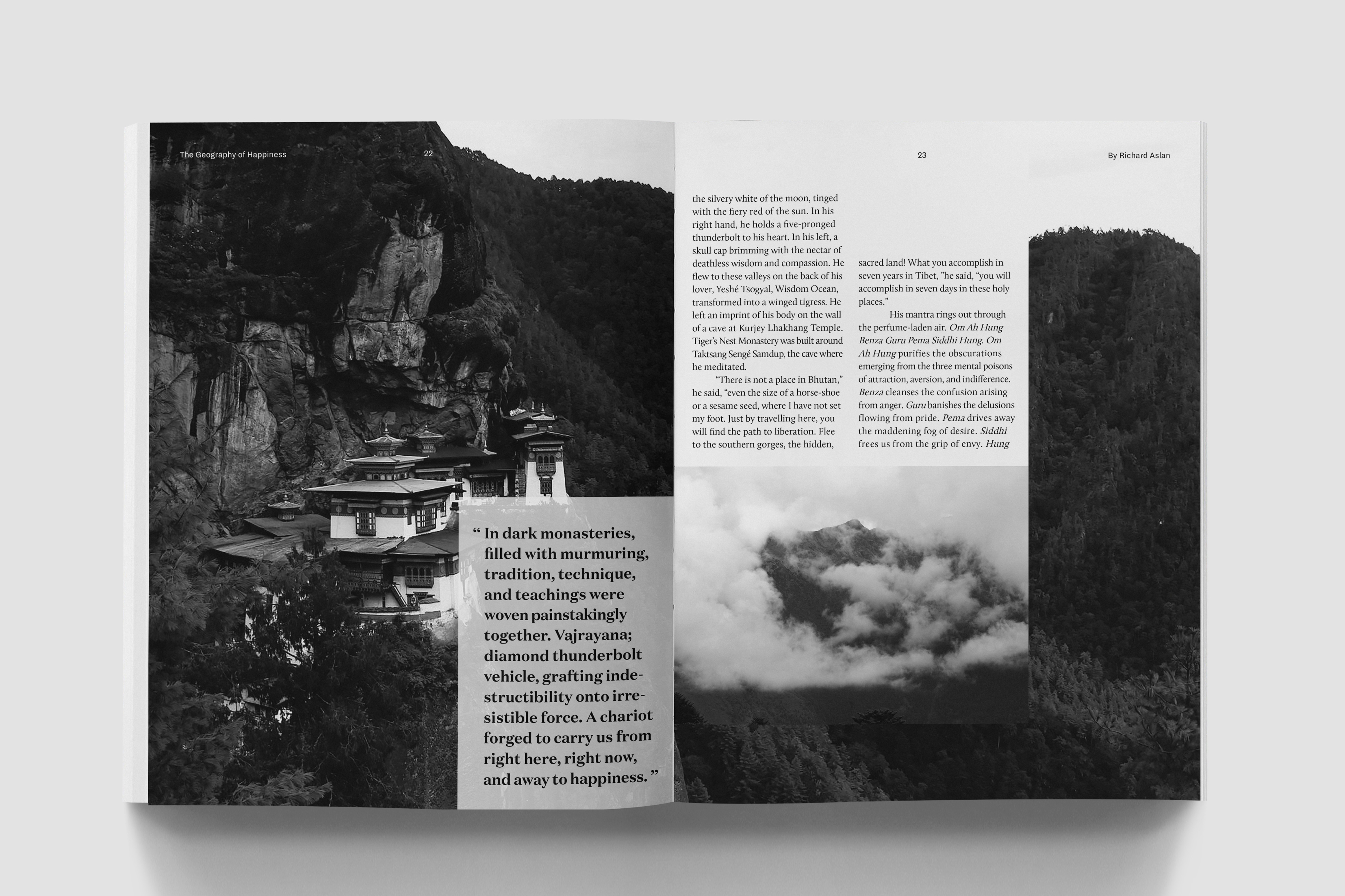
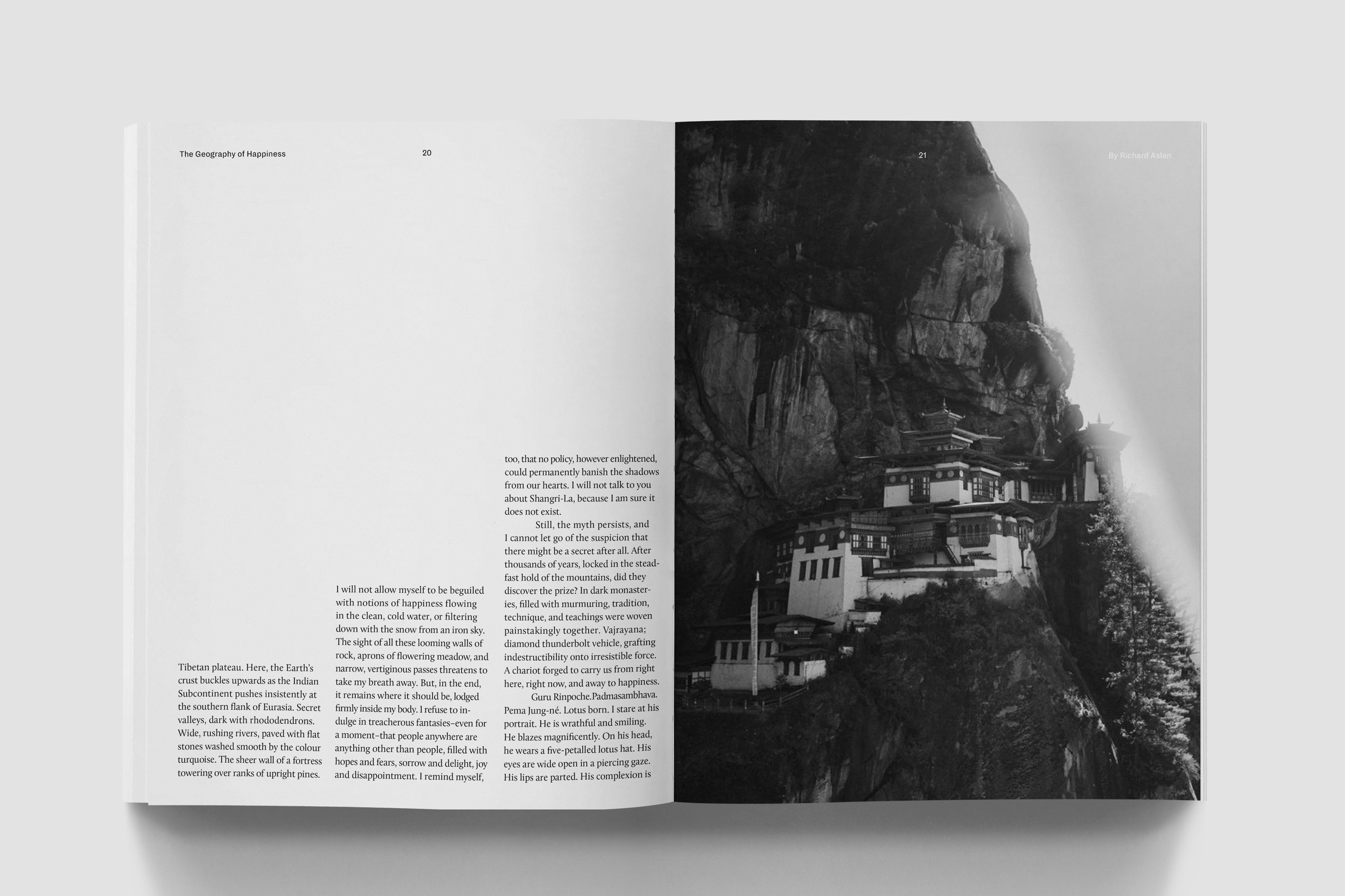
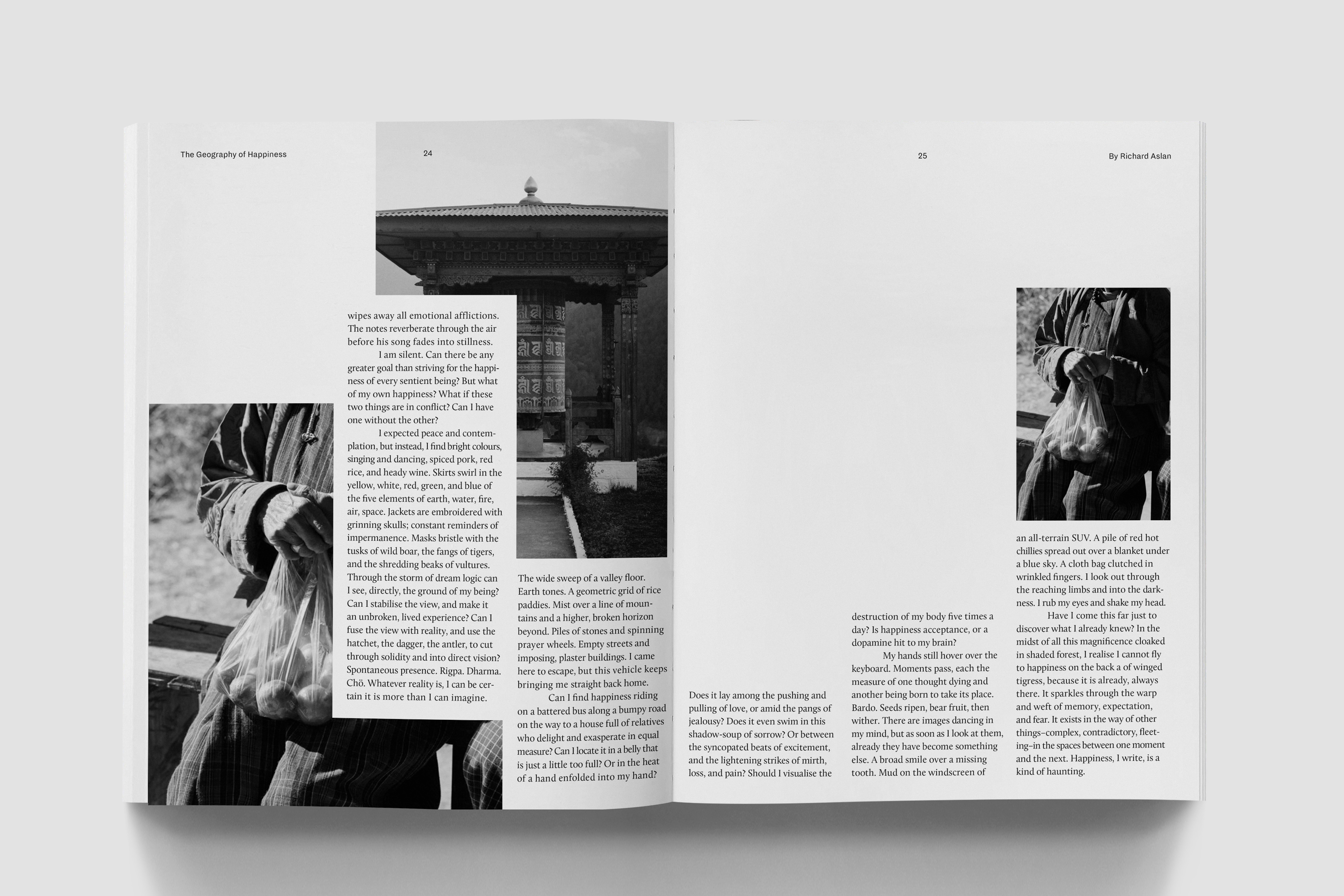
Magazine spreads of “Happiness of Geography” by Richard Aslan.
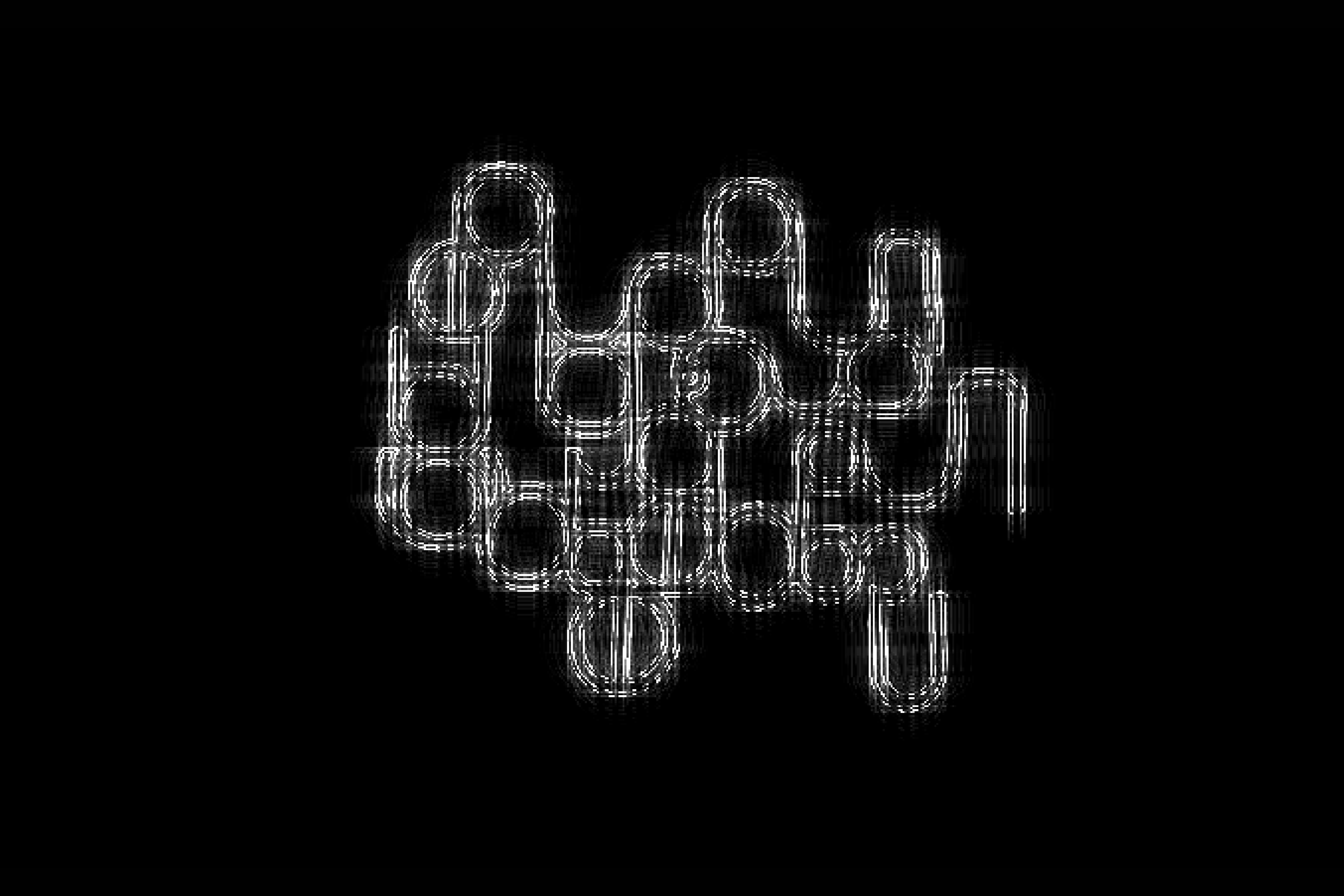
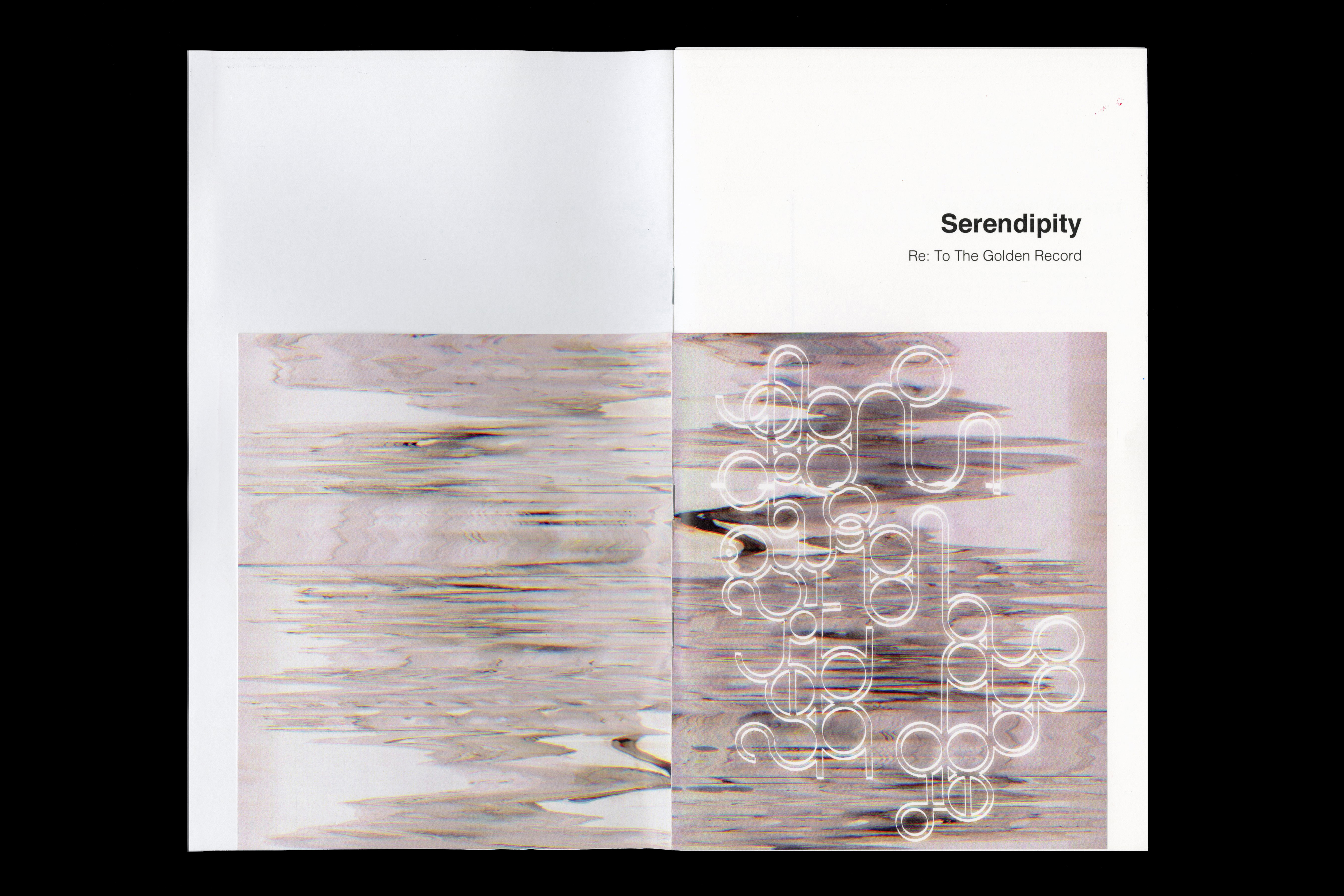
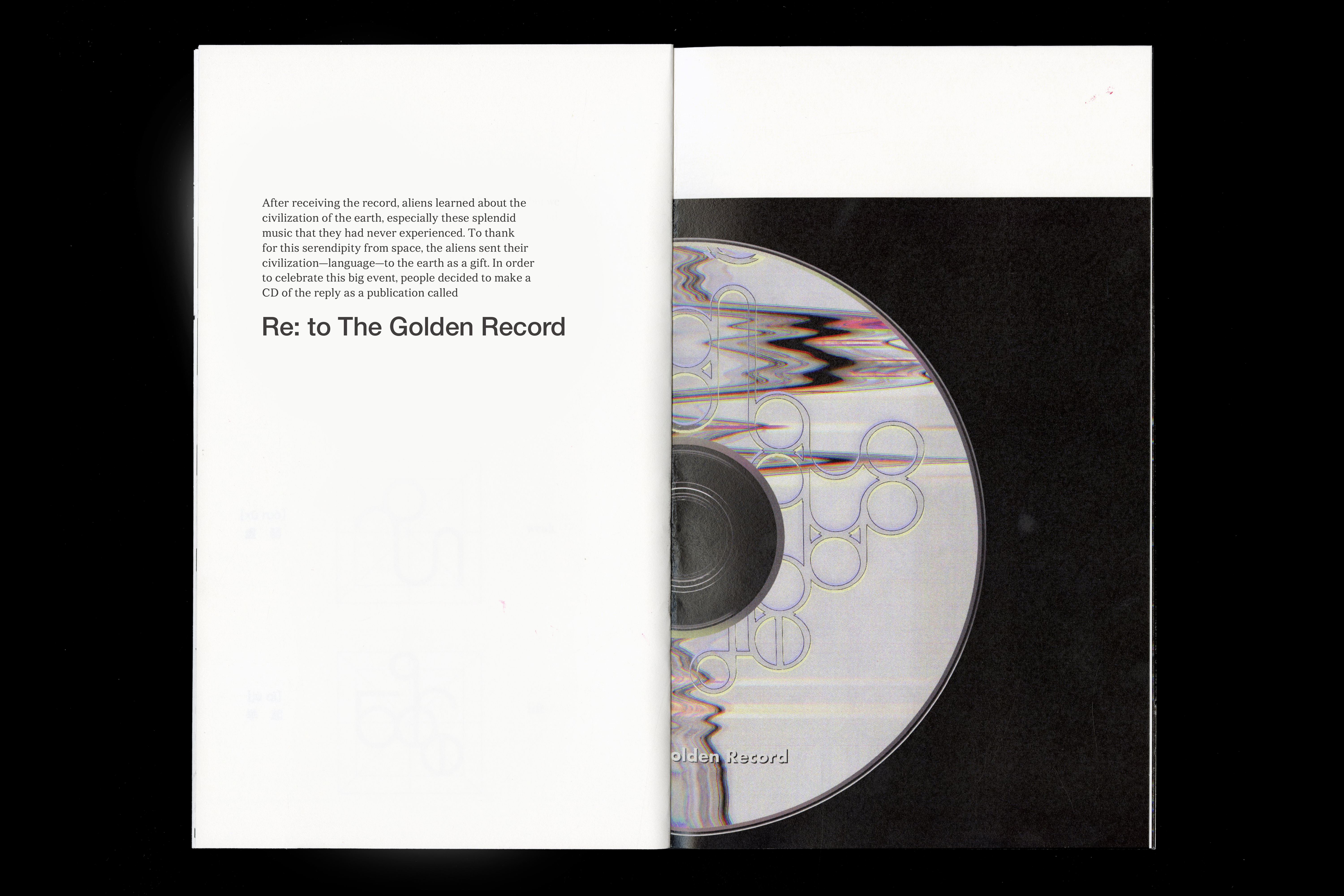
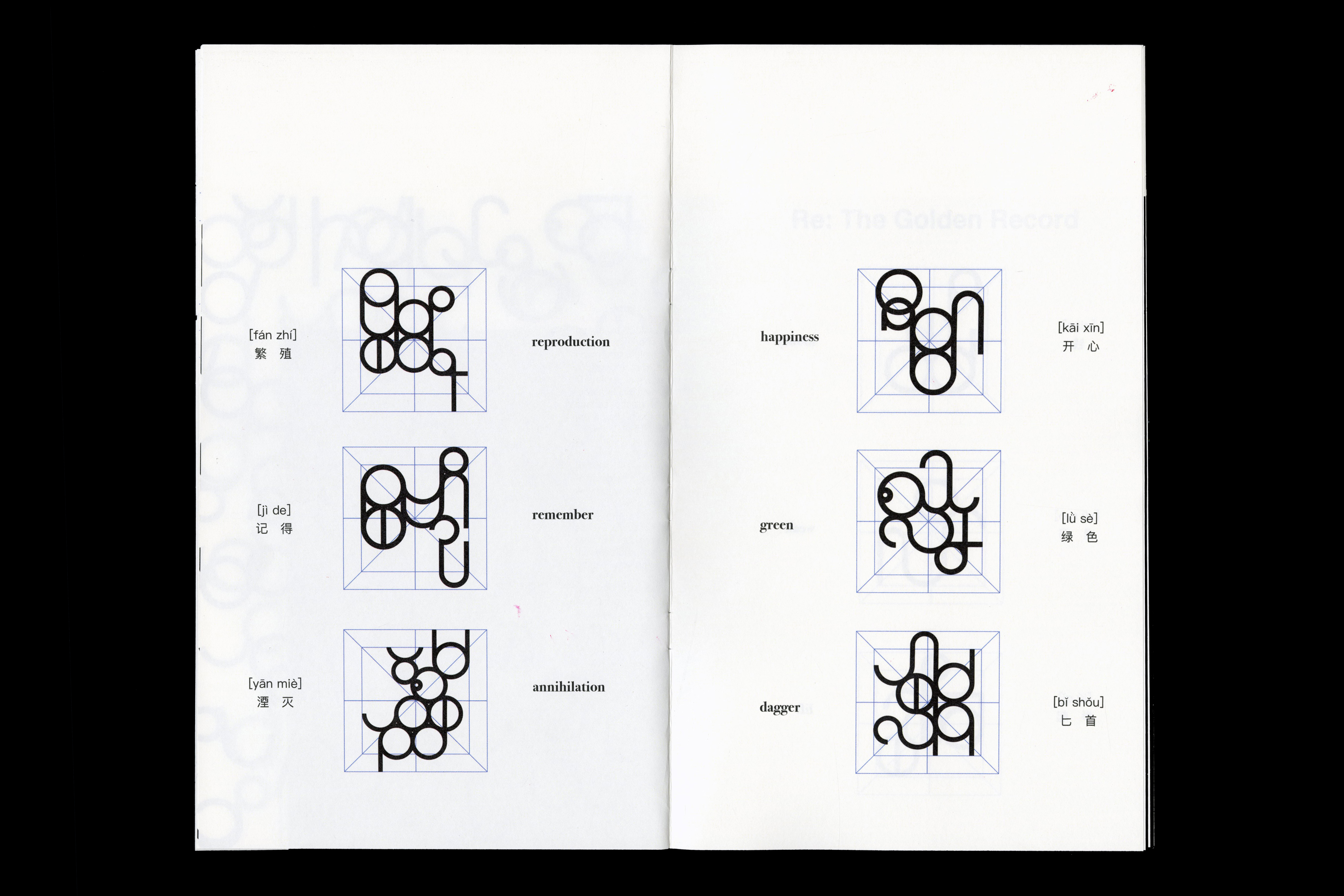
︎ Re: to the Golden Record
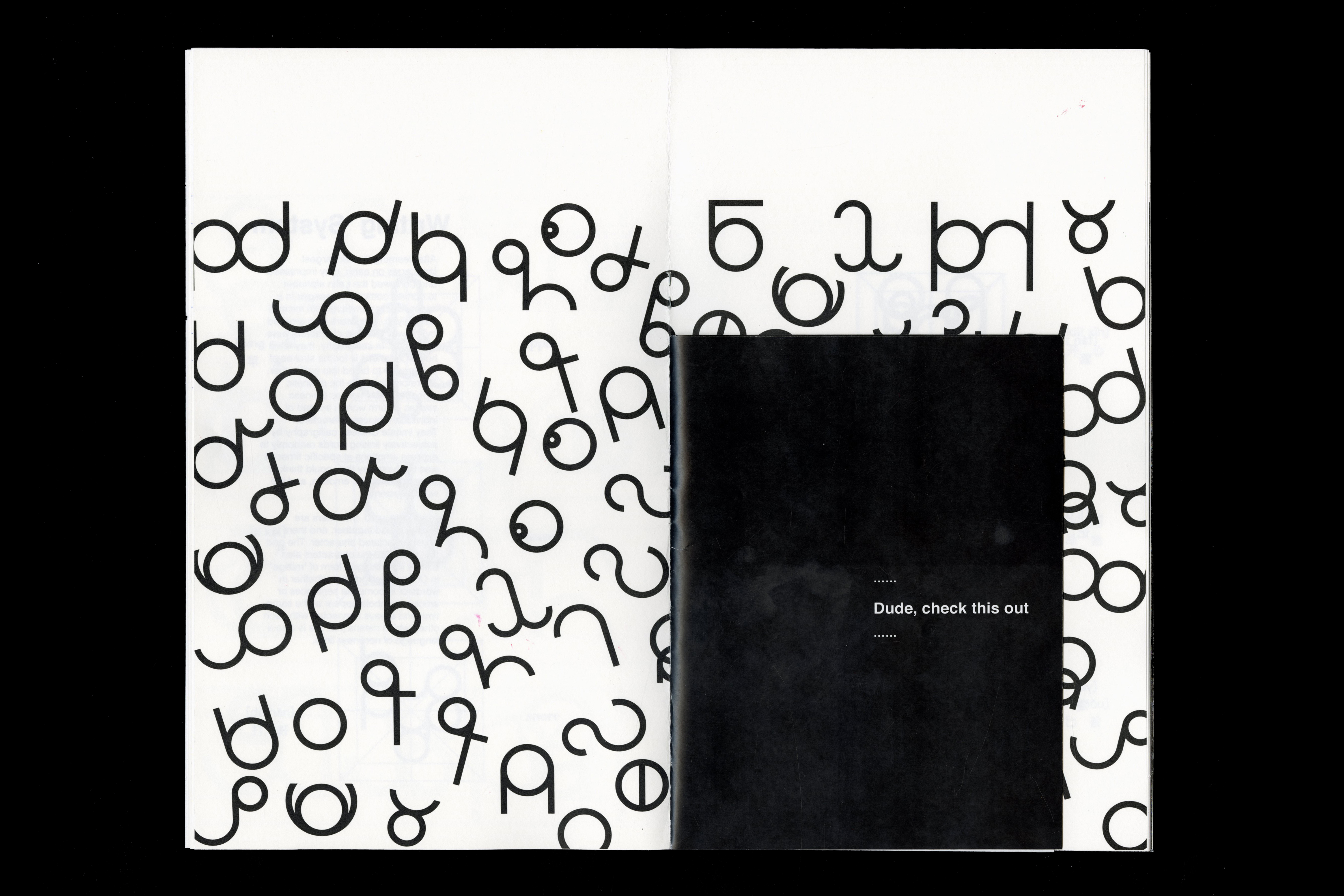
This project is an alien language that I imagined. The inspiration comes from how aliens will respond to The Golden Record. To explore more possibilities in contemporary typography, we need to extend the scope of design to a broader writing system. By getting rid of the existing letterforms' constraints, it is possible to extract some new forms as inspirations from the future or the places we never had a chance to know.
Video
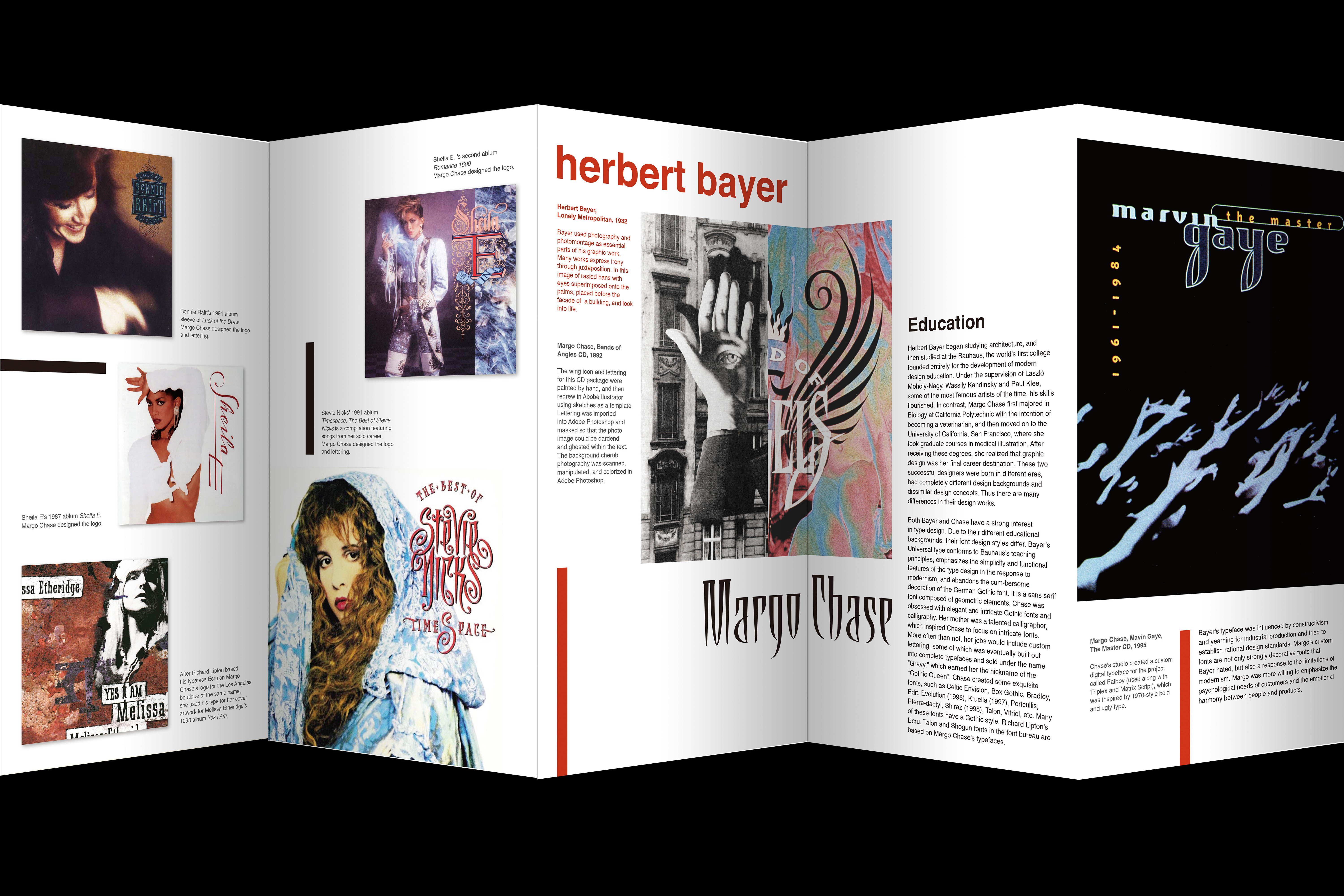
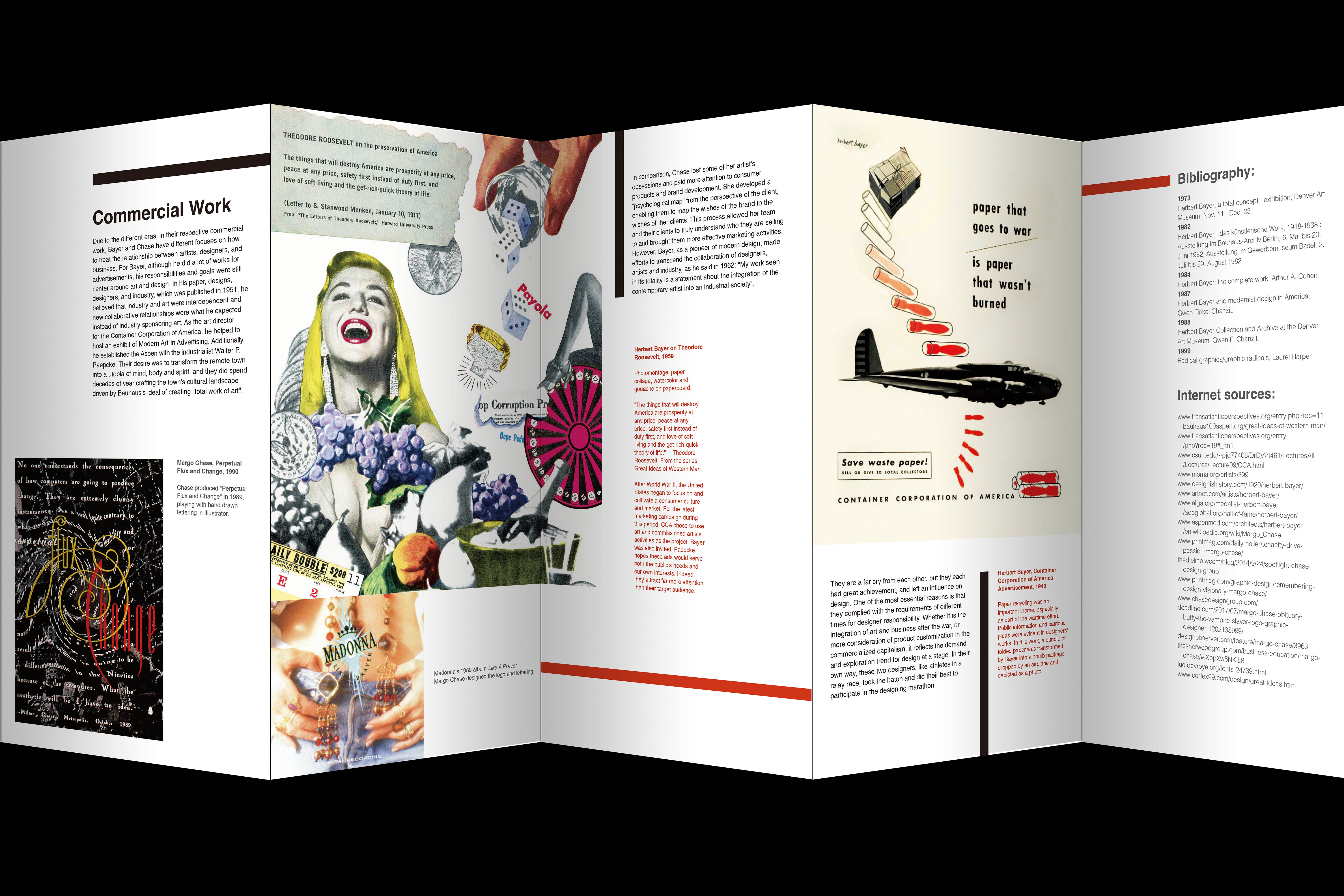
︎ Two Designers Accordion
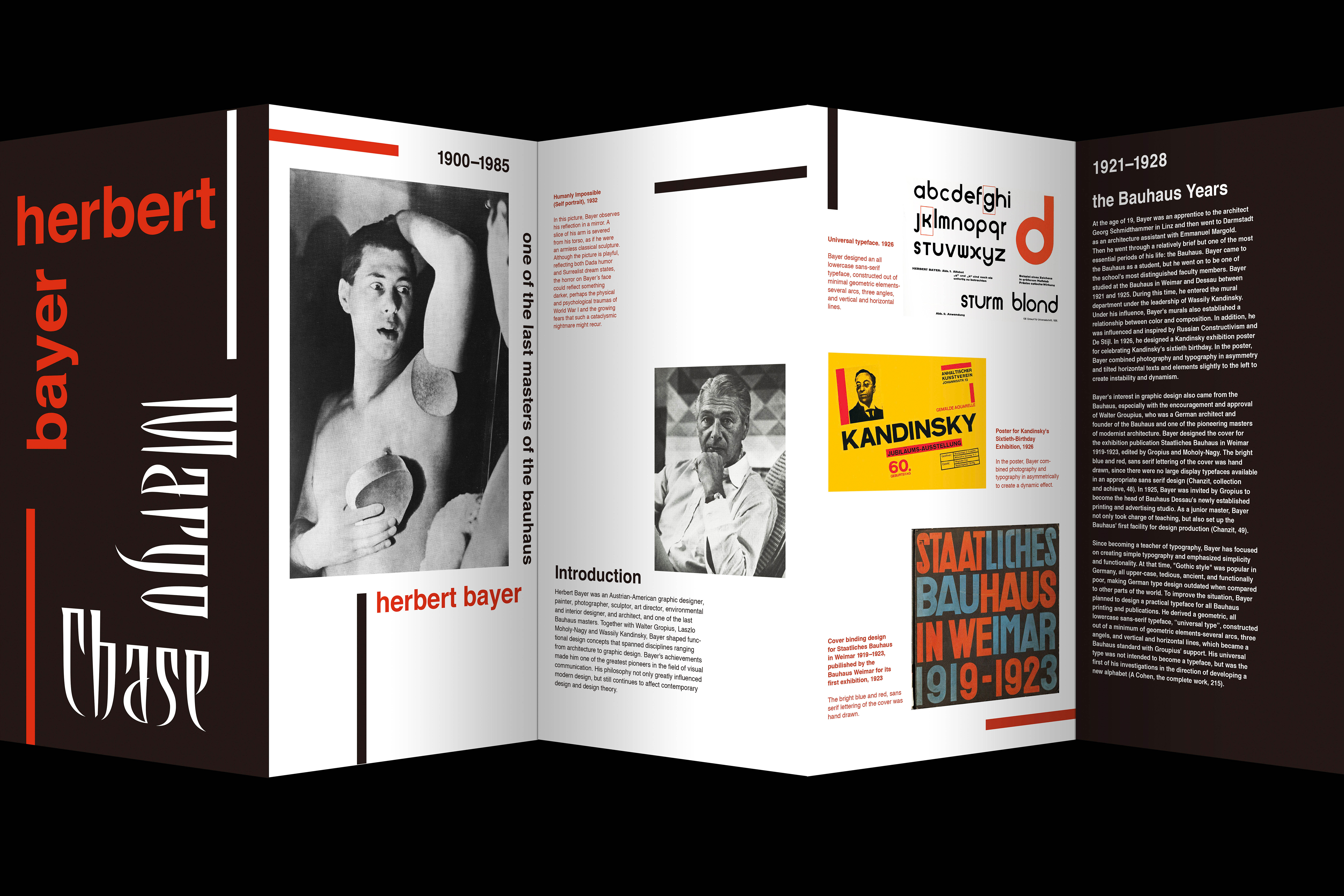
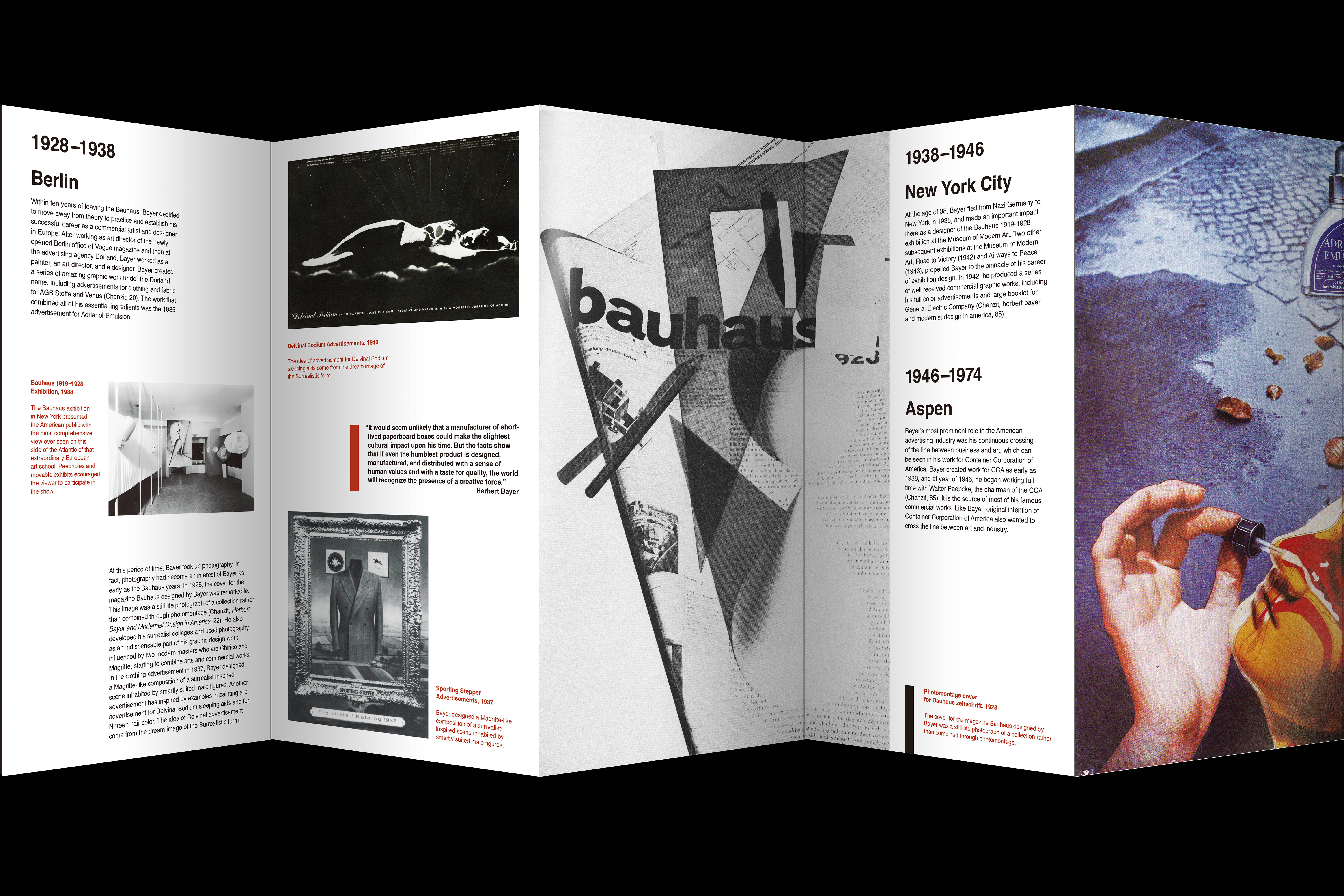
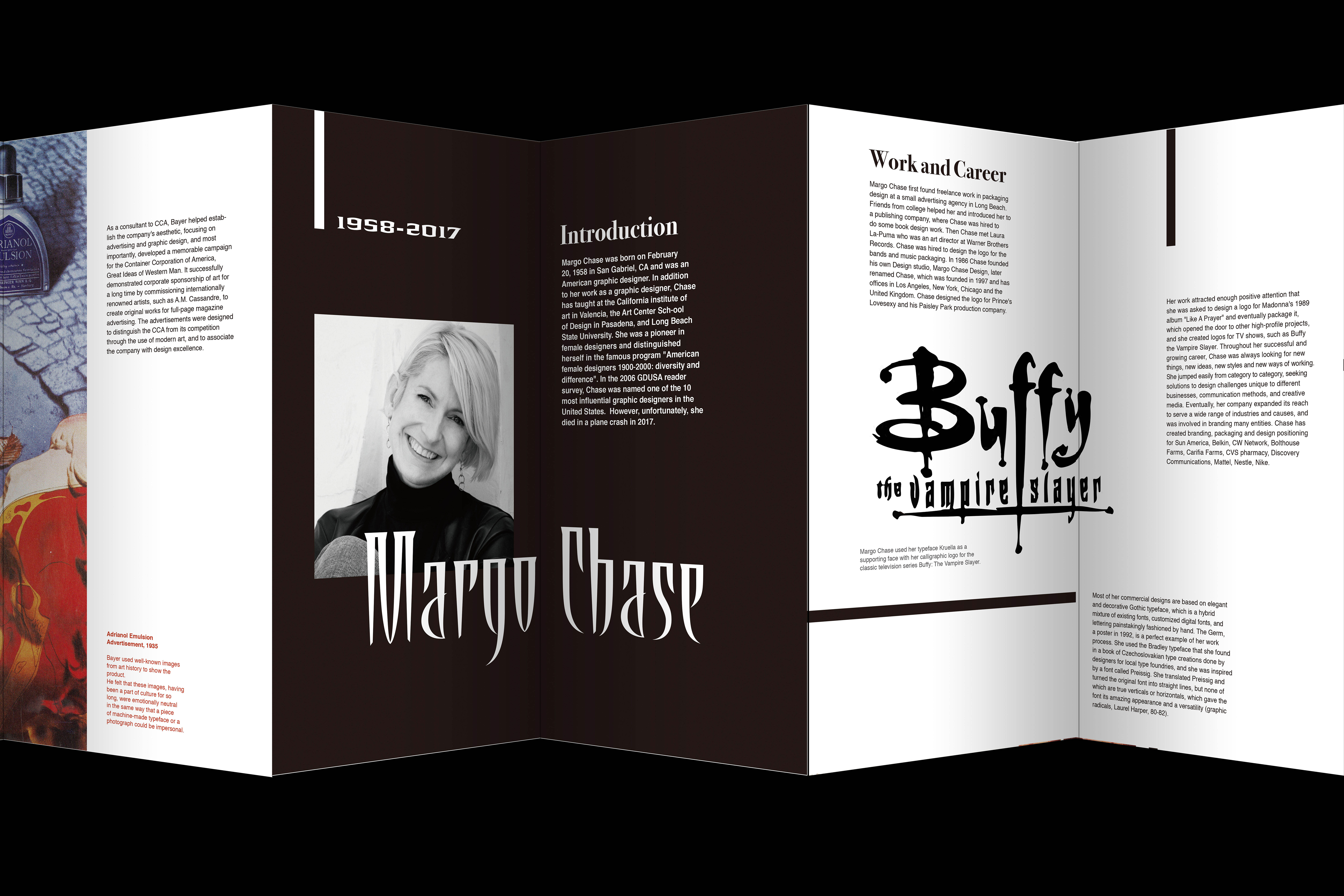
Images by Herbert Bayer and Margo Chase. Essay by Zengqi Guo.
Size:11*5.5 inch
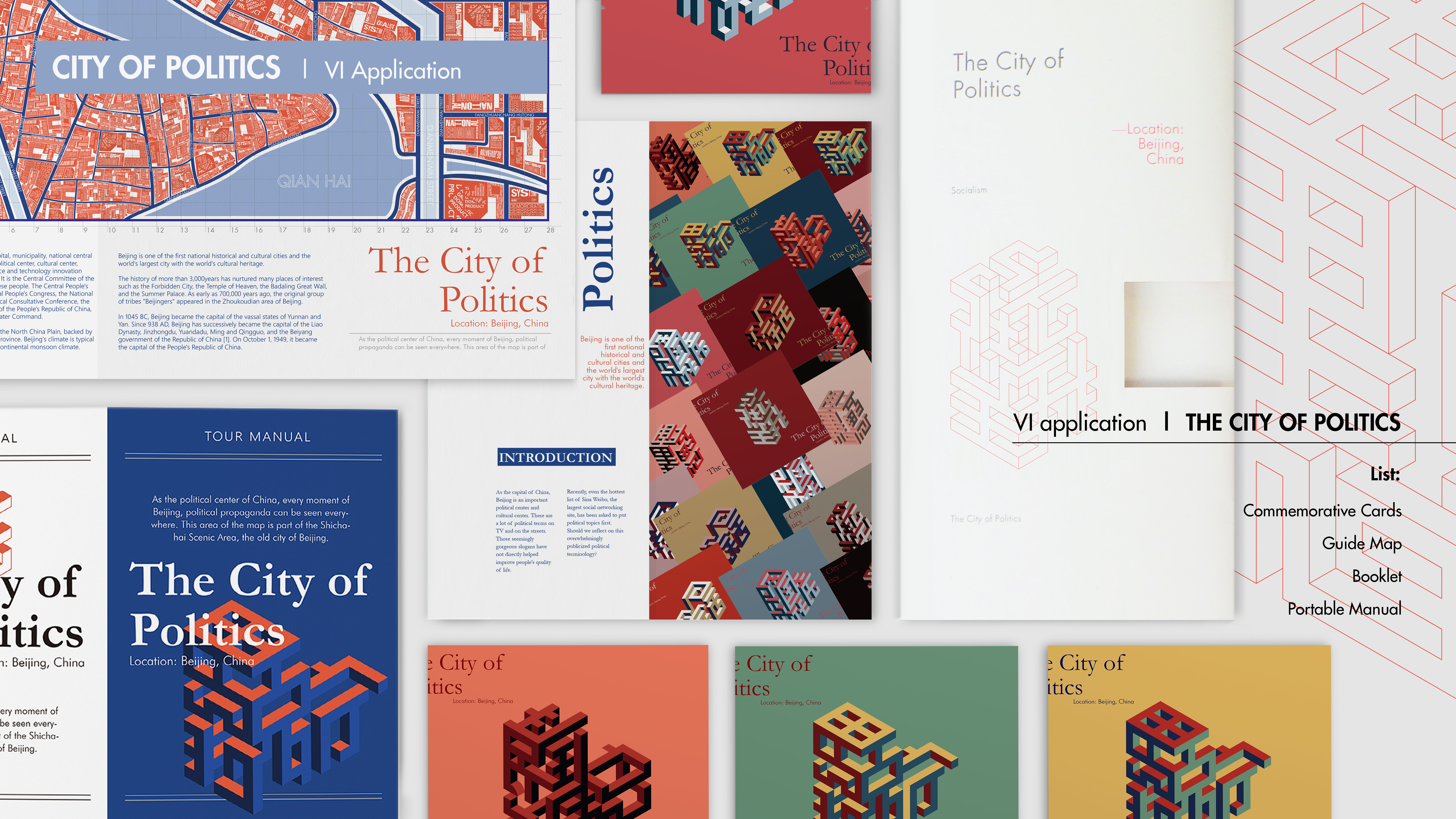
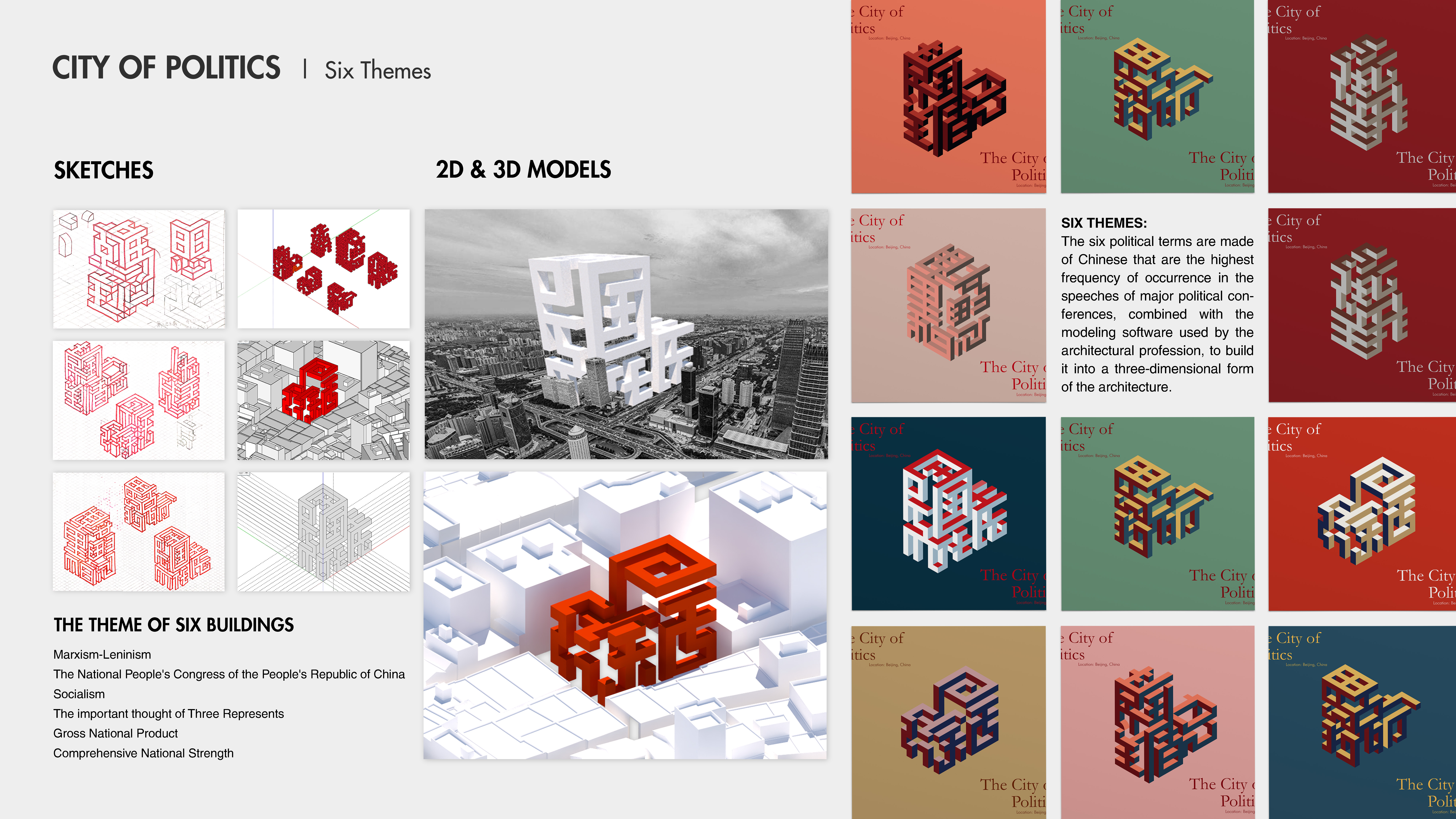
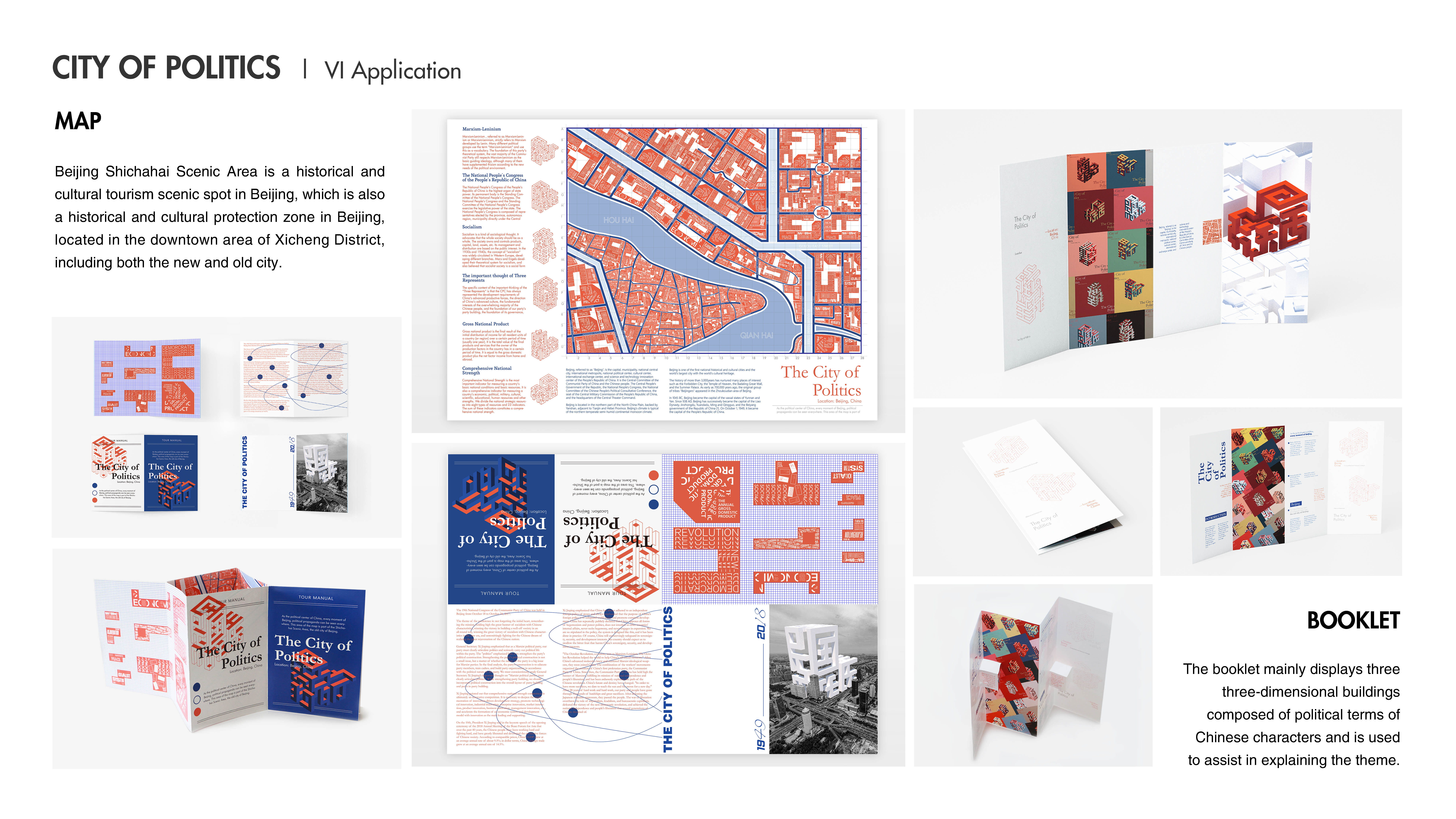
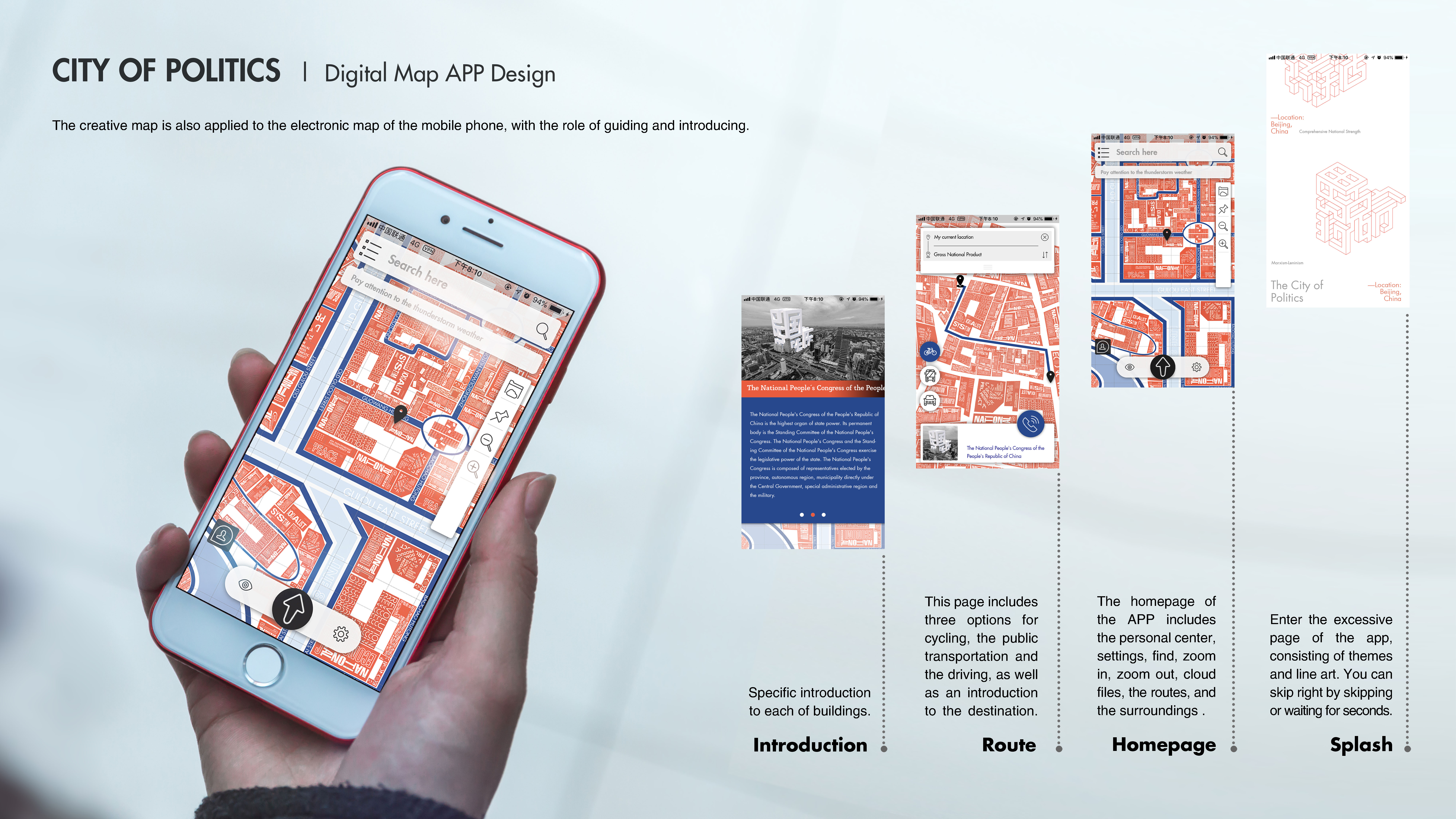
︎ City of Politics
The project is a response to excessive political propaganda in Beijing, China's capital city.

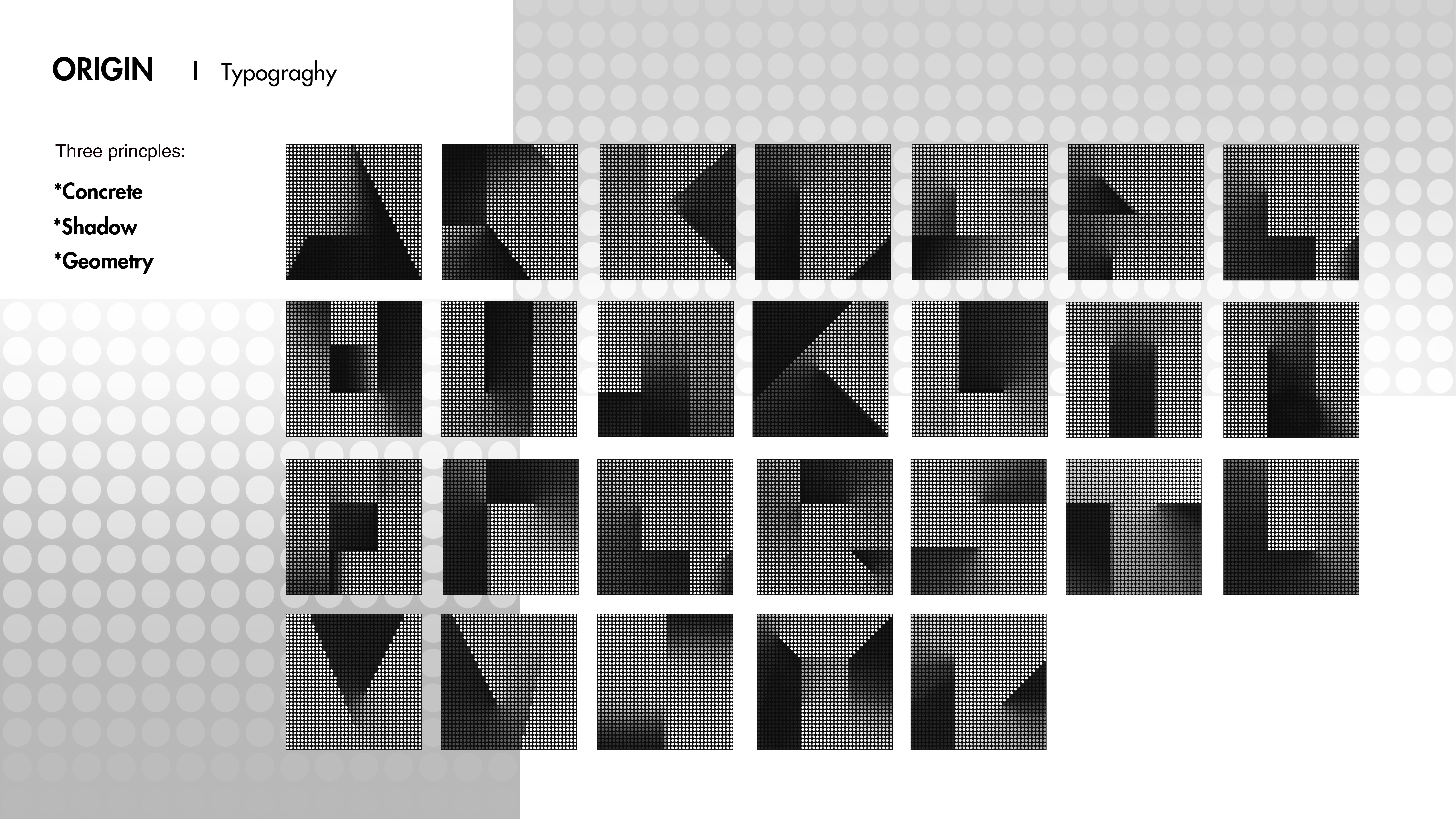
︎ Origin
Experimental typography inspired by Japanese architect, Andou Tadao.
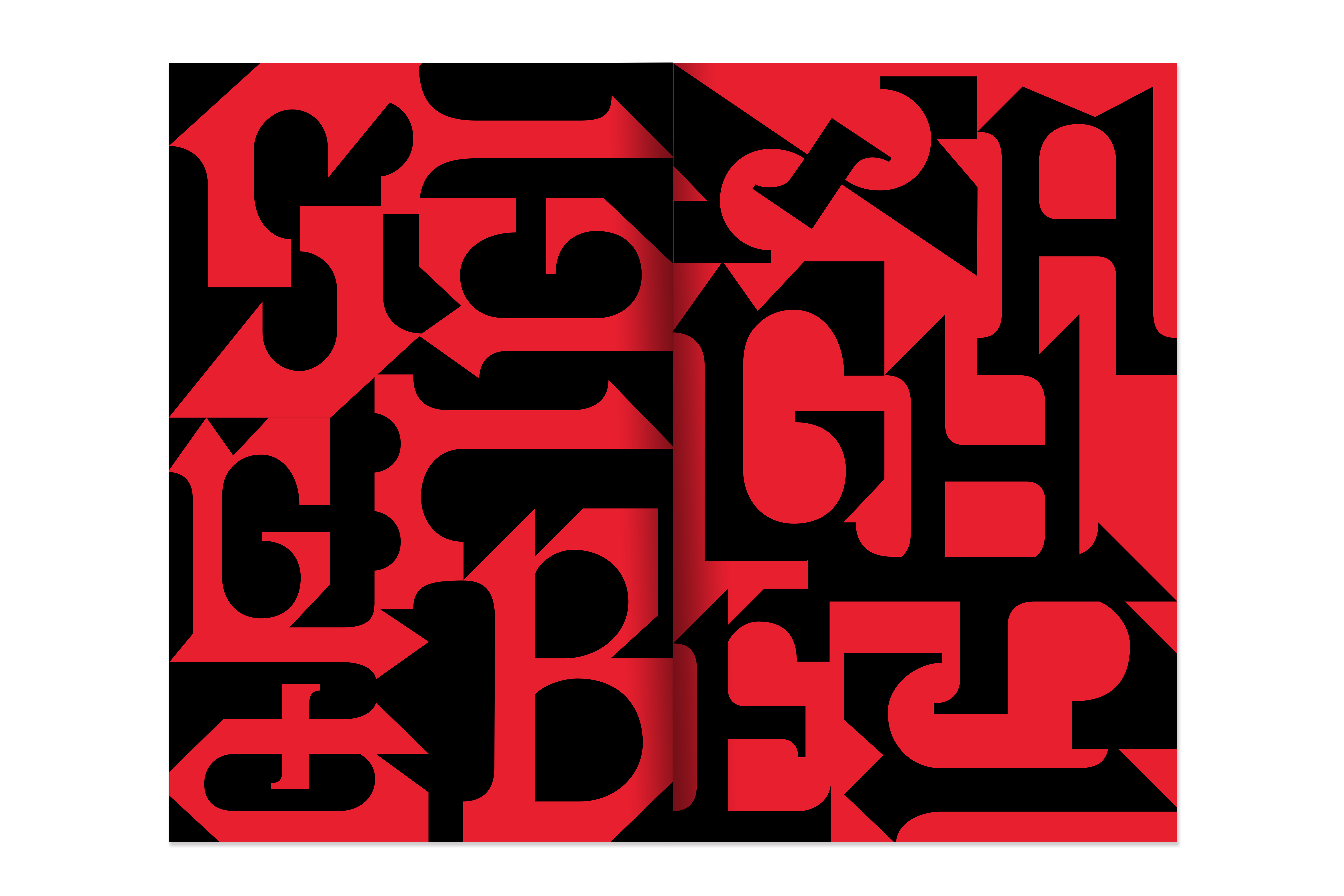
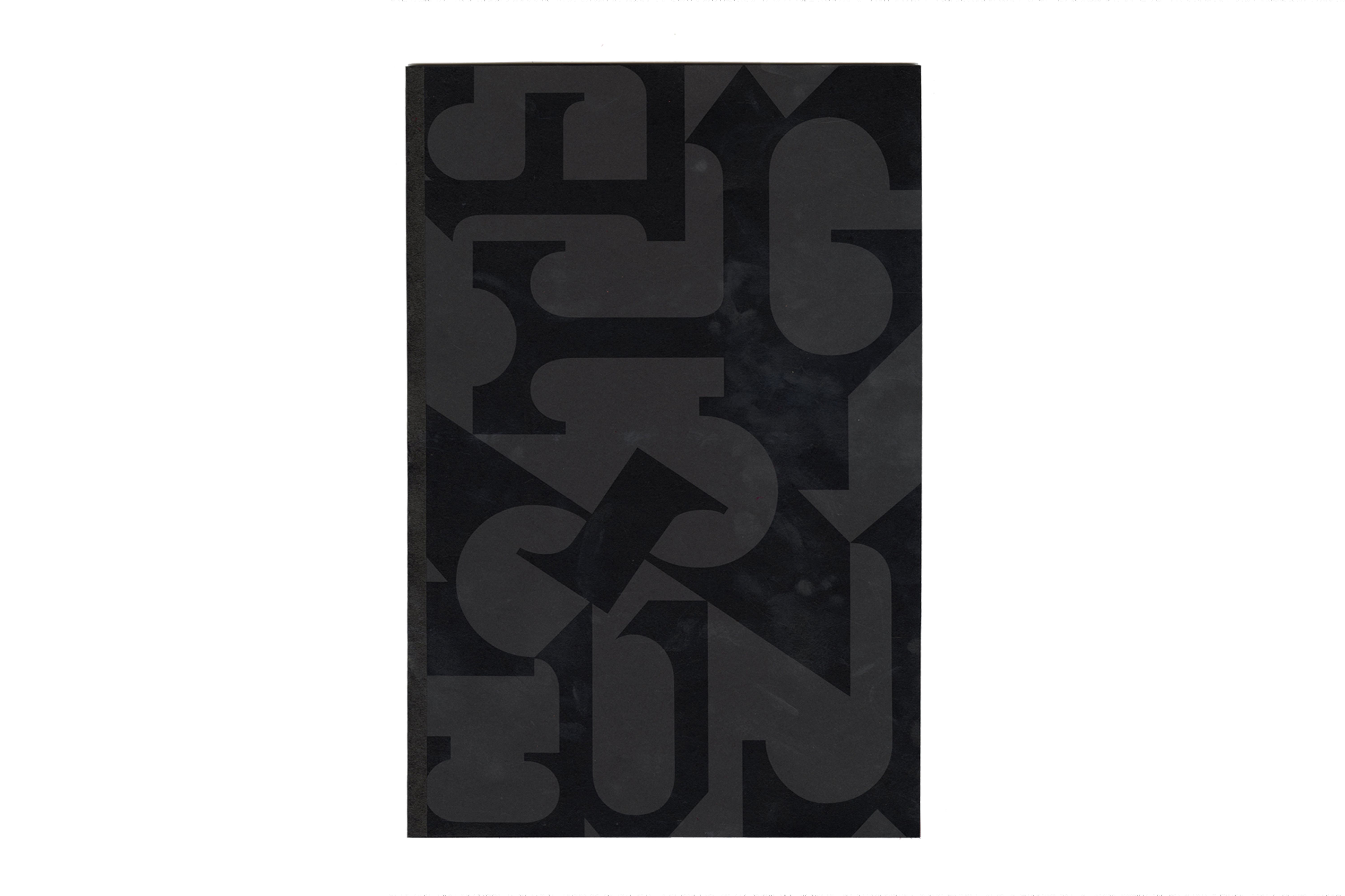
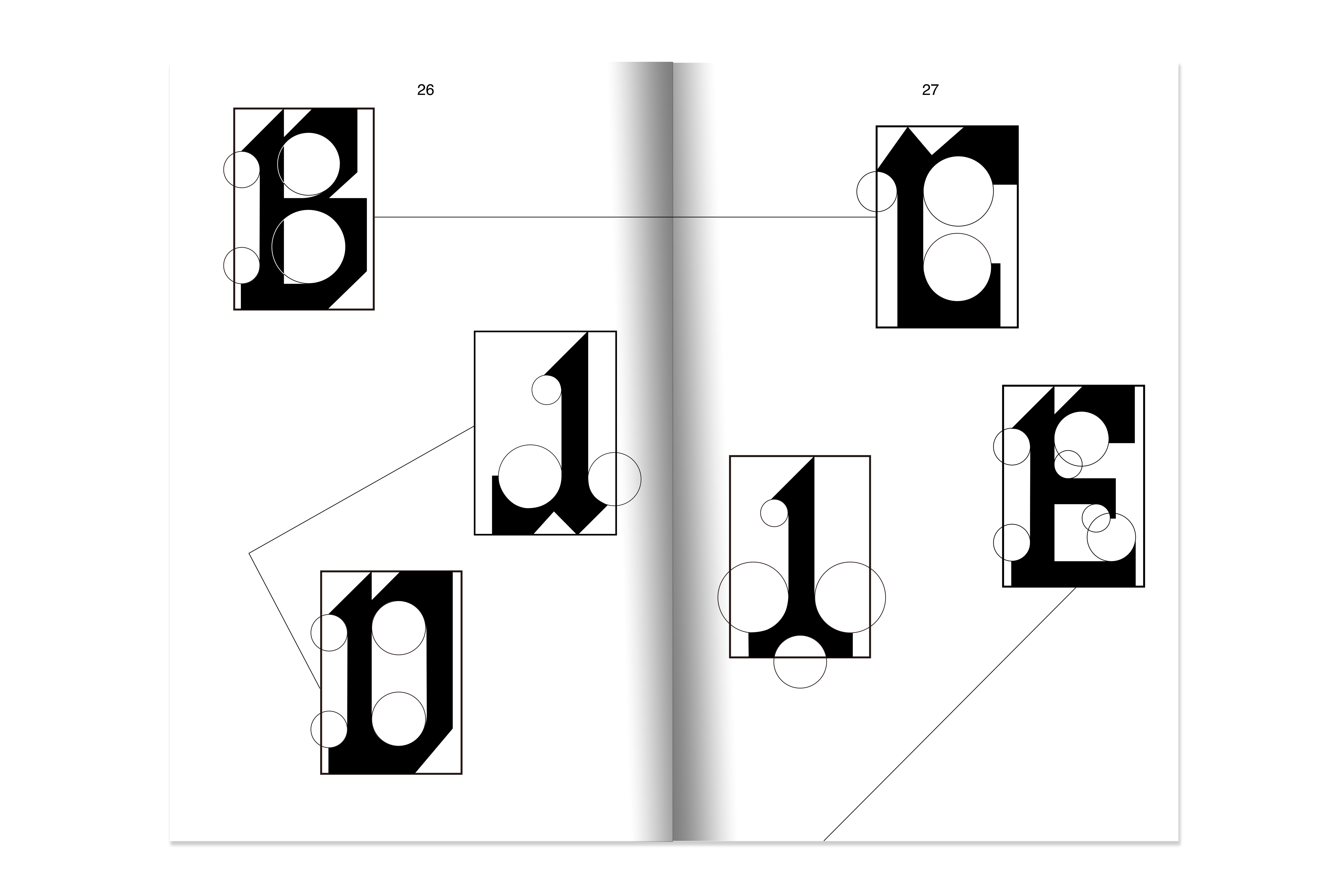
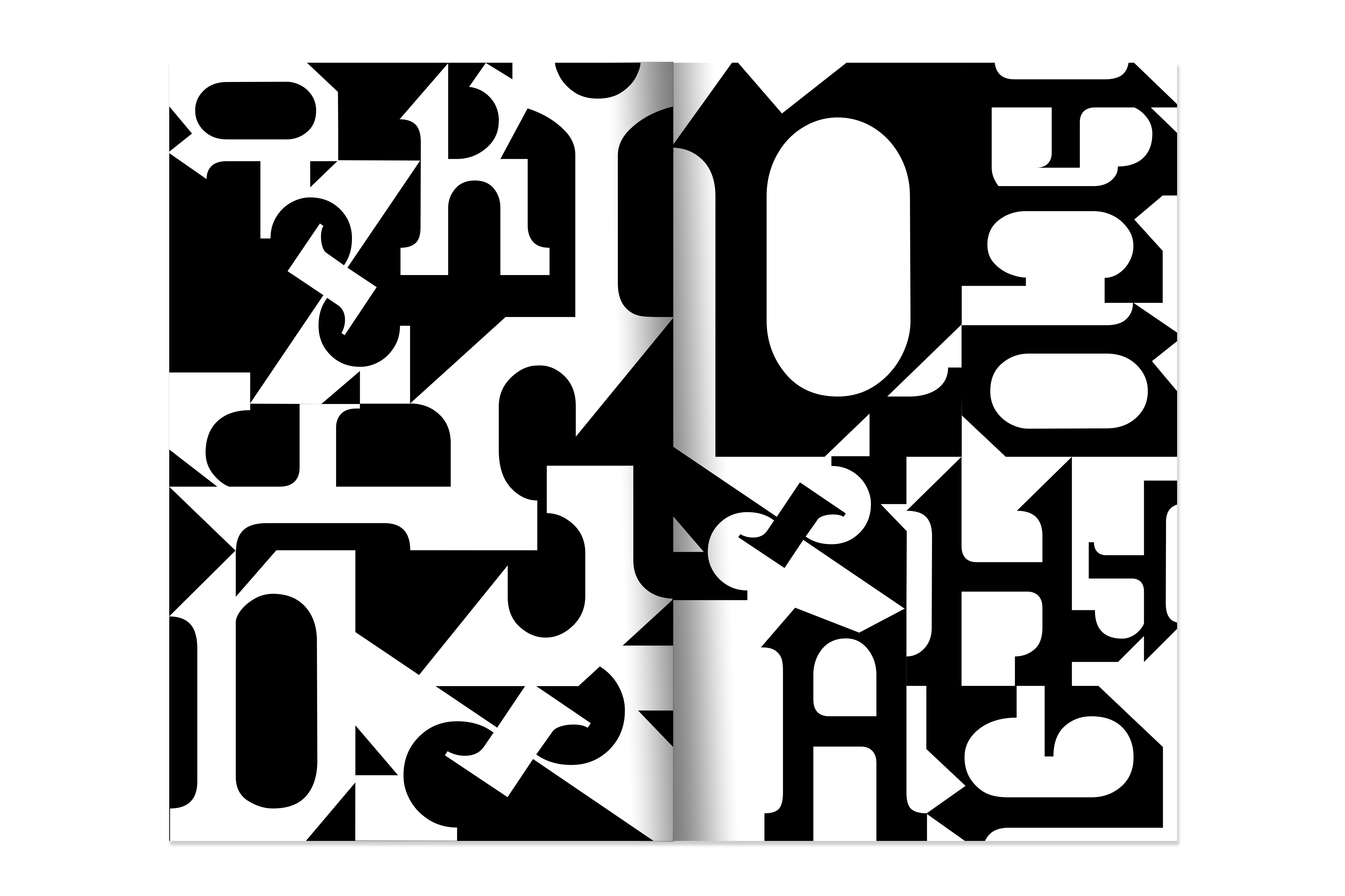
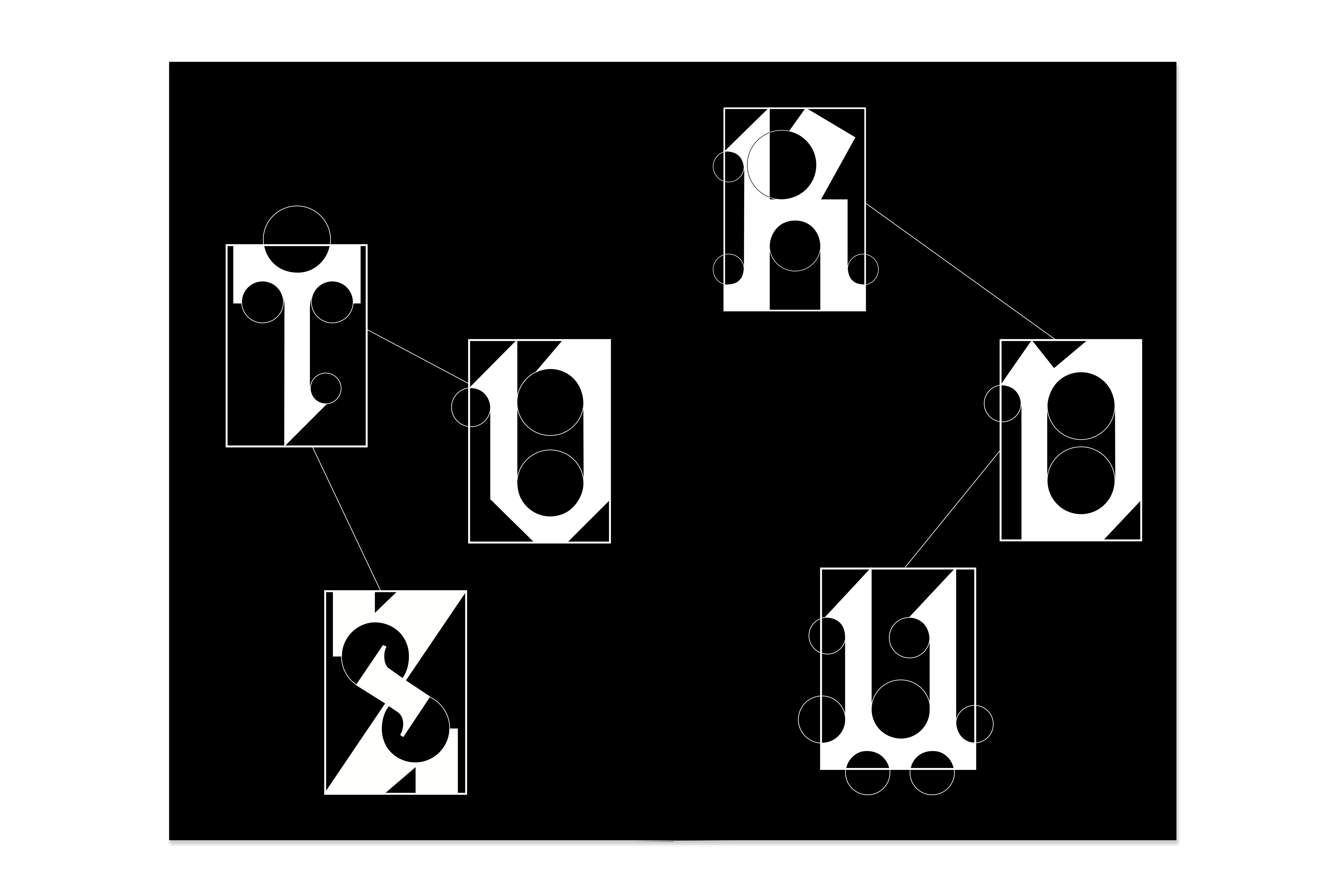
︎Display Typeface | NewBlackletter
NewBlackletter is a display typeface inspired by a signwriter’s and letter painter’s sample book in the nineteenth century. I was drawn to one piece of works in the chromolithograph sample that shows a highly decorative Blackletter surrounded by organic ornaments with striking red color because of the increasing popularity of advertising in the nineteenth. In my reinterpretation, NewBlackletter eliminated the complexity while still retaining the Blackletter’s characteristics and increasing its functionality, and establishing a unified standard. NewBlackletter is composed of geometrical shapes, and the circle specifies all the curve parts.