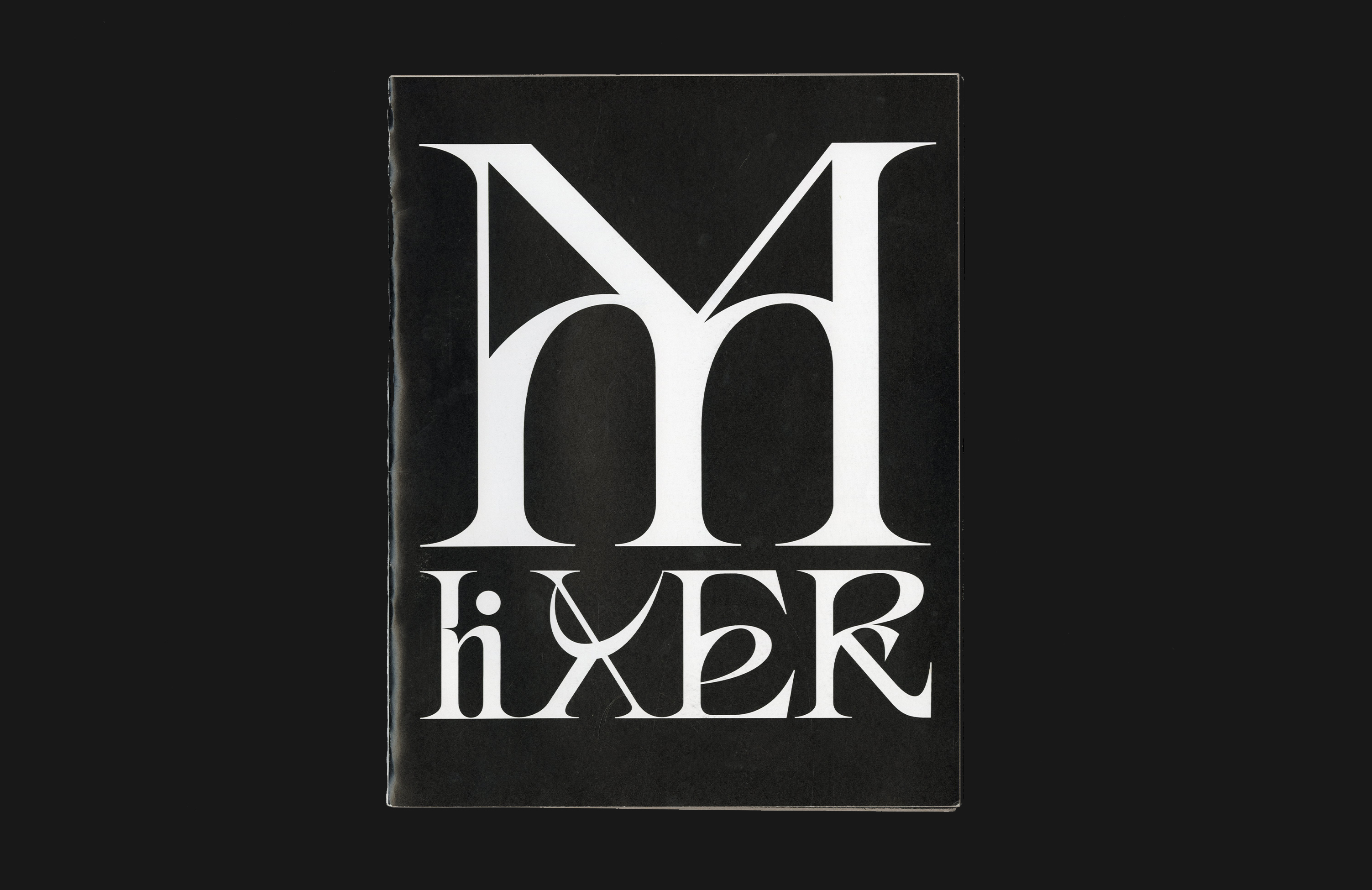

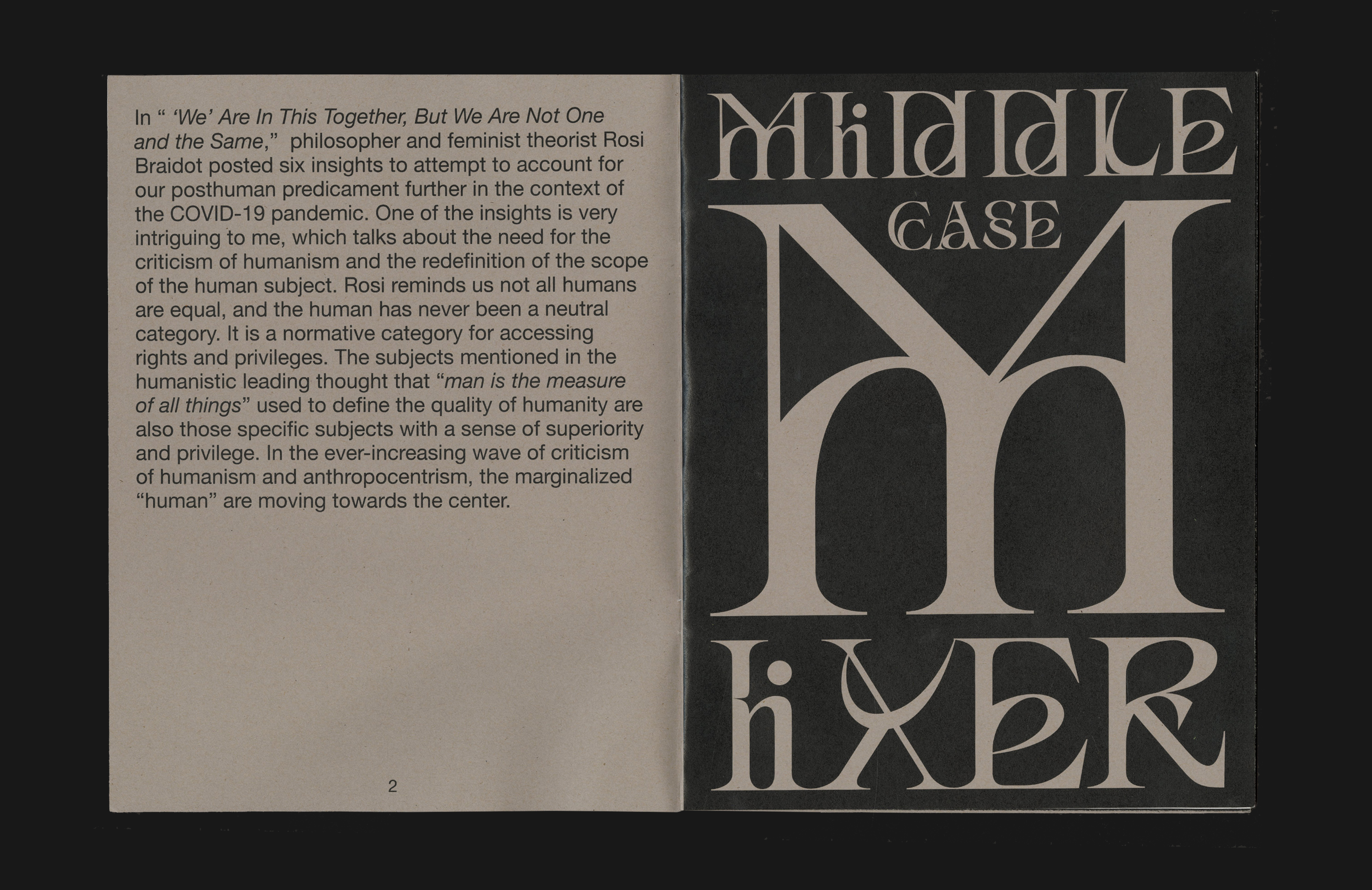

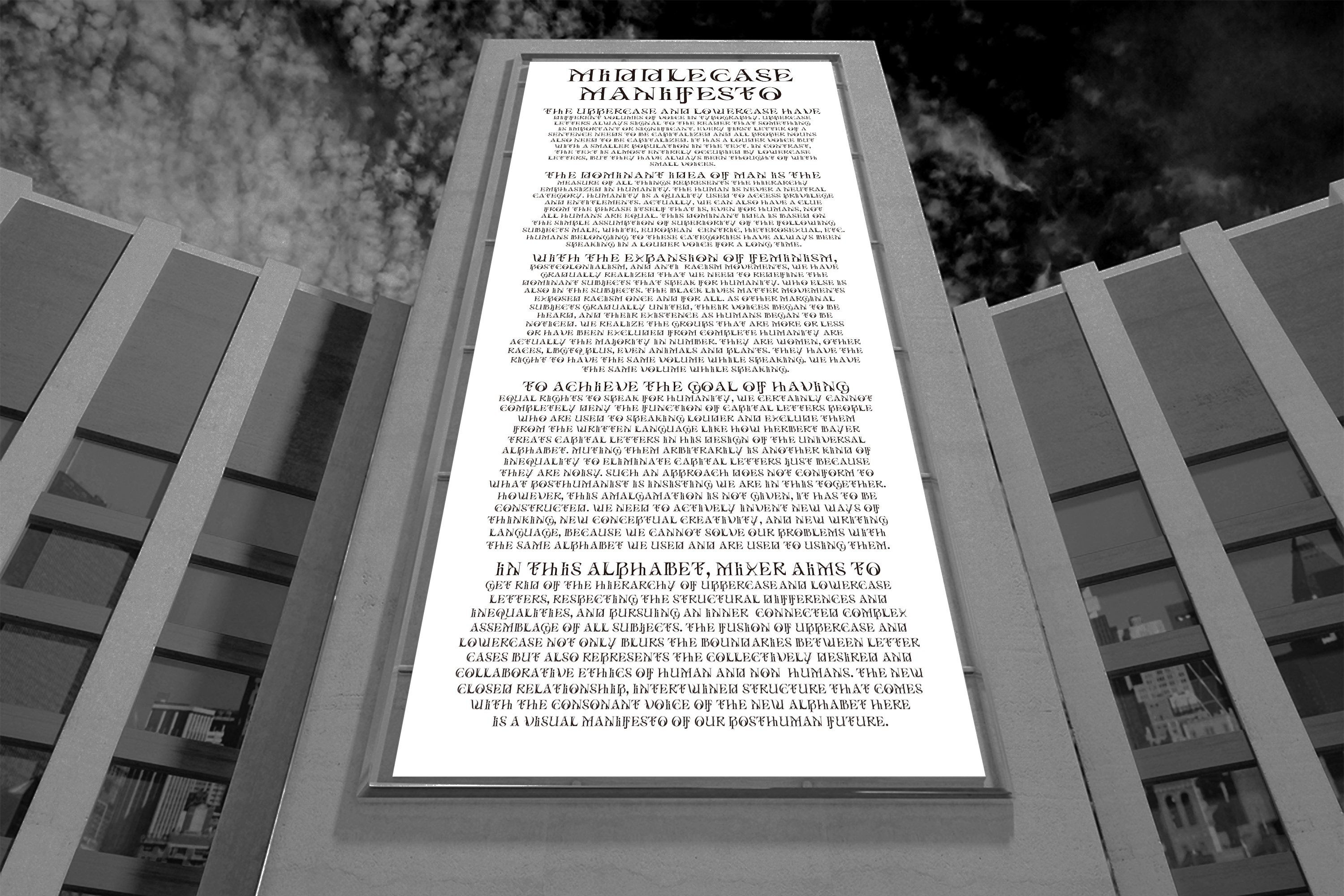
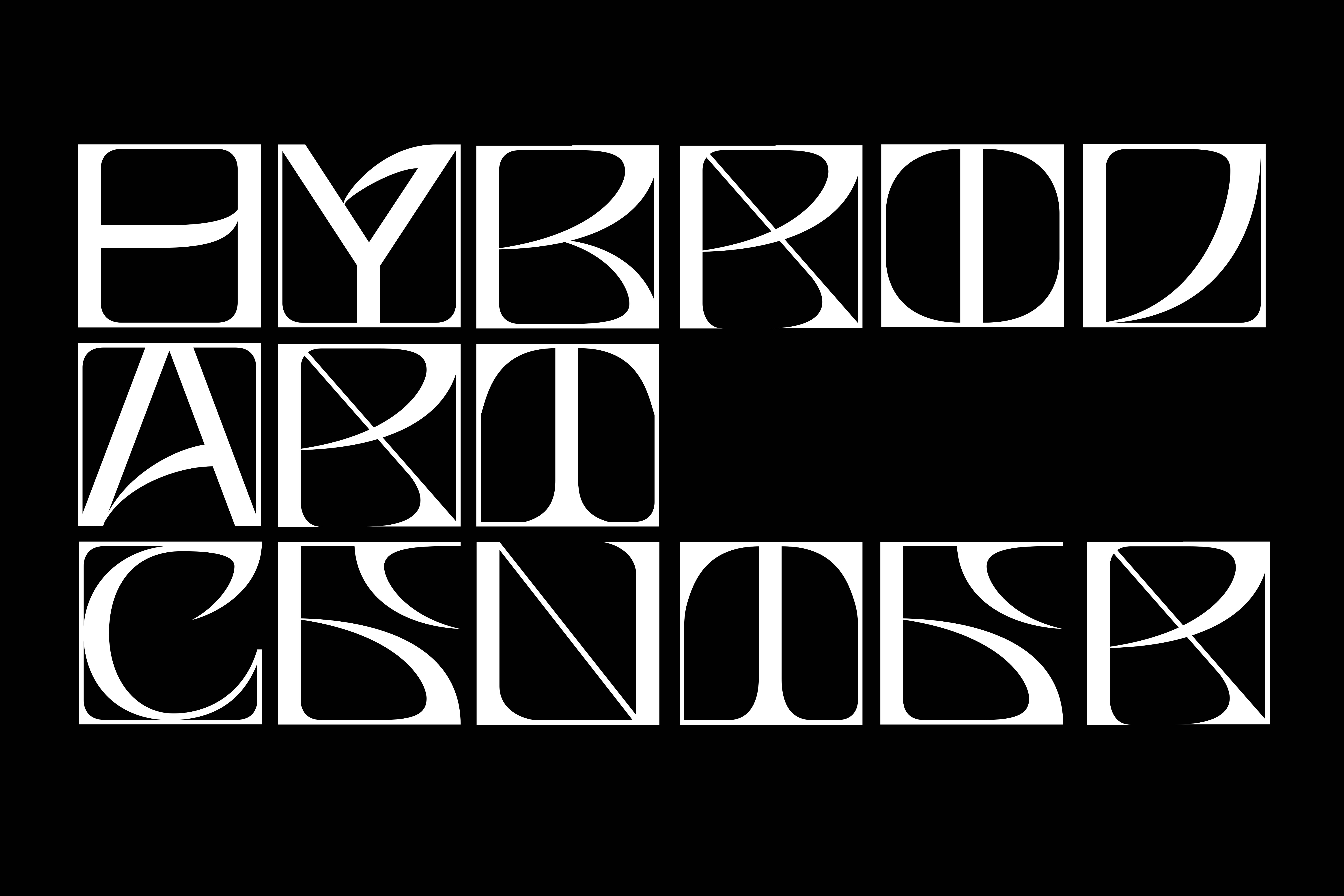
︎Middle Case | MiXeR
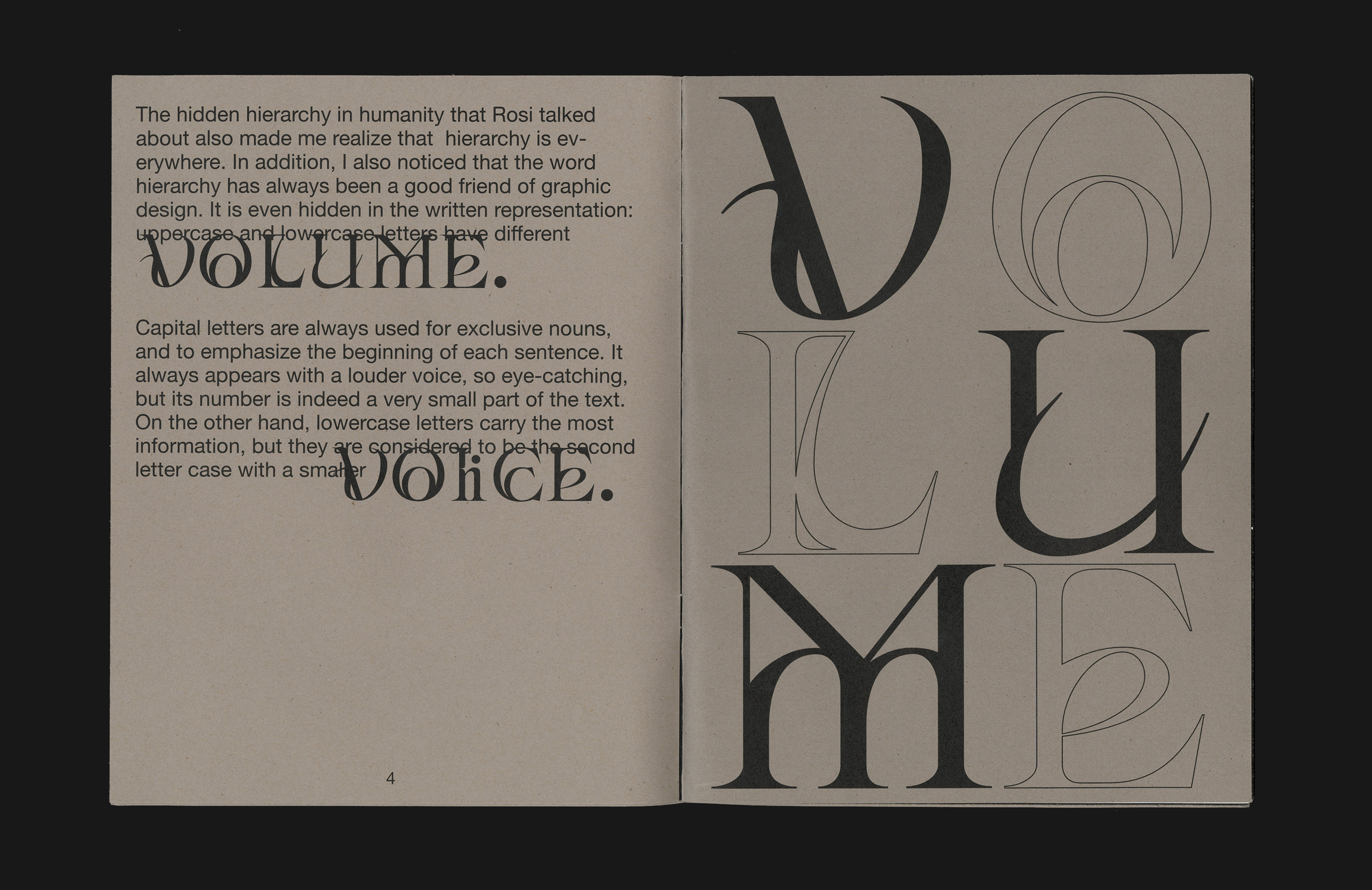
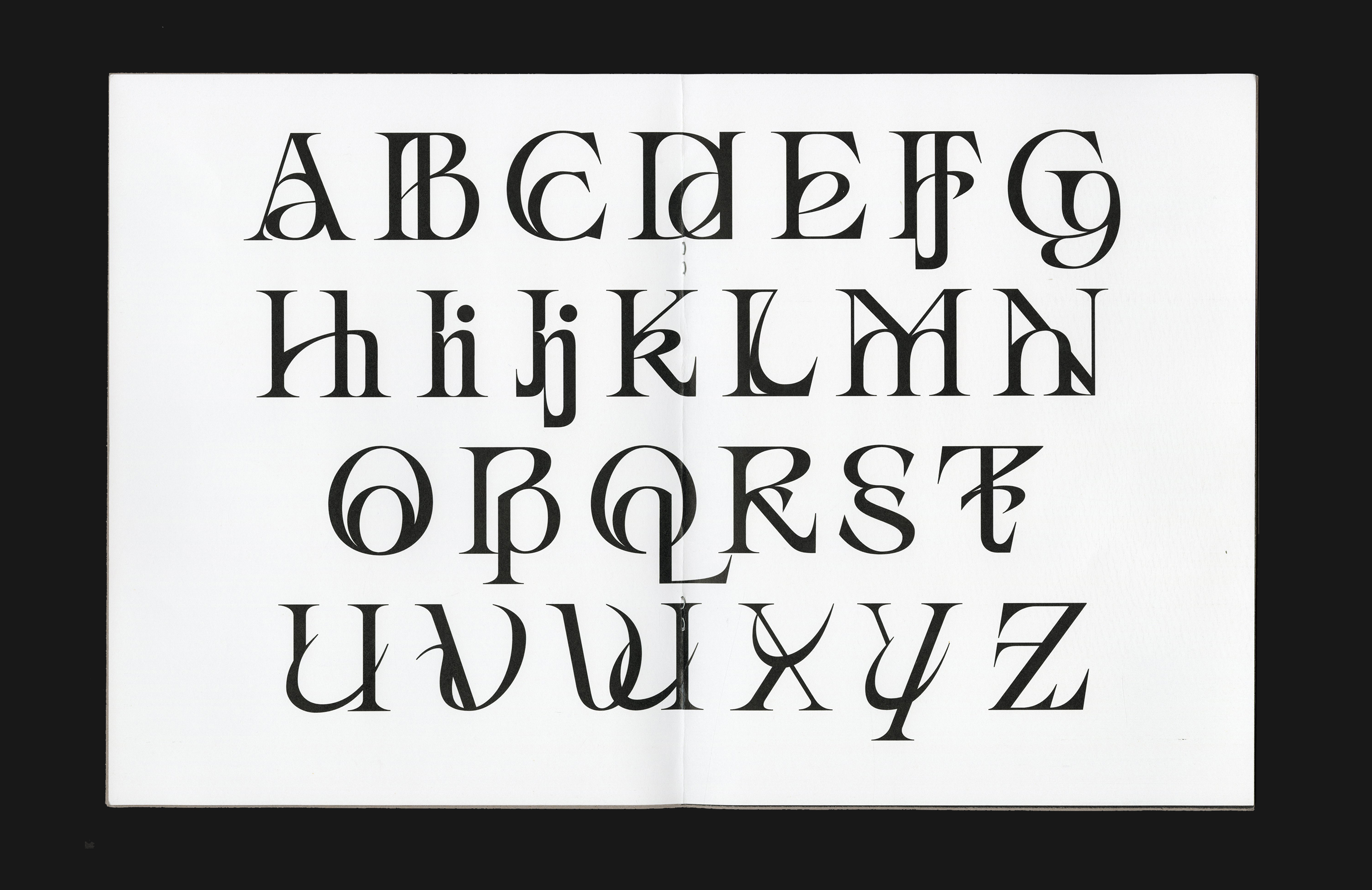
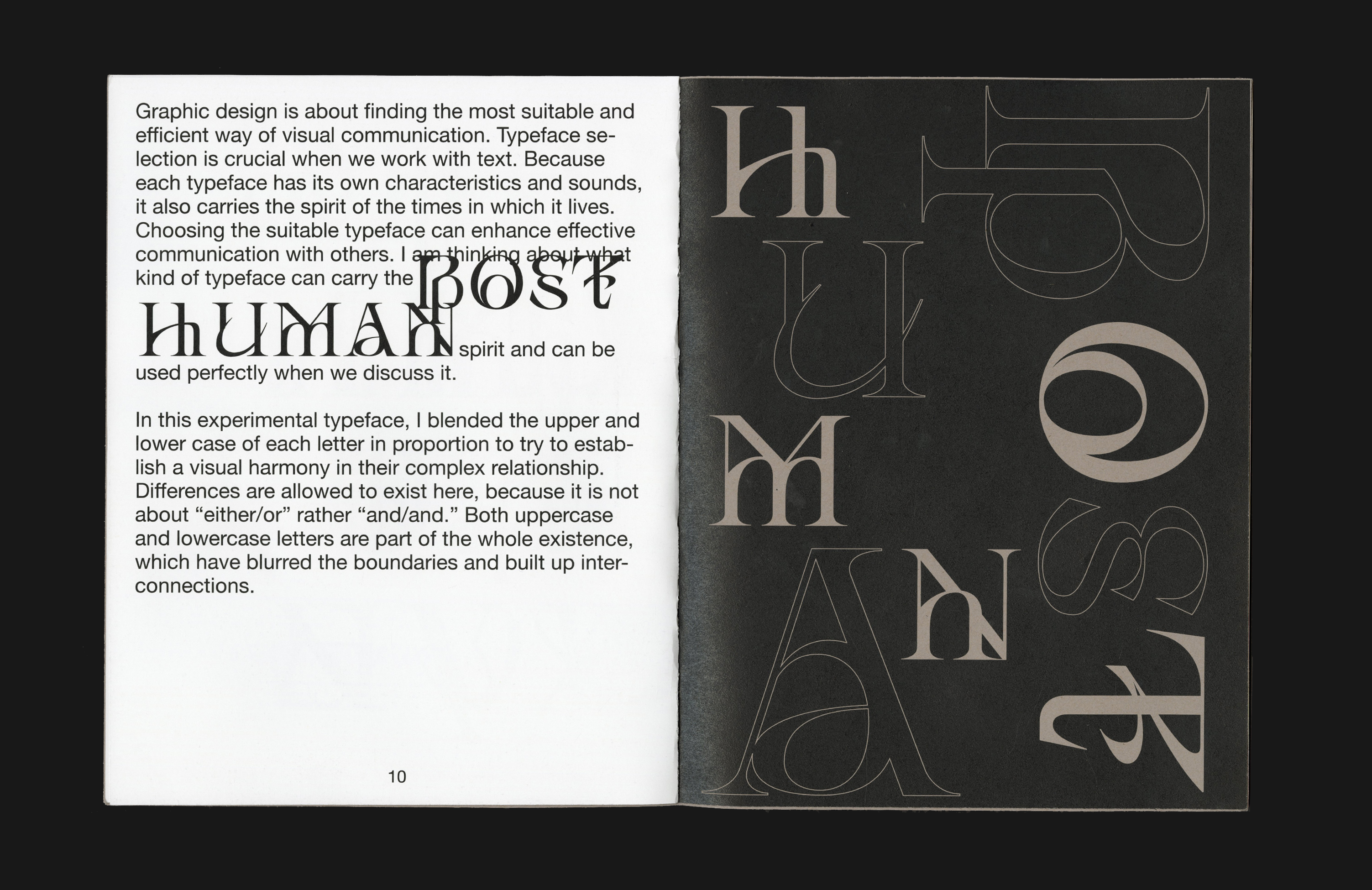
In MiXeR, the fusion of uppercase and lowercase makes the alphabet alien yet highly readable. All the letter cases should have the same right of speaking in the same volume without losing the characteristic of each individual because difference is allowed to exist. The new closed relationship, the intertwined structure that comes with the consonant voice of the new alphabet here, is a visual manifesto of our posthuman future.
Published by Draw Down
First edition, 2022
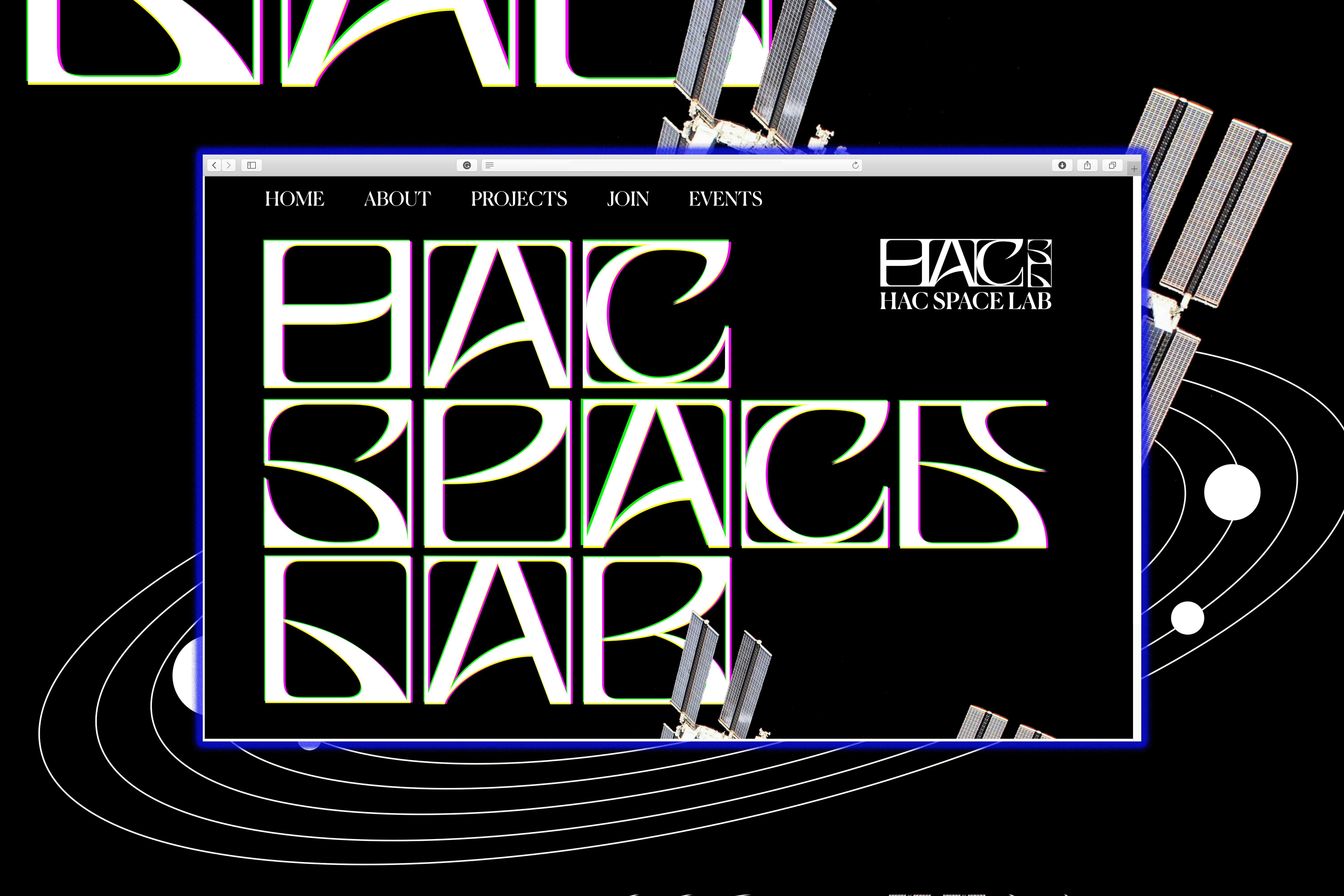
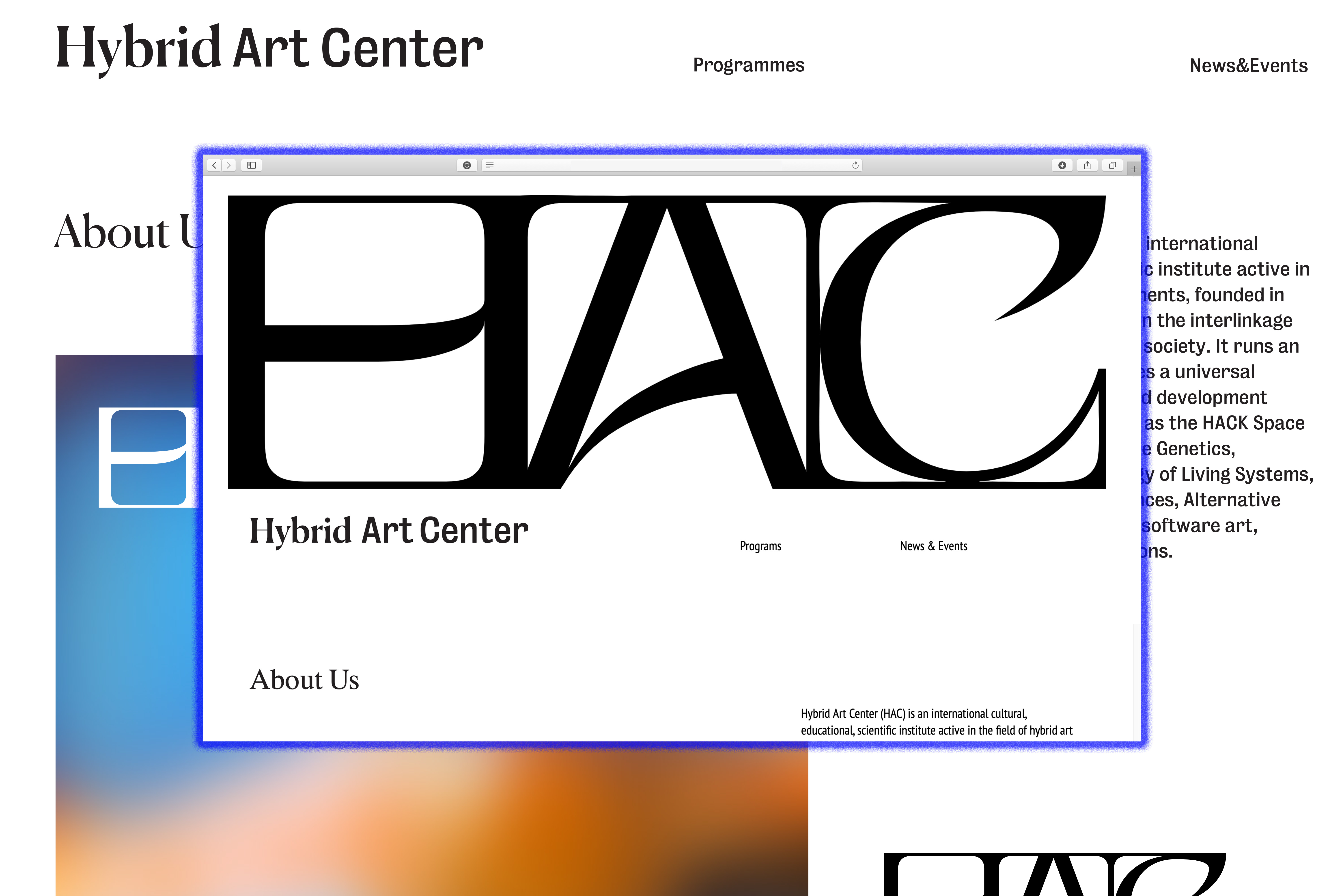
︎ Hybrid Art Center
Hybrid Art Center (HAC) is an international cultural, educational, scientific institute active in the field of hybrid art experiments. HAC’s activities focus on the interlinkage between art, technology, and society. It runs an annual magazine, and manages a universal facility across species known as the HACK Space Lab. HAC also runs Amalgam Studio that focuses multidisplinary collaborations.
︎ Valor
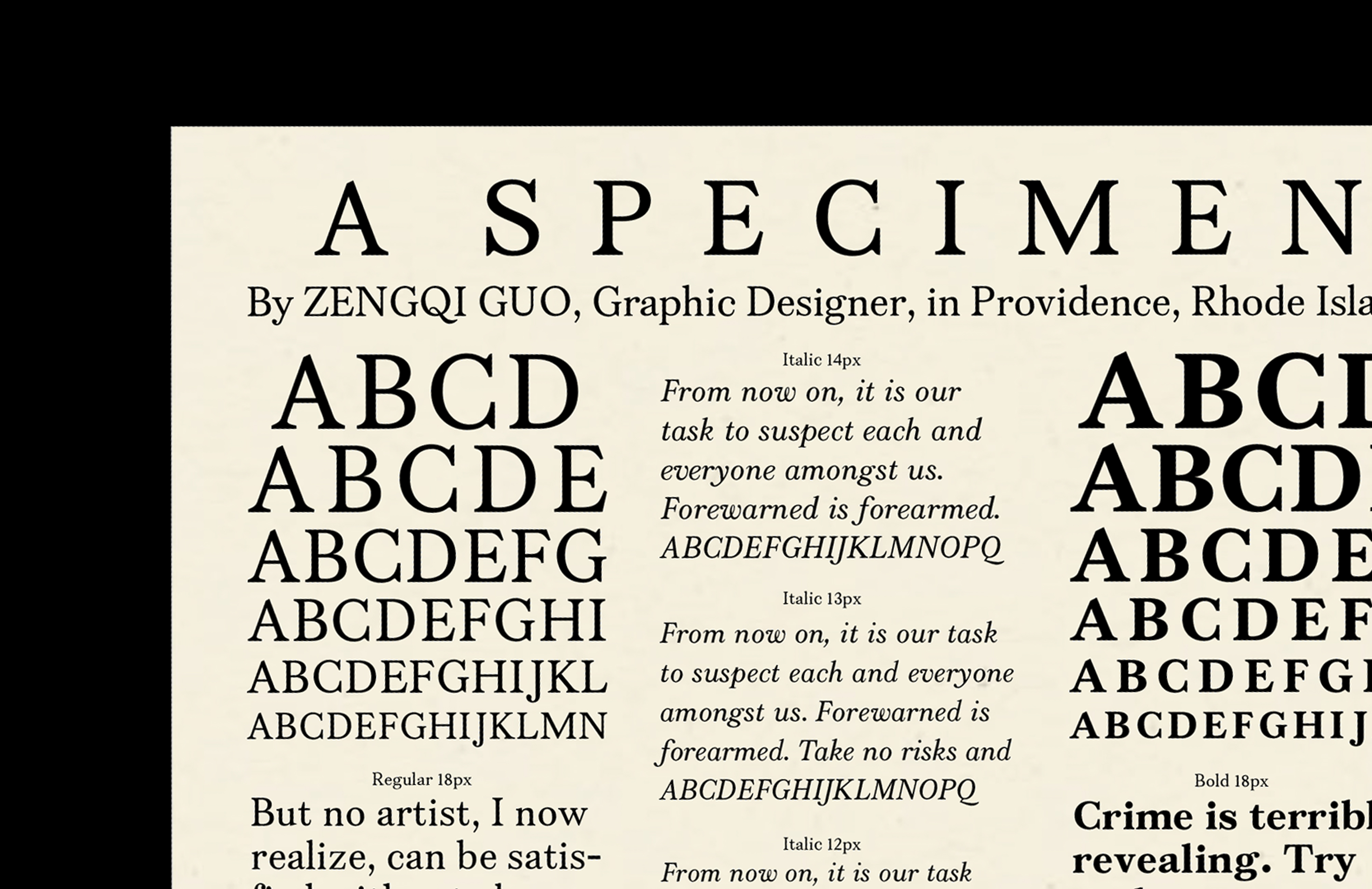
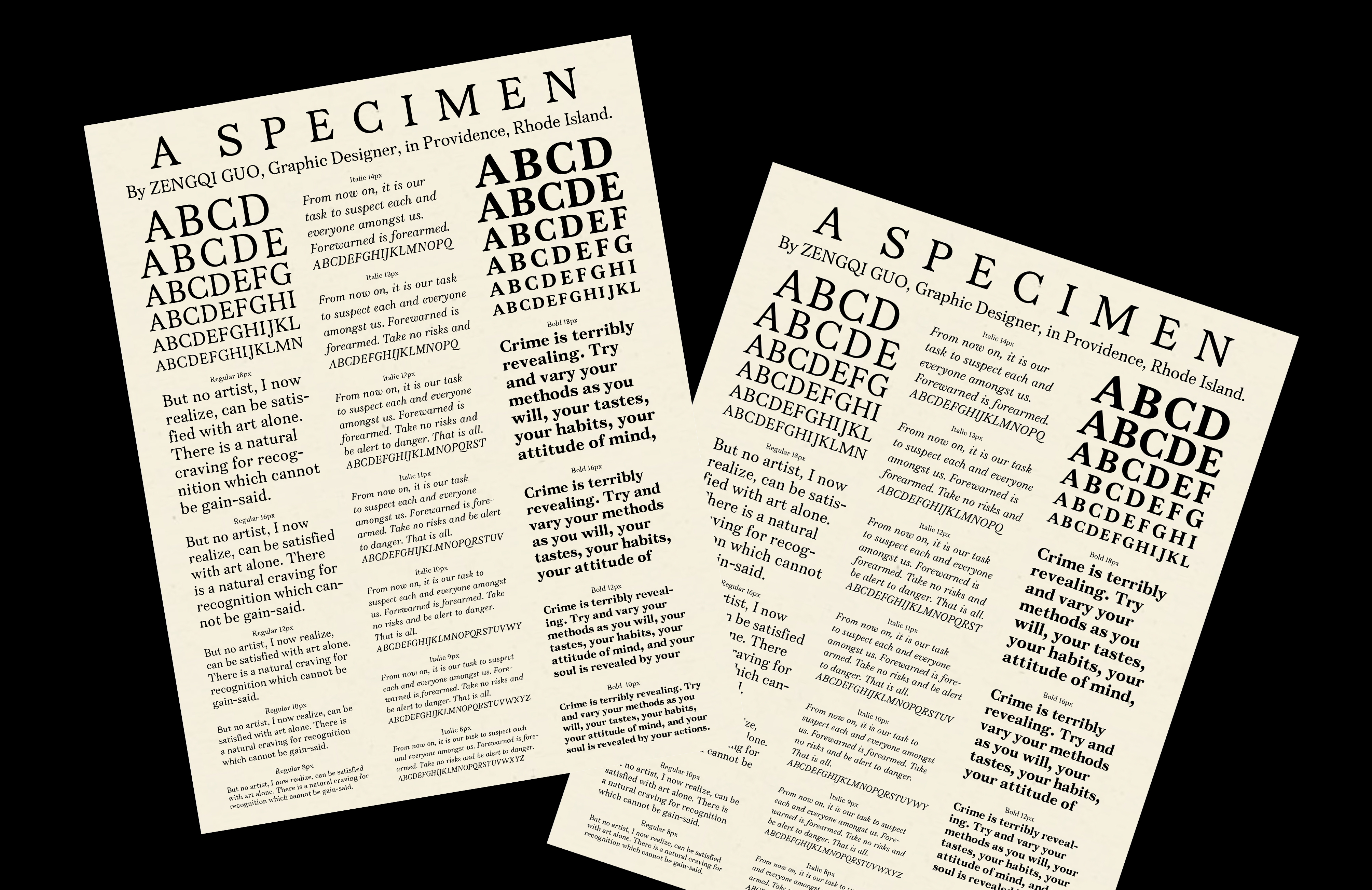
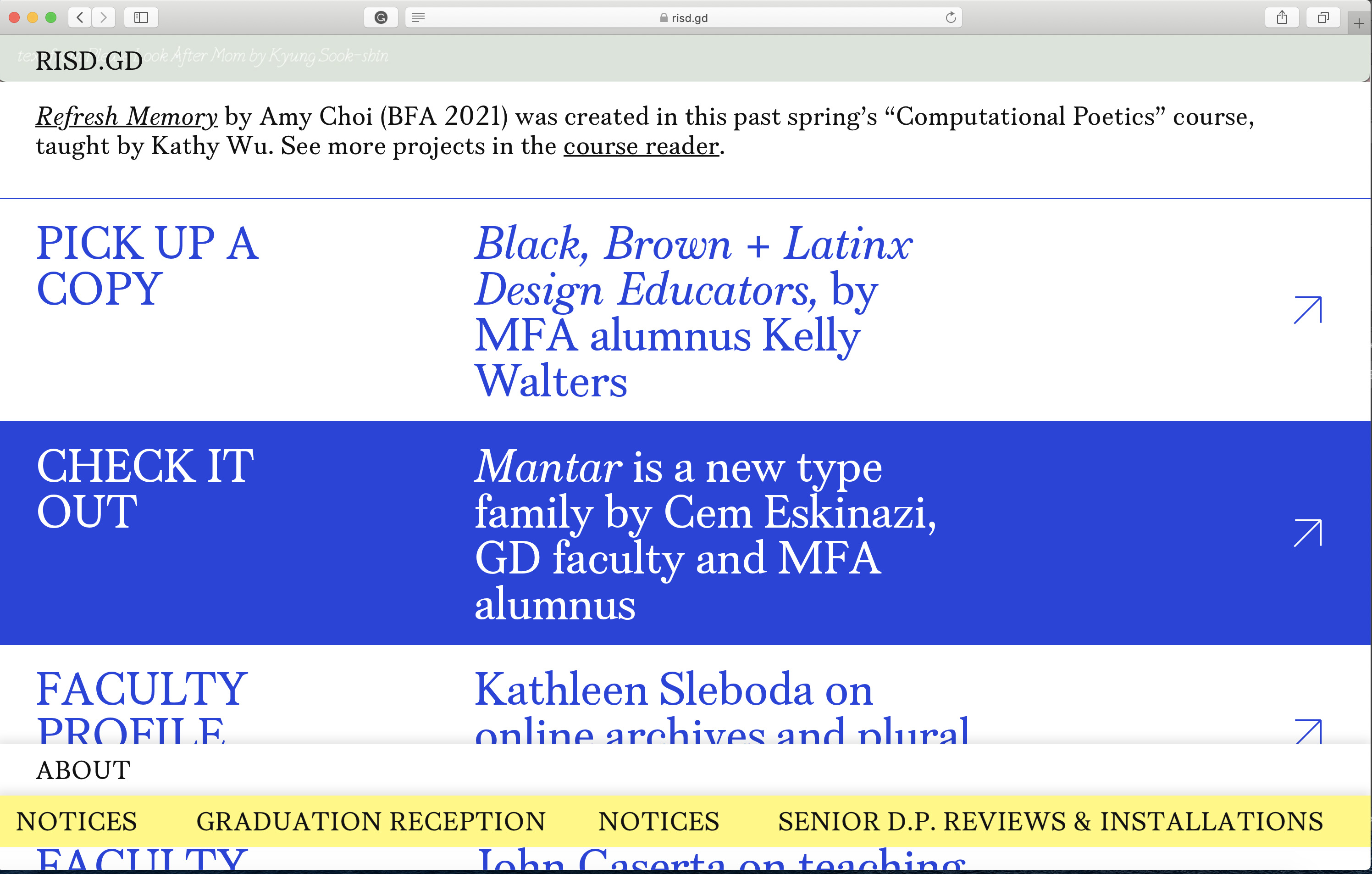
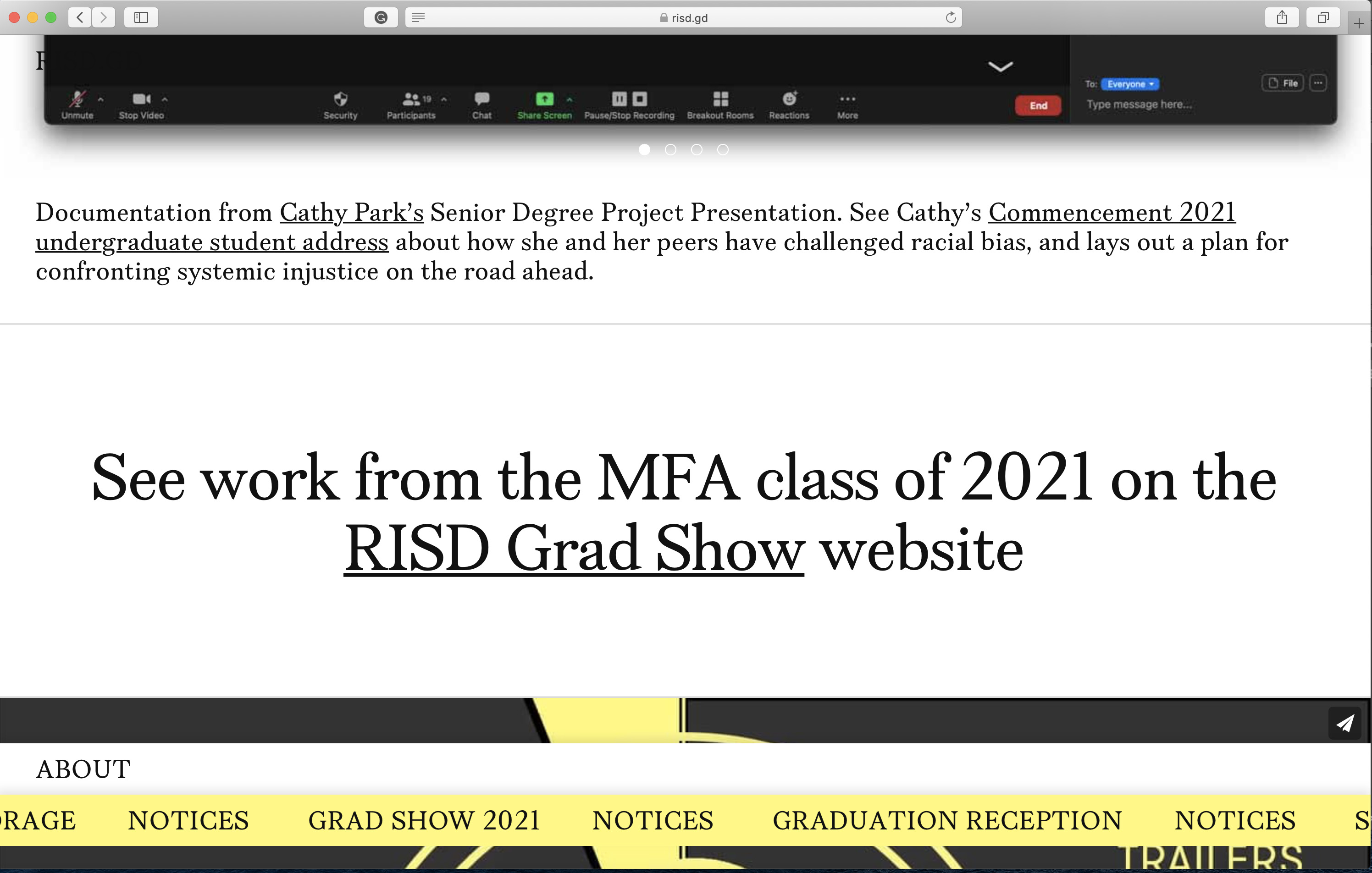
Valor is a serif text face inspired by Caslon. I made this typeface at RISD and developed it at Occupantfonts. It has Roman, Italic, and Bold. More glyphs are to come! Valor was used on risd.gd website in the summer of 2021.
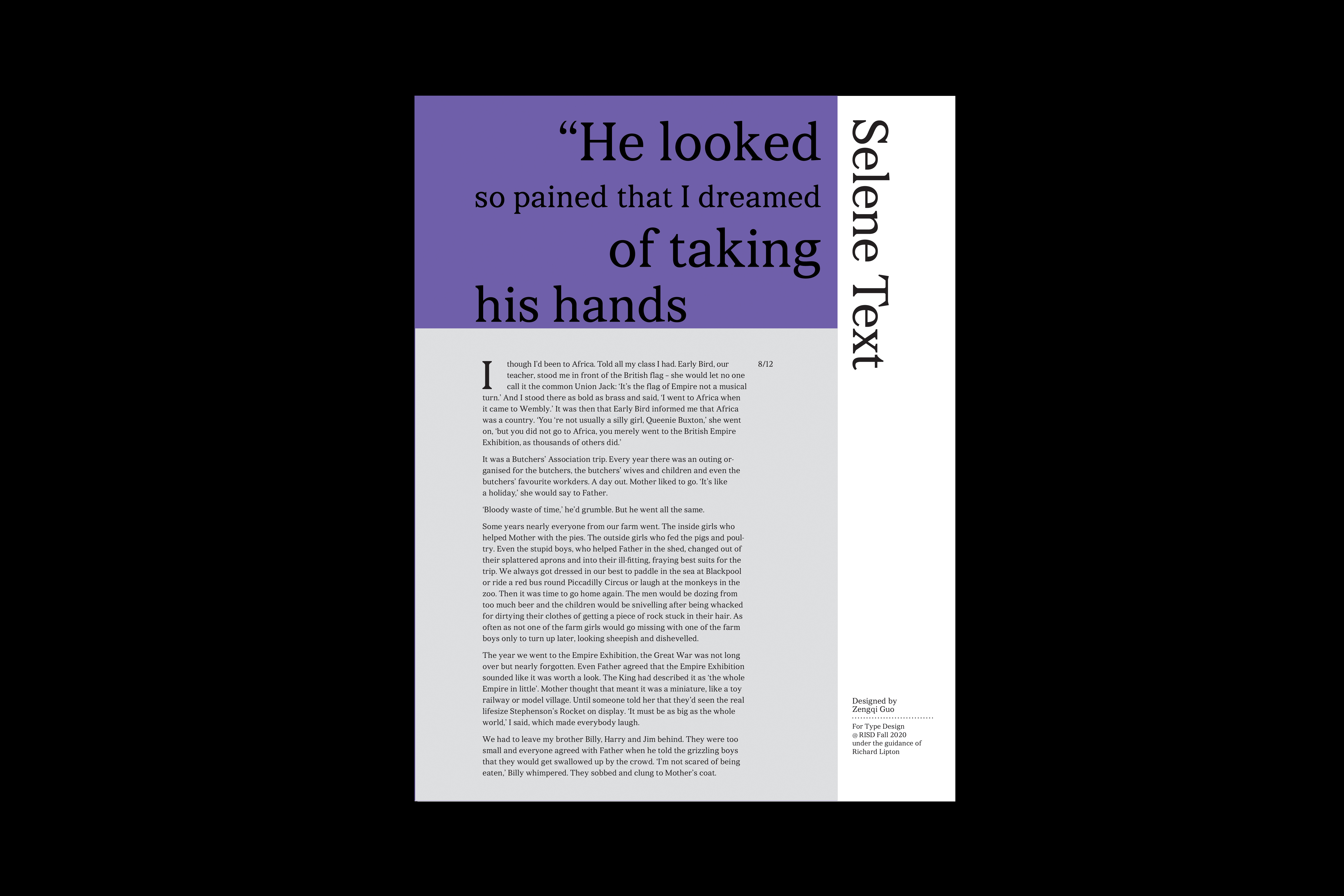


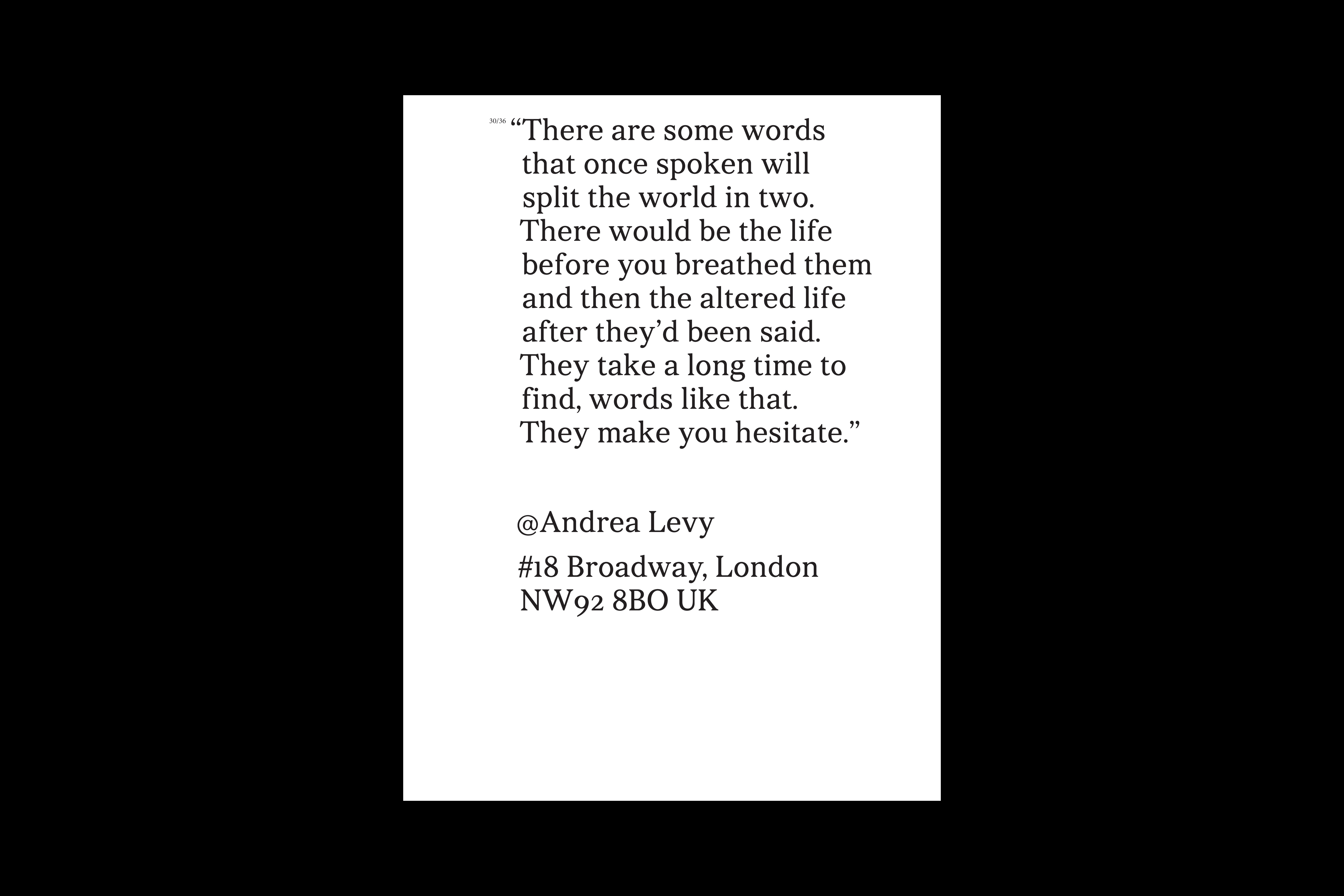
︎ Selene Text
Selene is a serif text face designed to match the tone of Andrea Levy’s novel, Small Island. It is all about brave, loyalty, and optimism in difficulties. Its almost straight bracket and triangular serifs make it both strong, warm, and also contemporary.
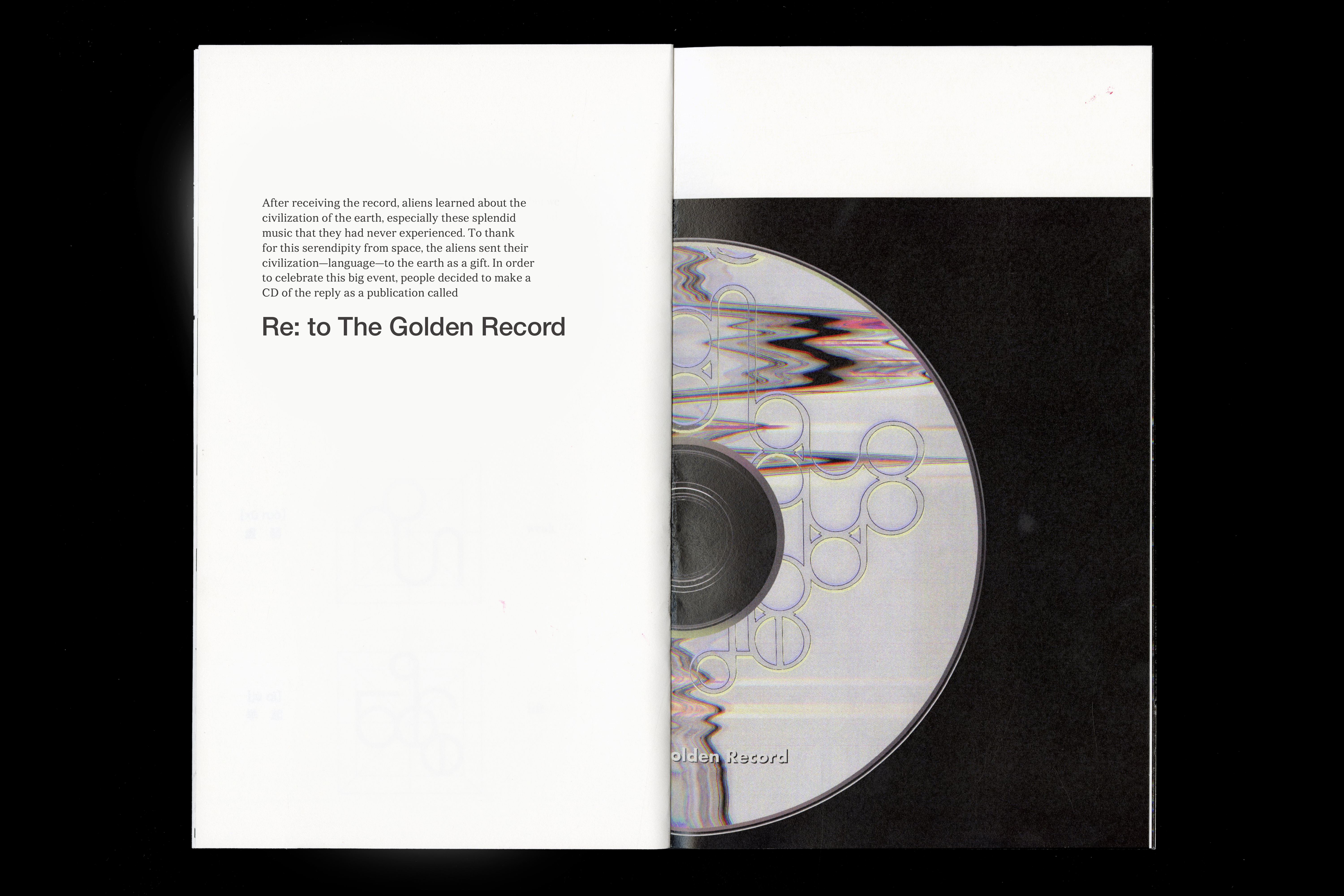
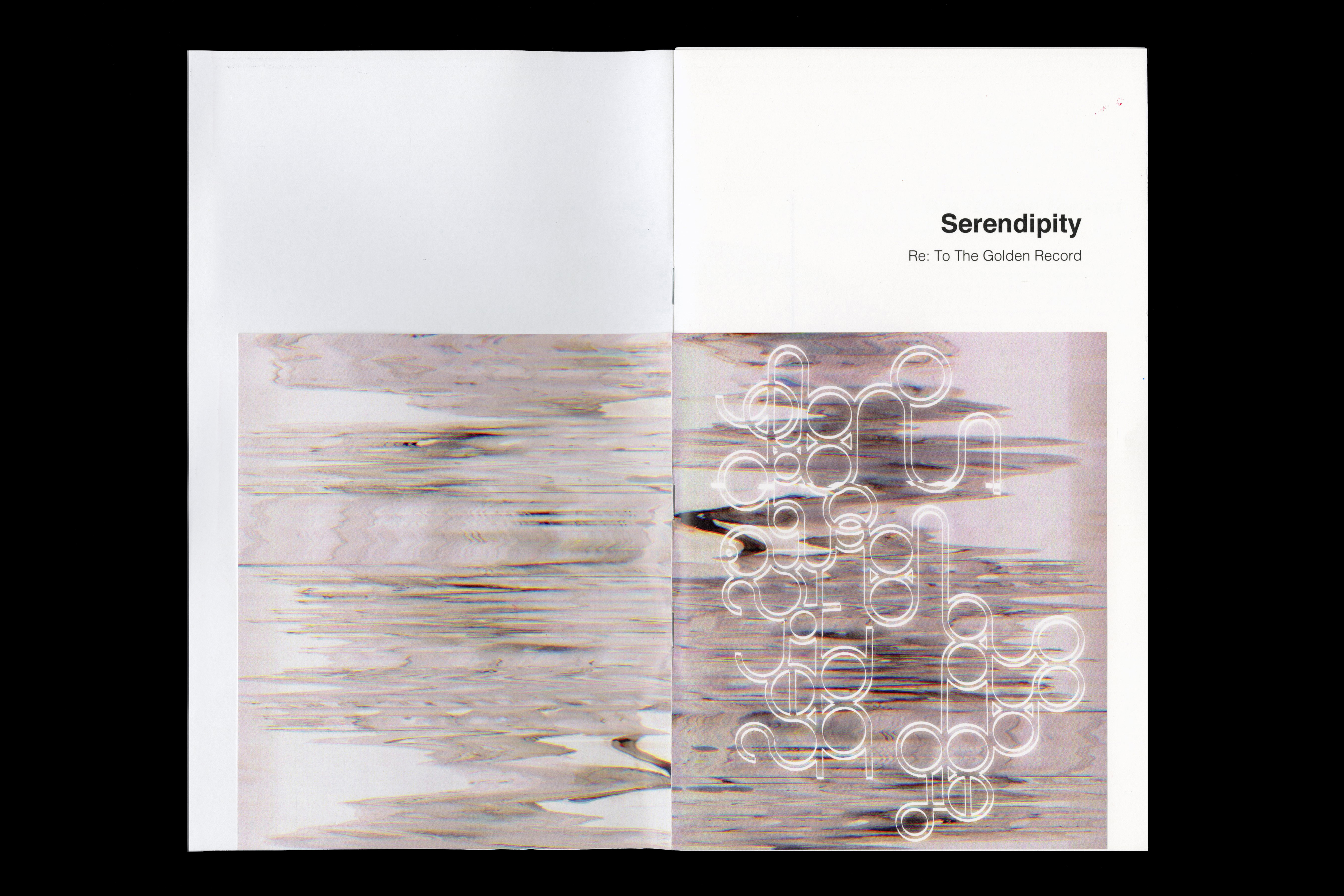
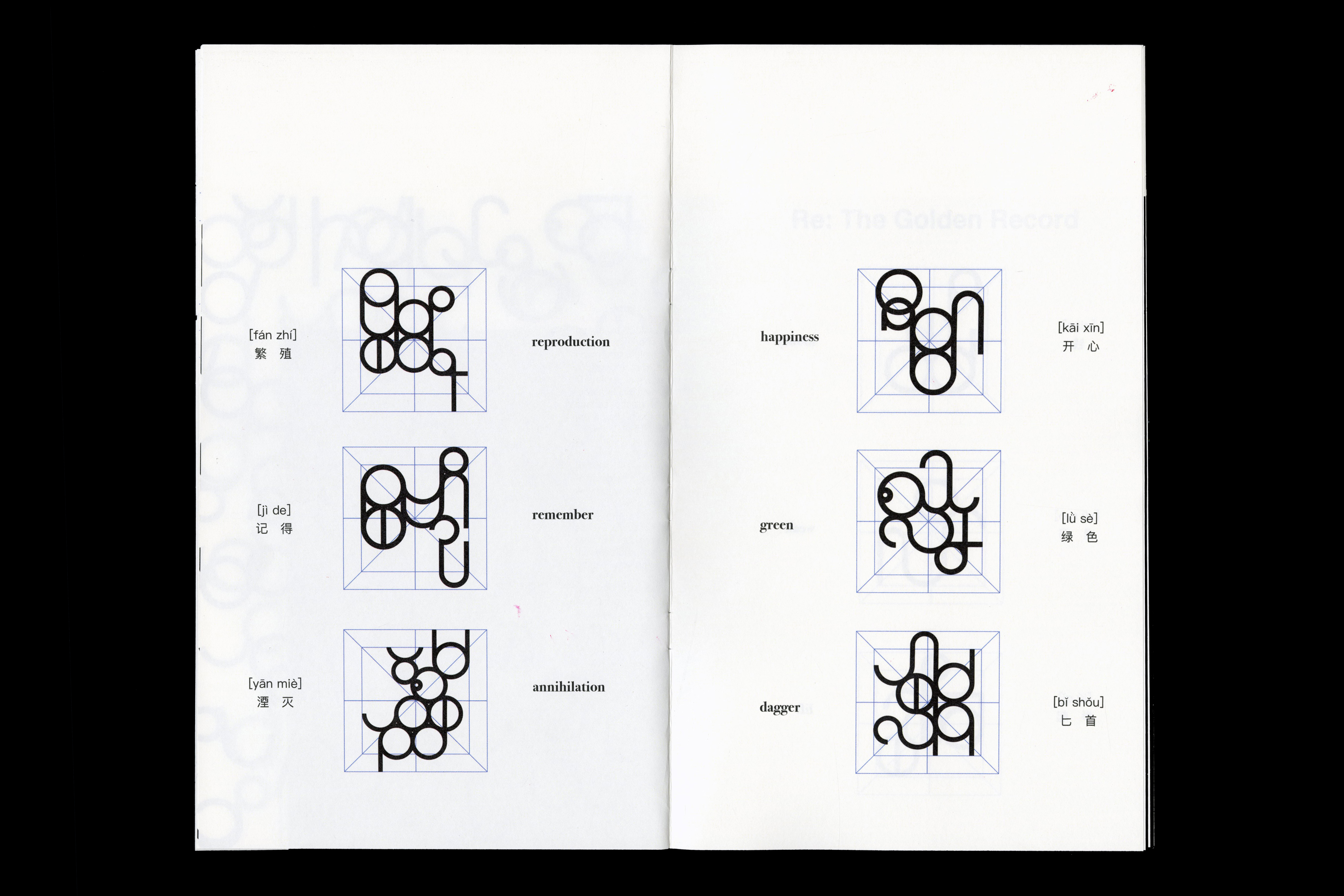
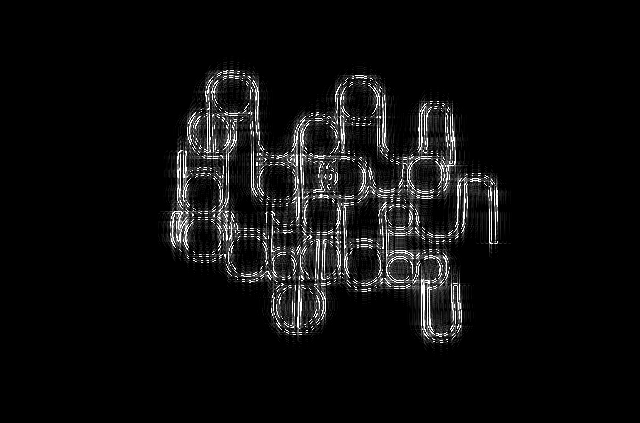
︎ Re: to the Golden Record
This project is an alien language that I imagined. The inspiration comes from how aliens will respond to The Golden Record. To explore more possibilities in contemporary typography, we need to extend the scope of design to a broader writing system. By getting rid of the existing letterforms' constraints, it is possible to extract some new forms as inspirations from the future or the places we never had a chance to know.
Video
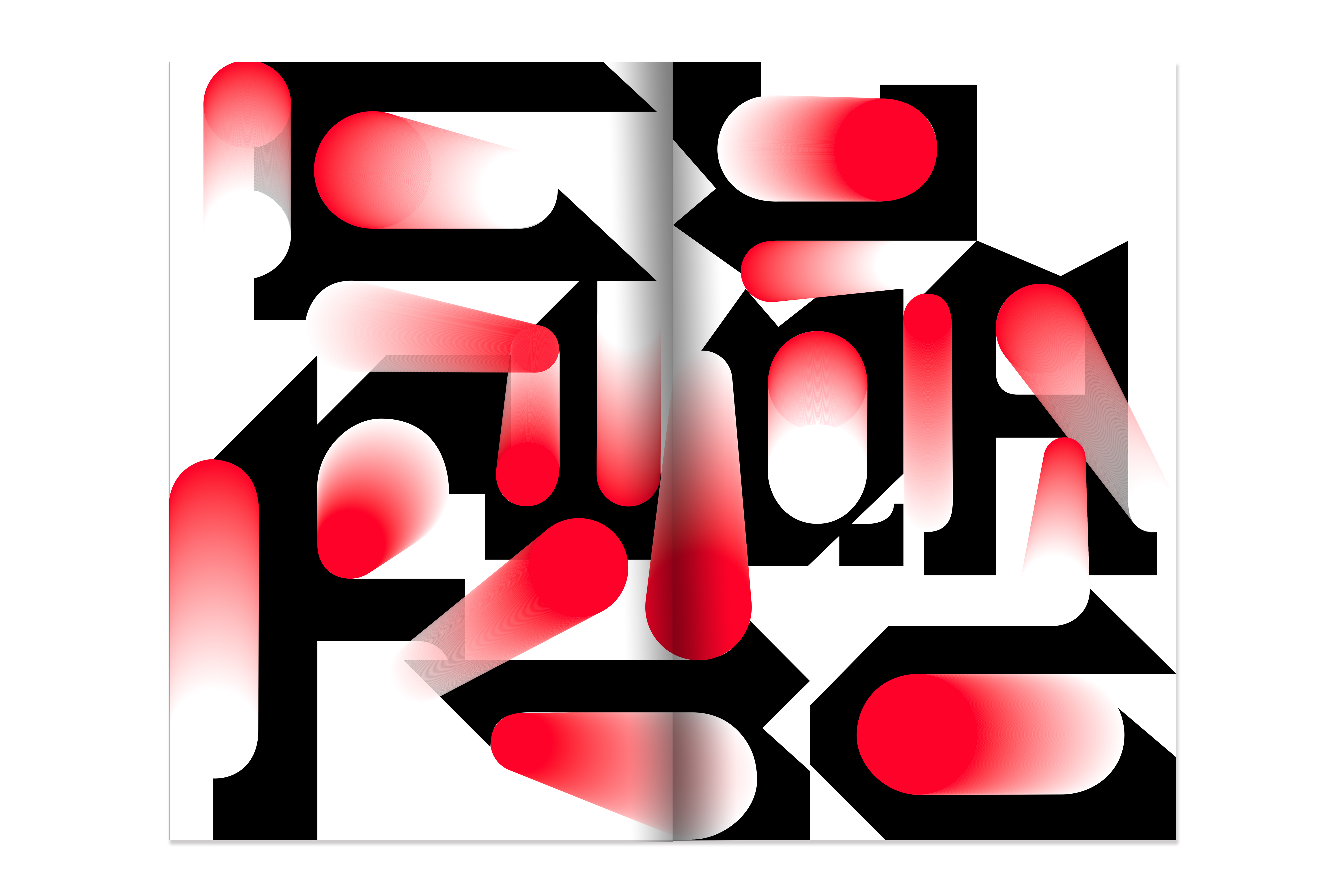
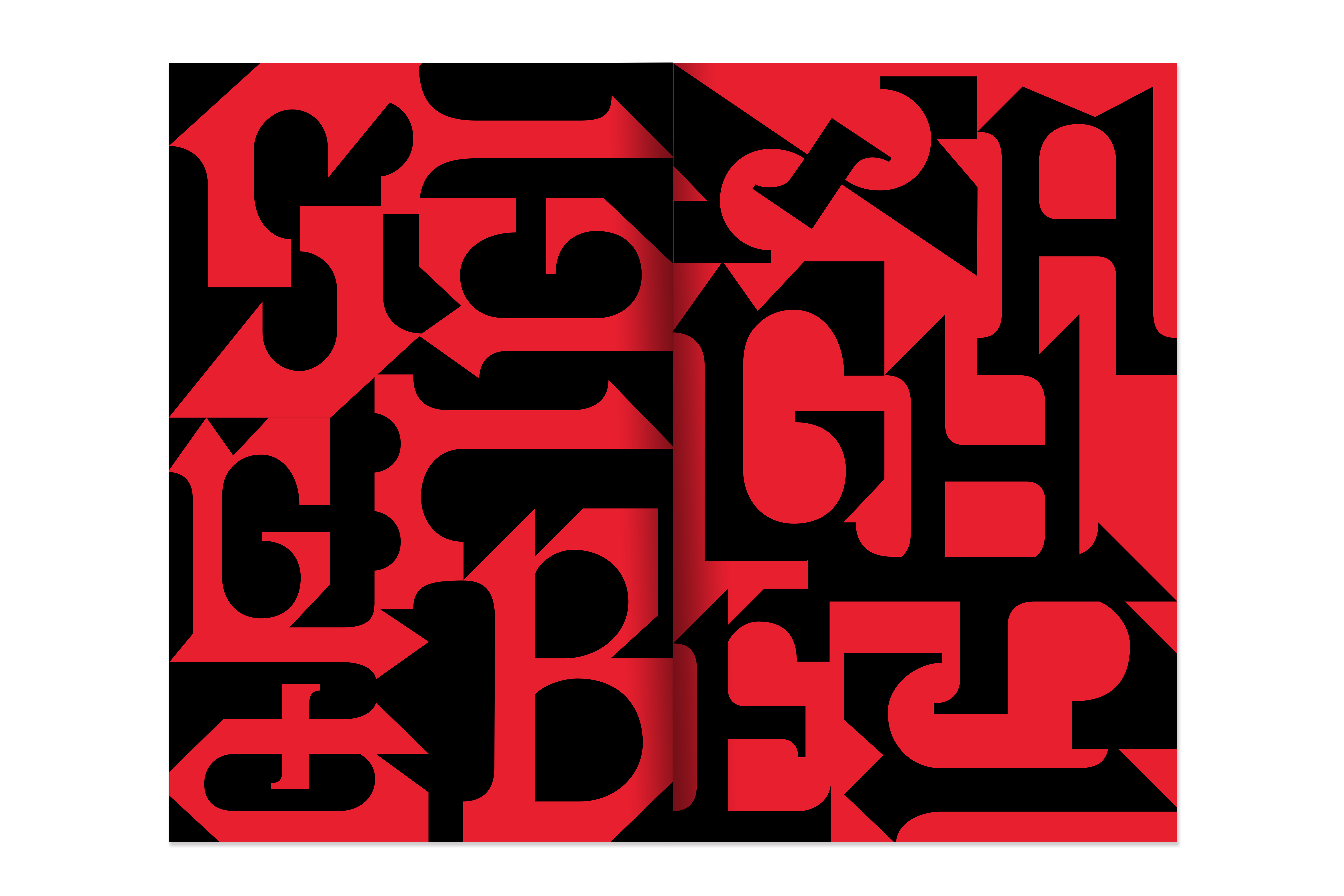
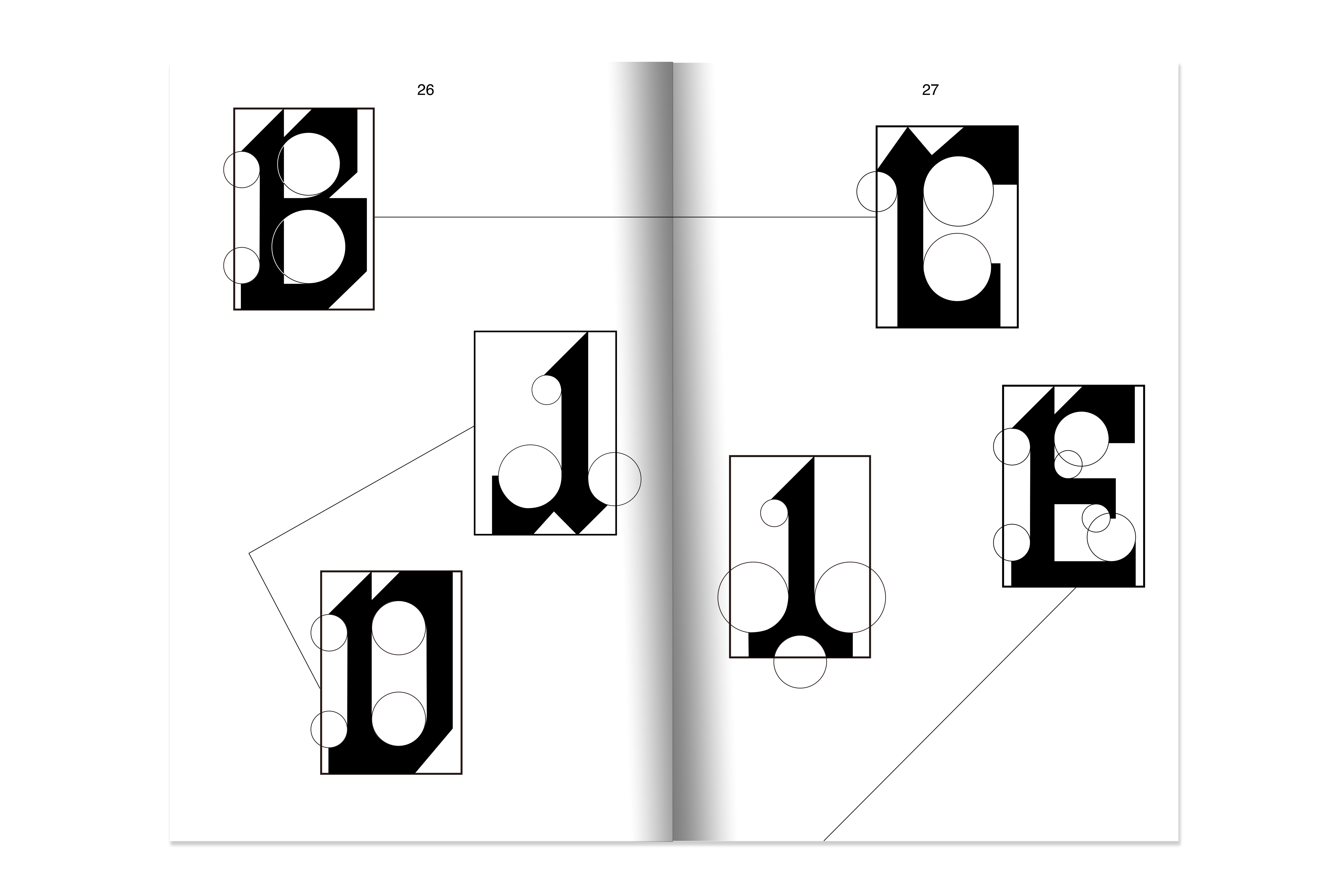
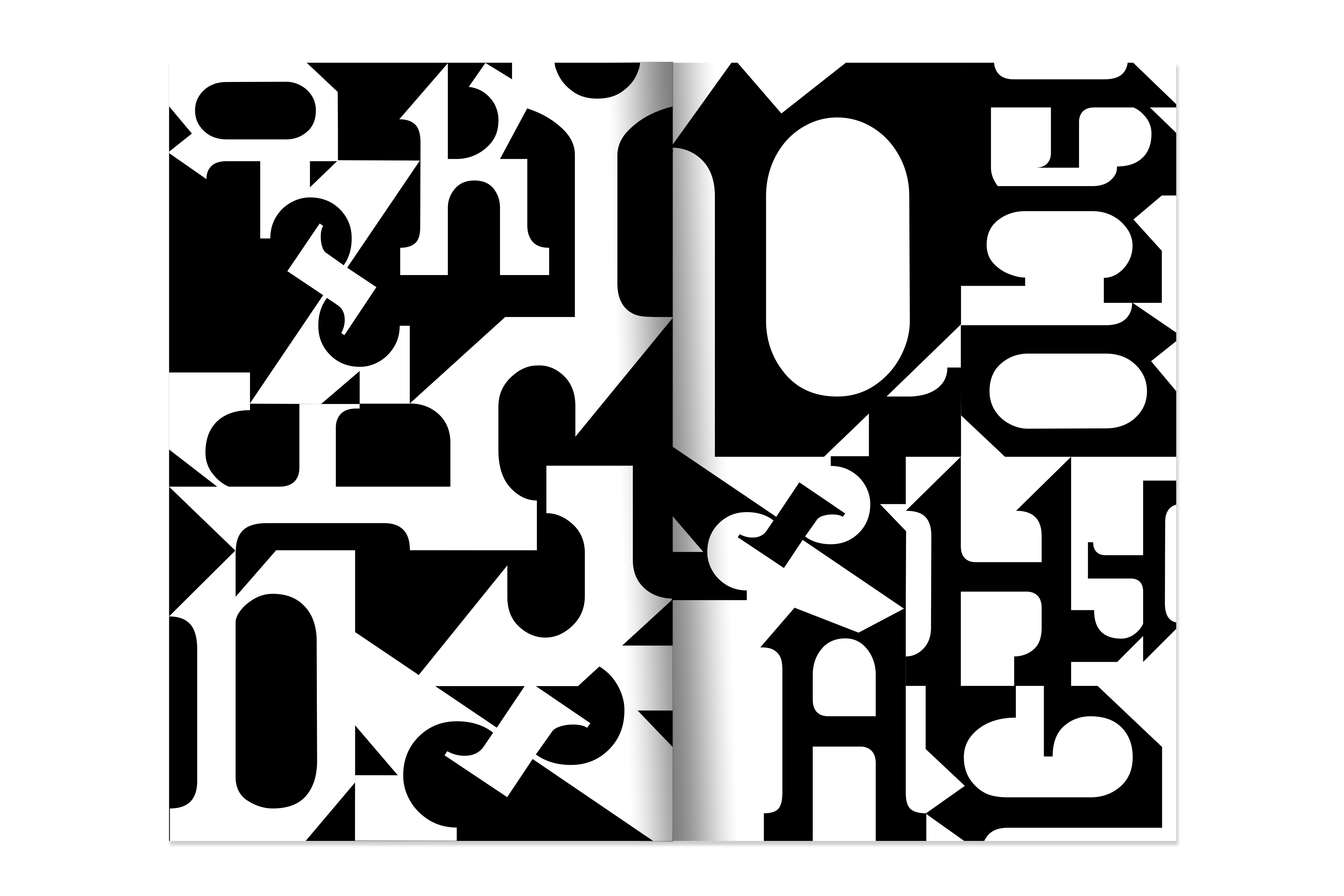
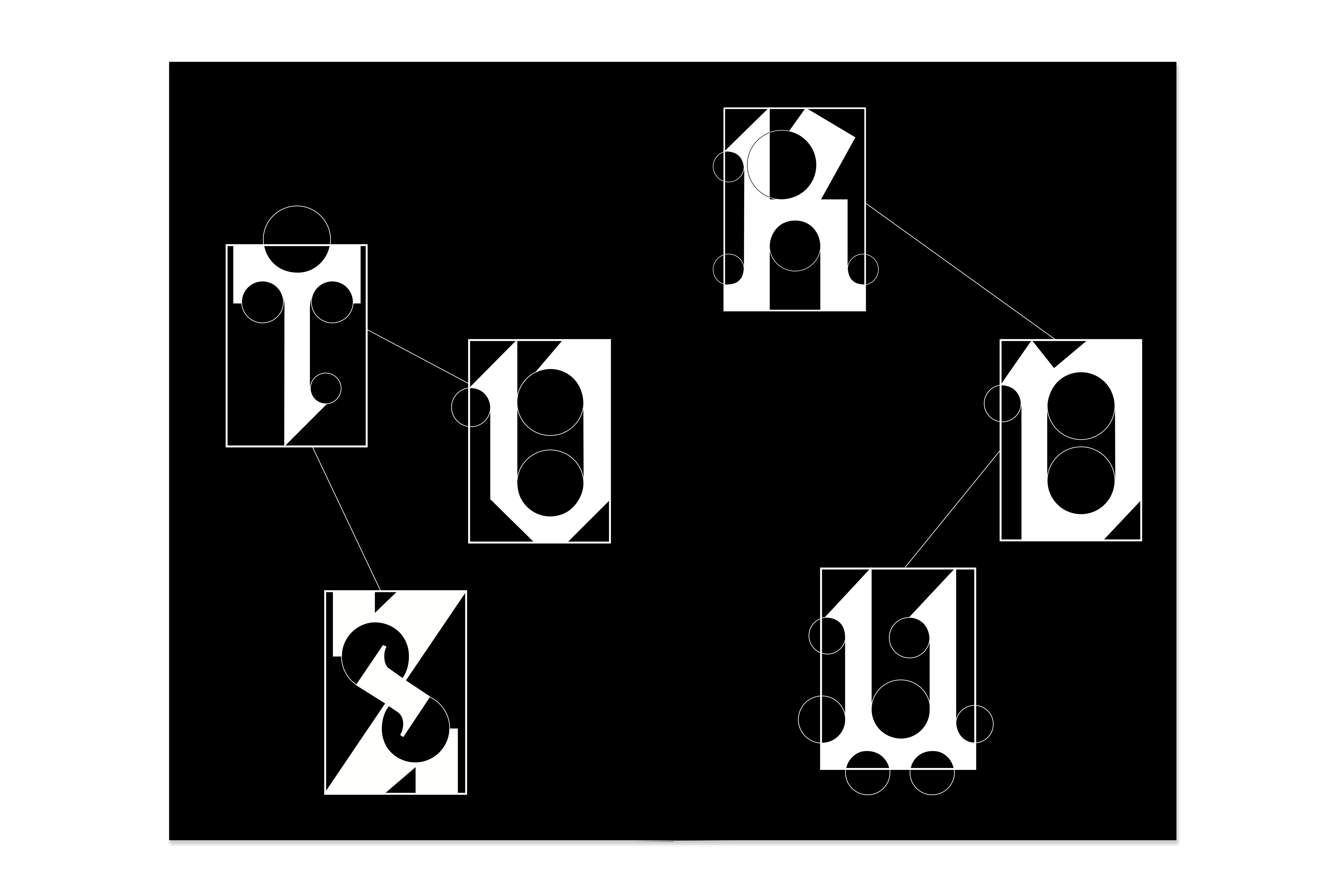
︎Display Typeface | NewBlackletter
NewBlackletter is a display typeface inspired by a signwriter’s and letter painter’s sample book in the nineteenth century. I was drawn to one piece of works in the chromolithograph sample that shows a highly decorative Blackletter surrounded by organic ornaments with striking red color because of the increasing popularity of advertising in the nineteenth. In my reinterpretation, NewBlackletter eliminated the complexity while still retaining theBlackletter’s characteristics and increasing its functionality, and establishing a unified standard. NewBlackletter is composed of geometrical shapes, and the circle specifies all the curve parts.