TYPE DESIGN
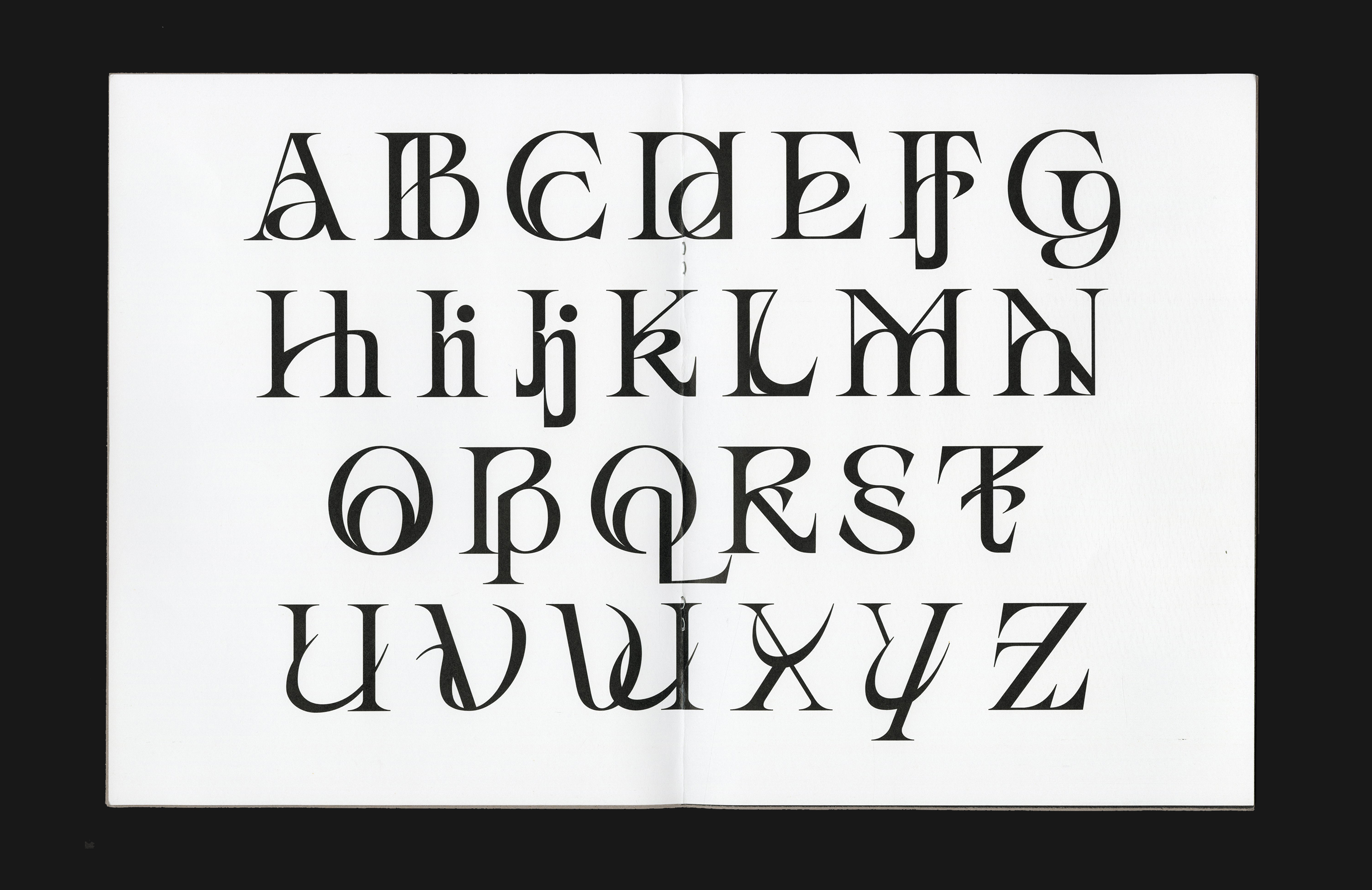
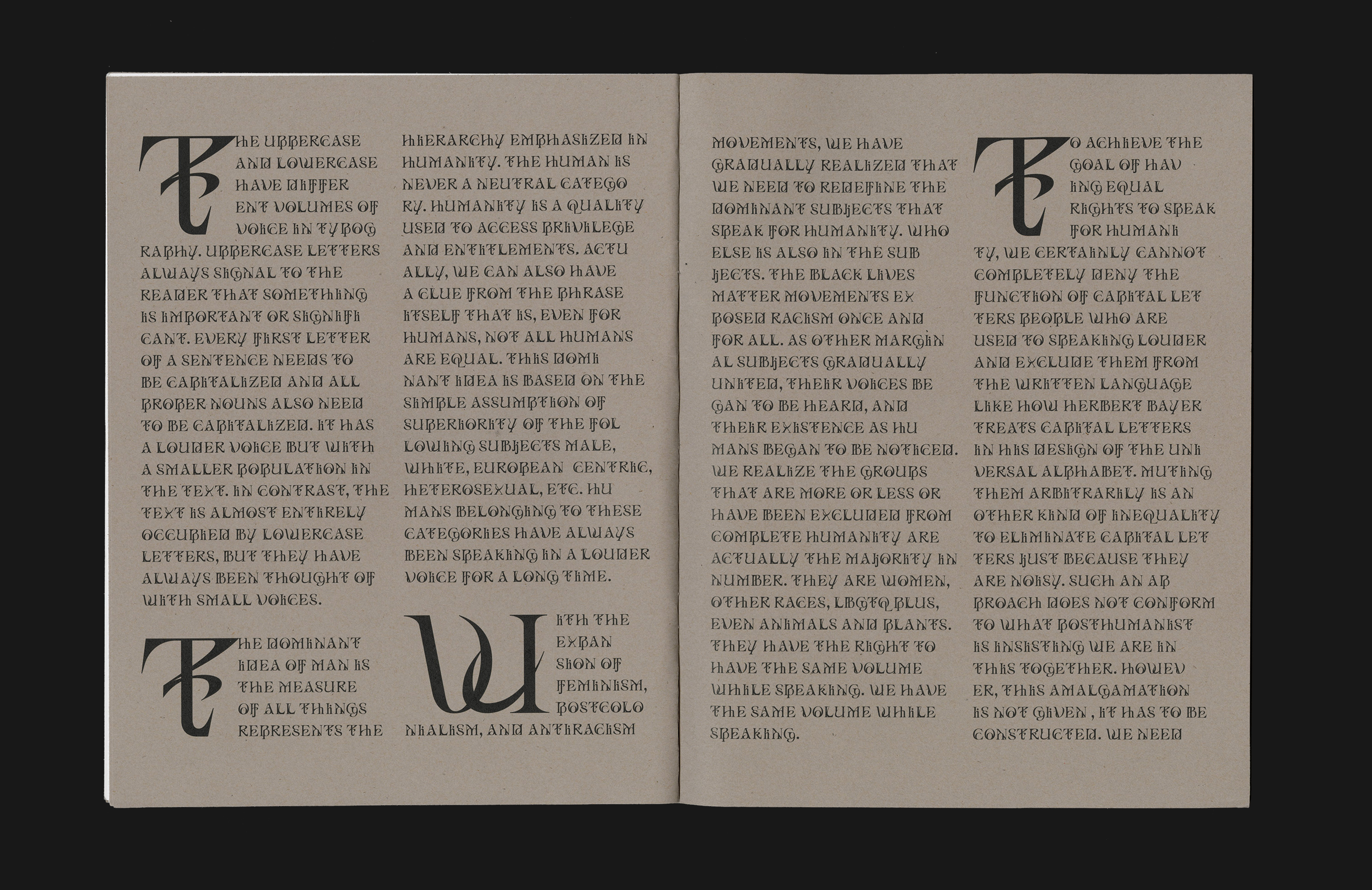
In MiXeR, the fusion of uppercase and lowercase makes the alphabet alien yet highly readable. All the letter cases should have the same right of speaking in the same volume without losing the characteristic of each individual because the difference is allowed to exist. The new closed relationship, the intertwined structure that comes with the consonant voice of the new alphabet here, is a visual manifesto of our posthuman future.
Published by Draw Down
Trail fonts available
︎Middle Case | MiXeR