CAMPAIGN
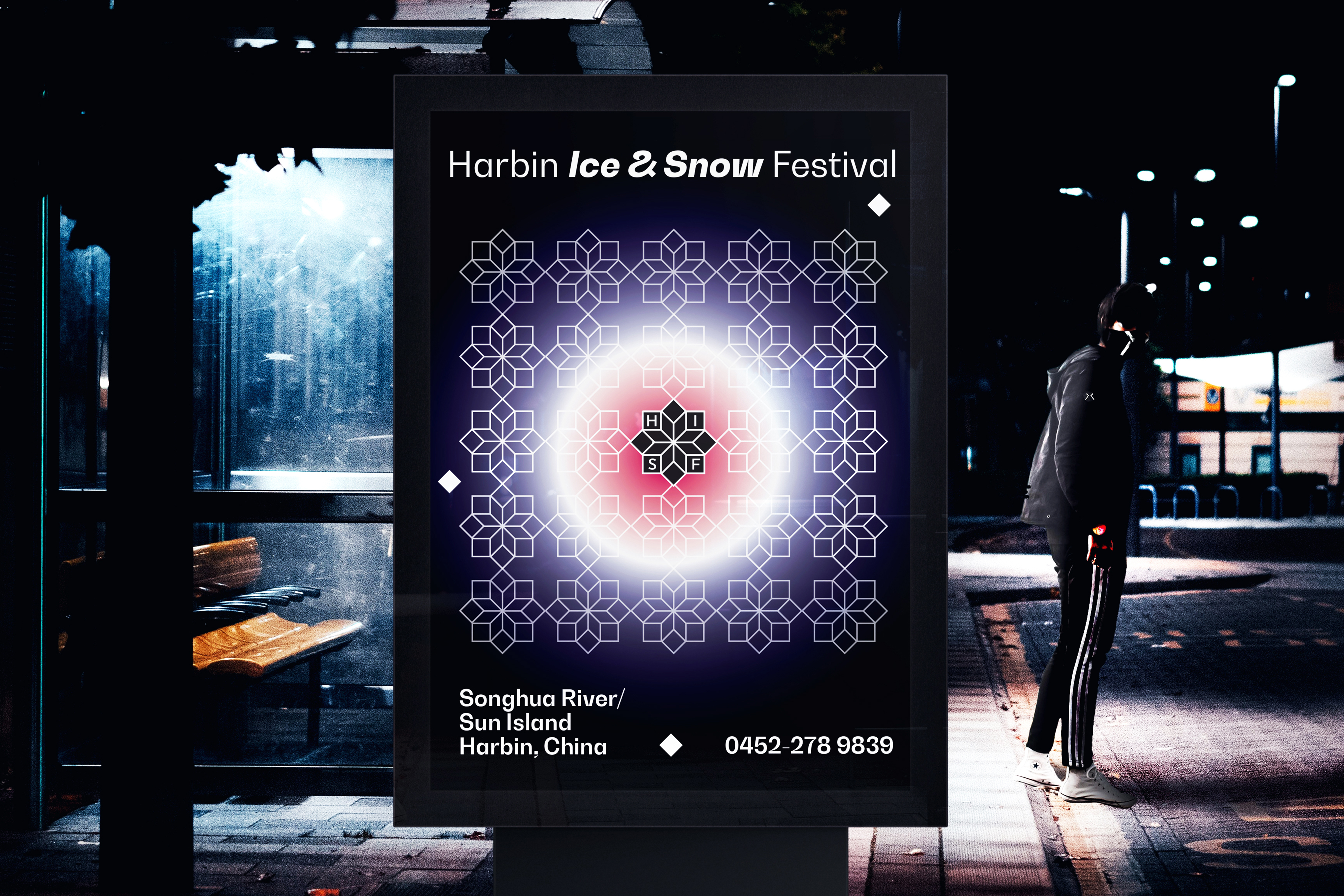
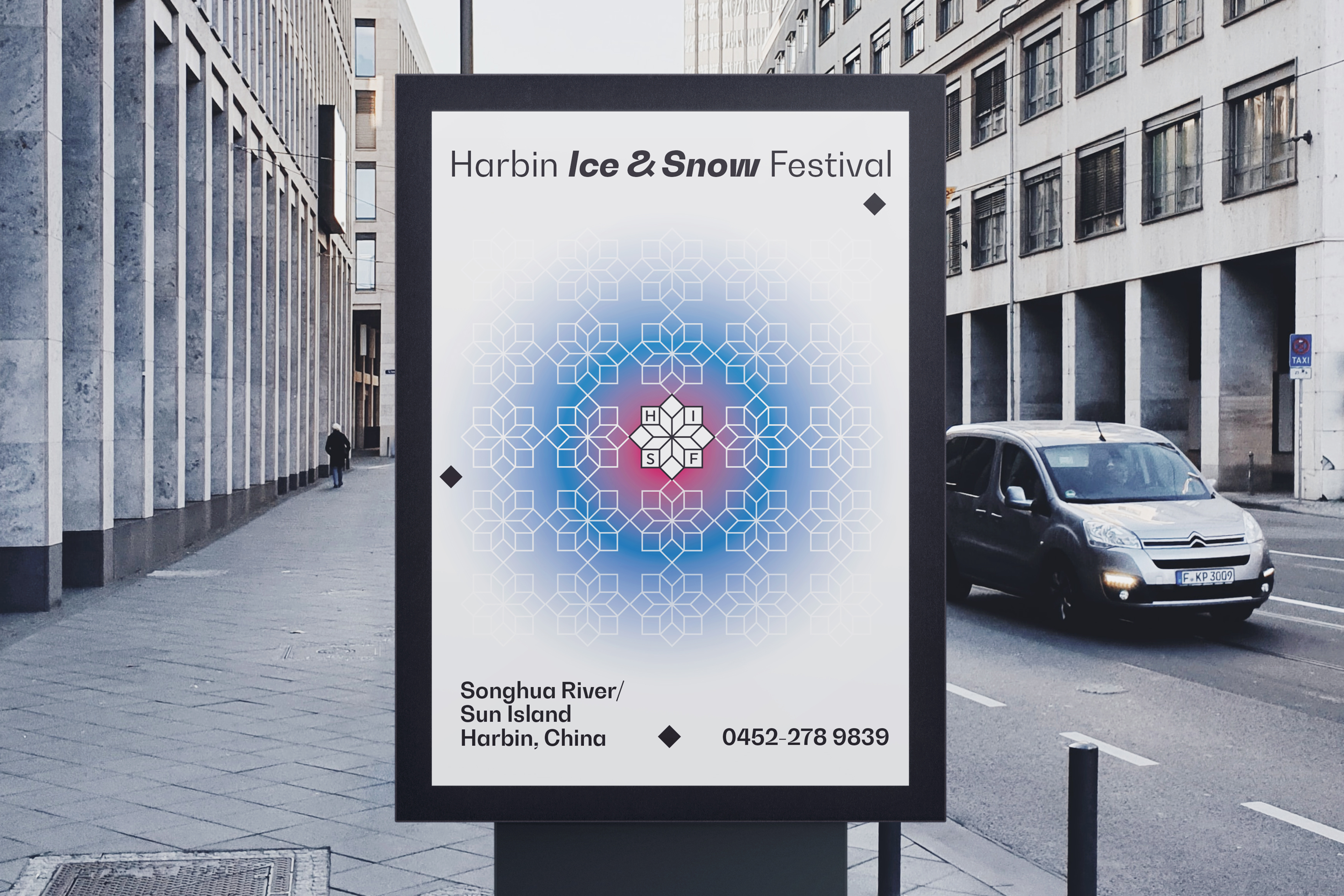
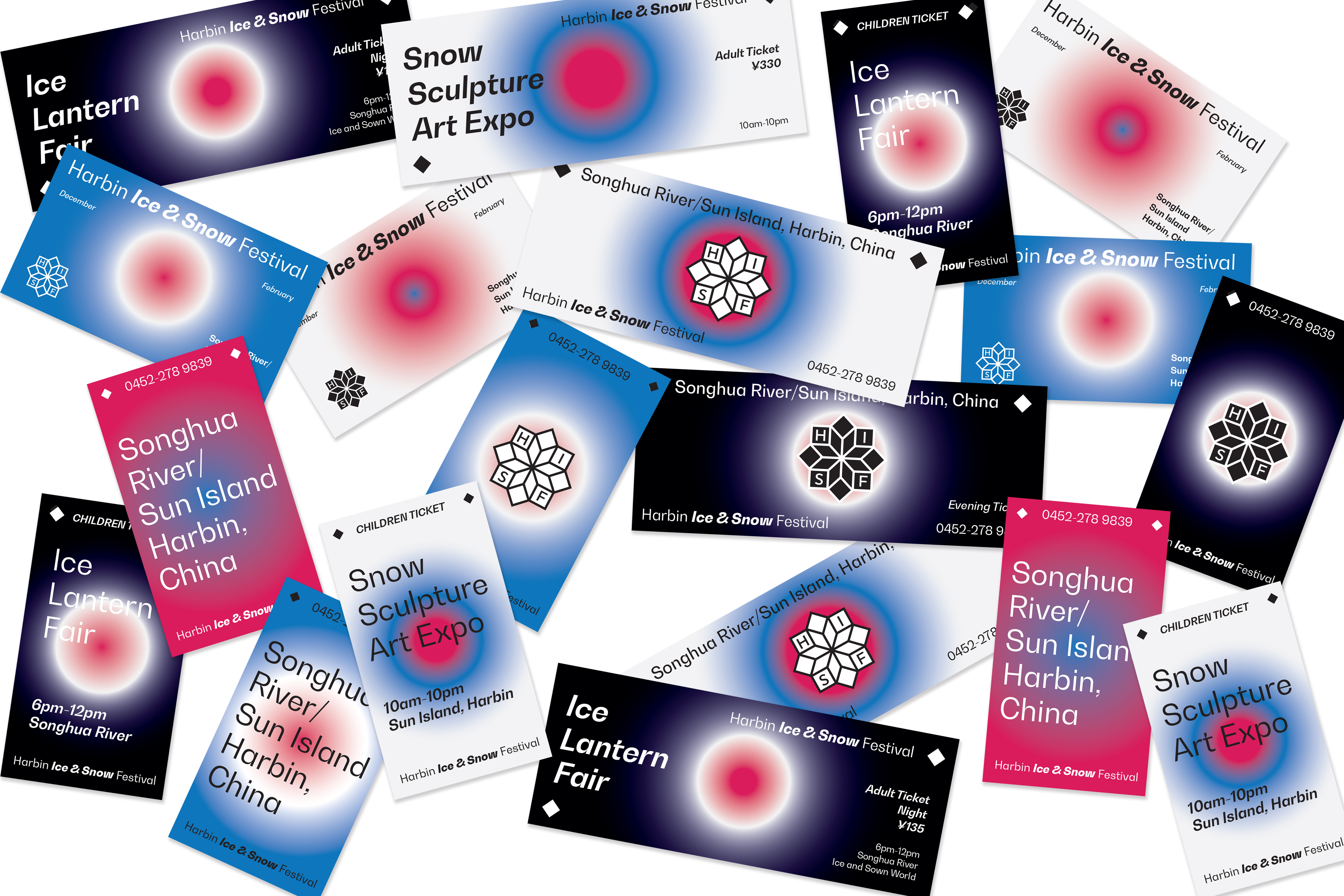
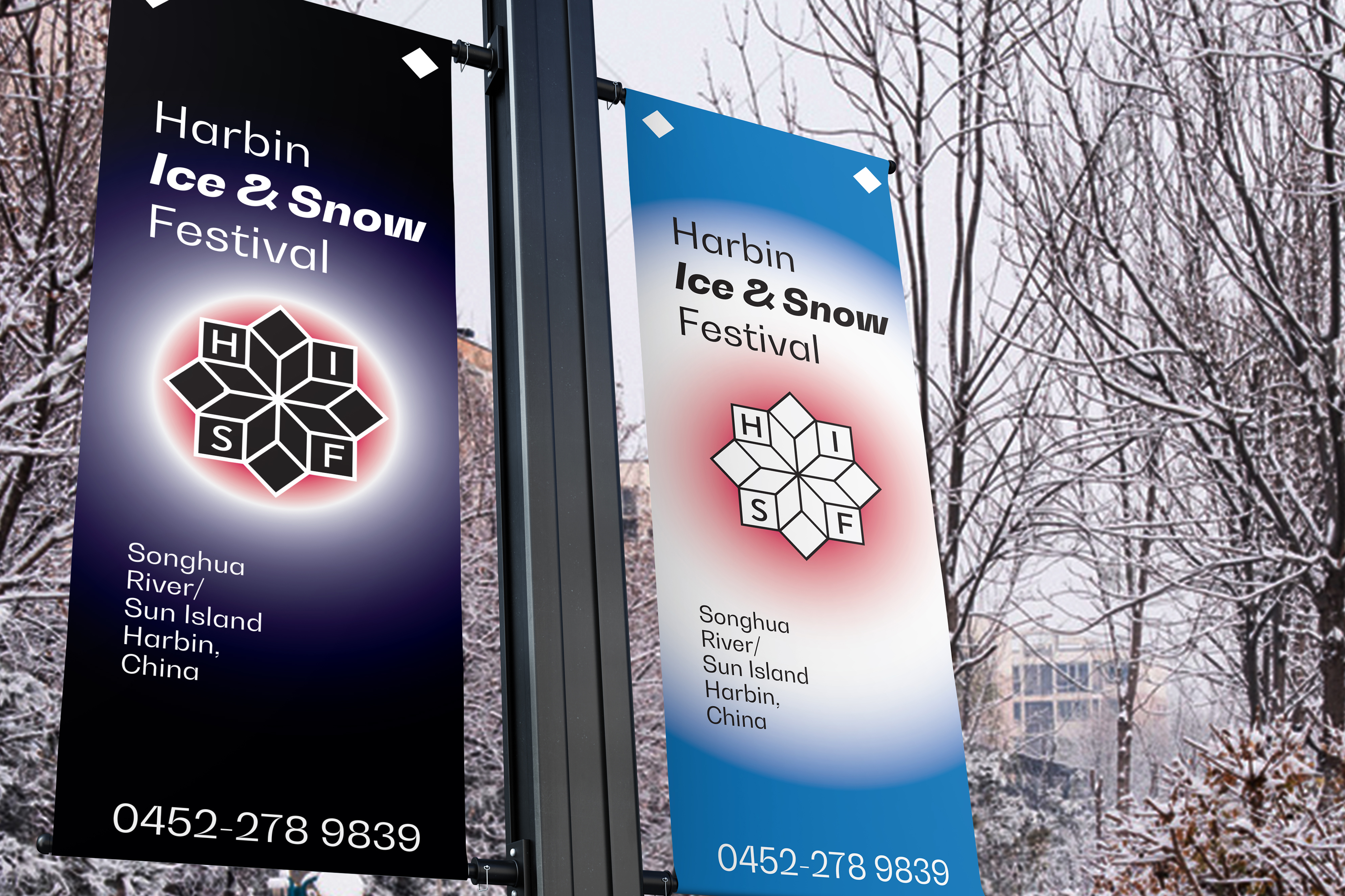
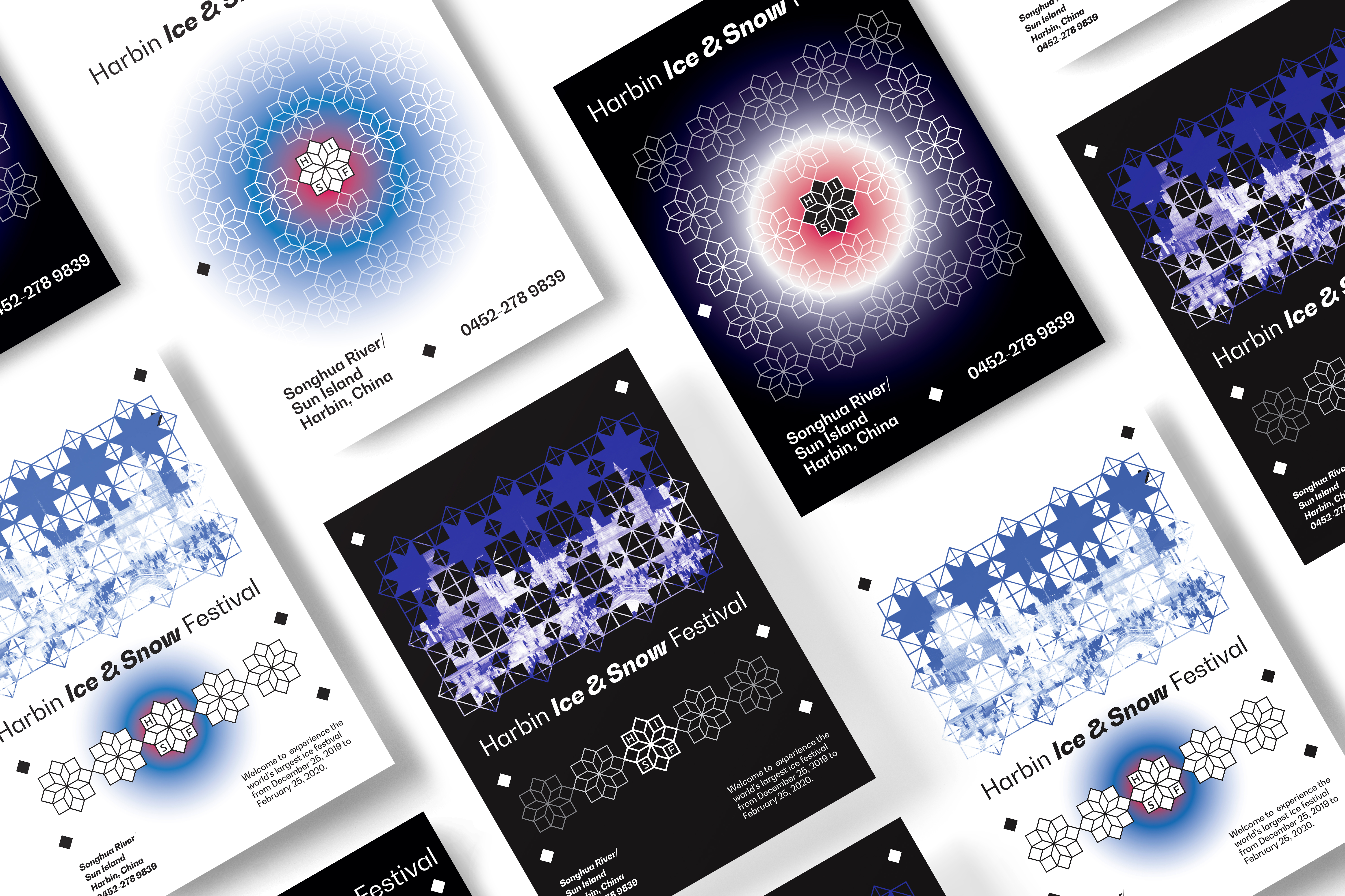
Identity system for Harbin Ice&Snow Festival. Inspiration comes from the fact that no snowflake is the same. Black and white versions are used to distinguish between daytime and nighttime activities.
︎ Harbin Ice&Snow Festival
BRAND IDENTITY
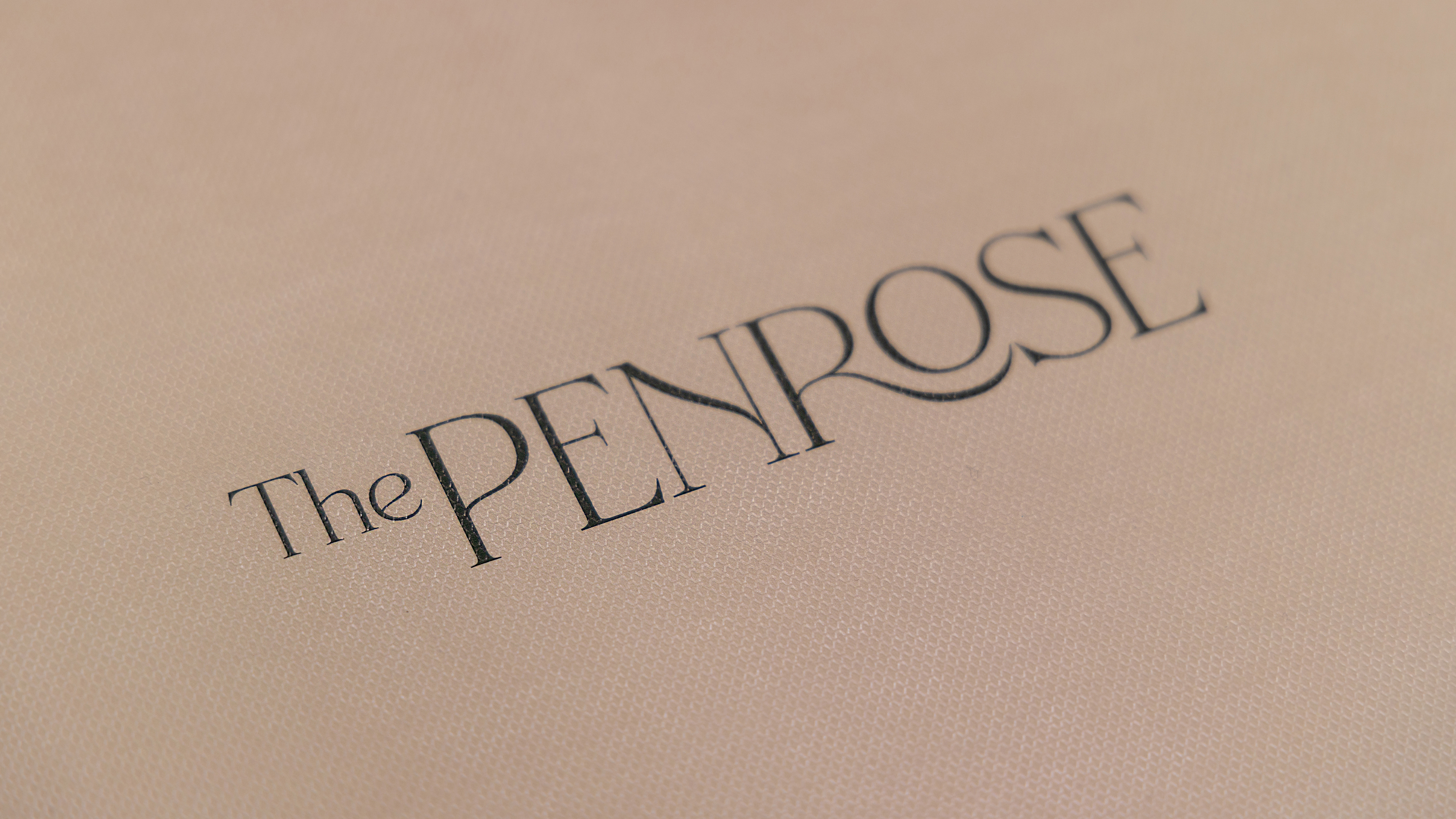
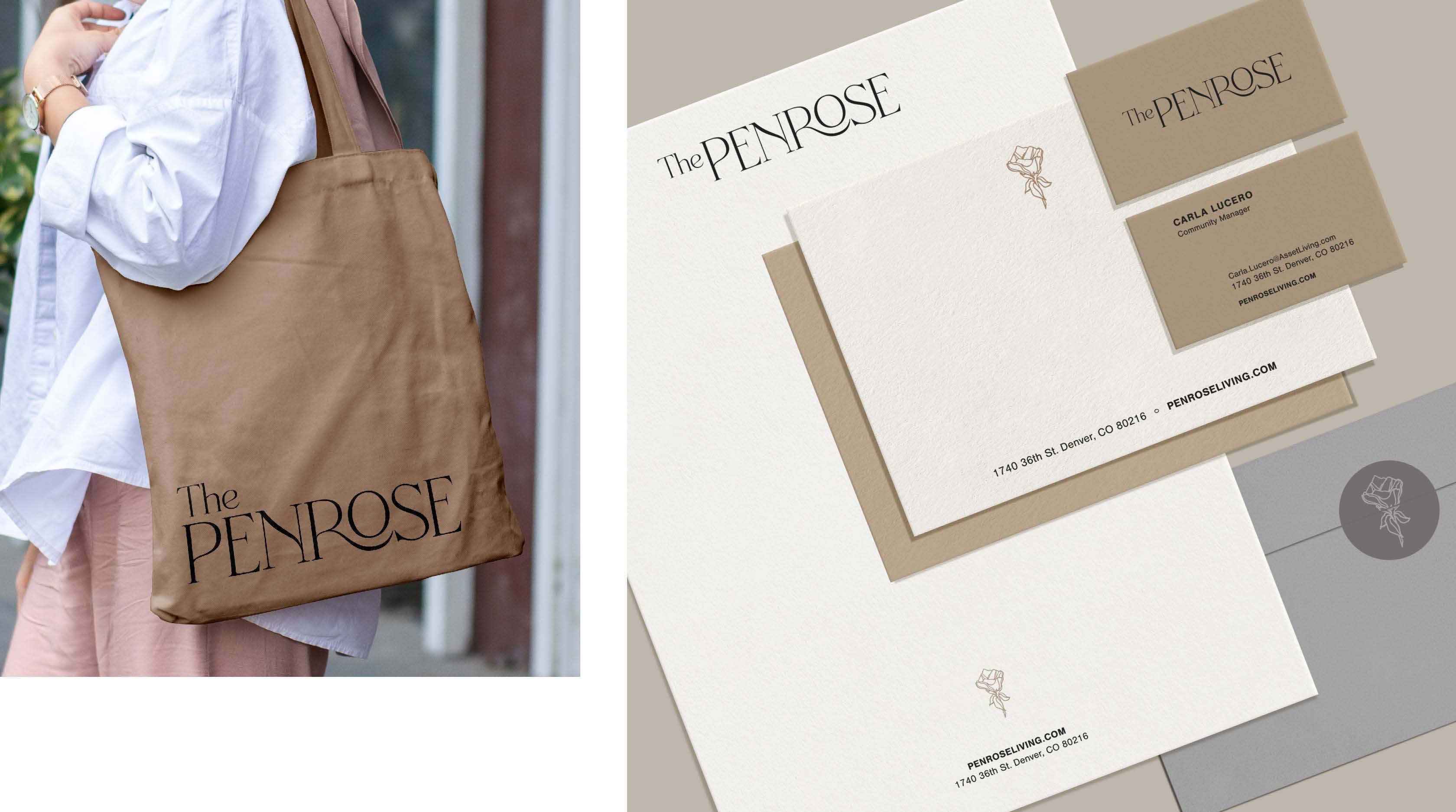
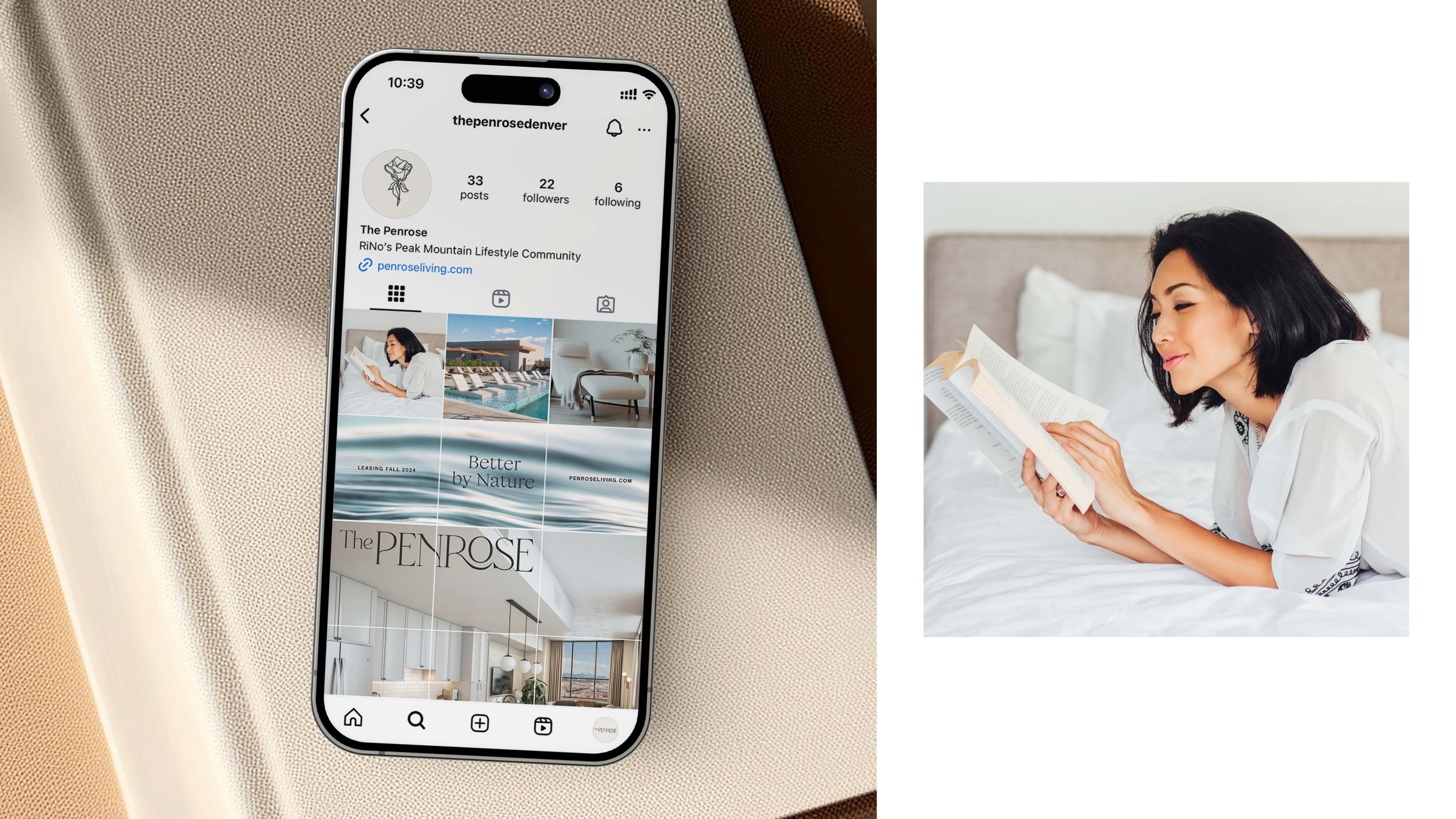
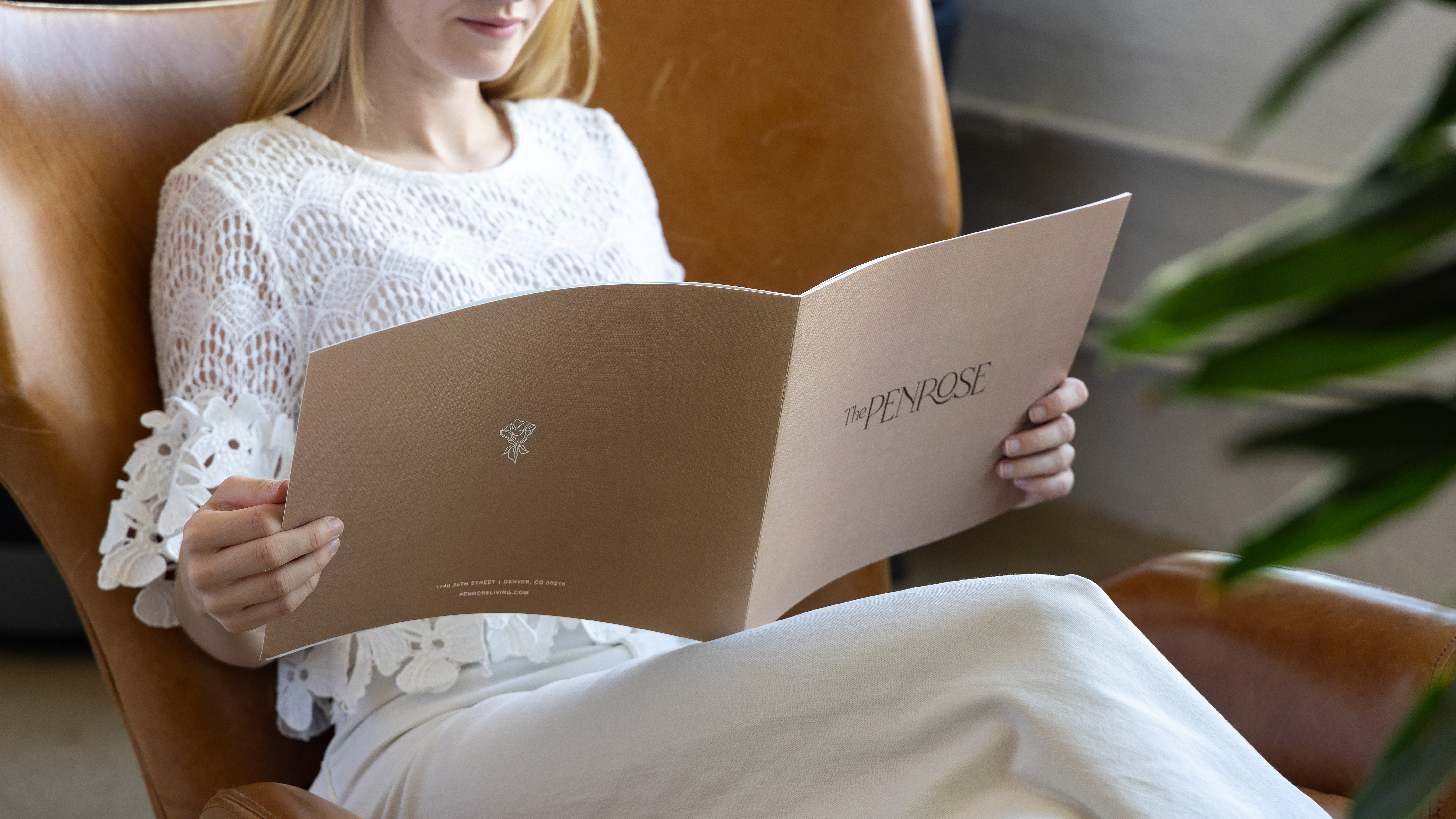
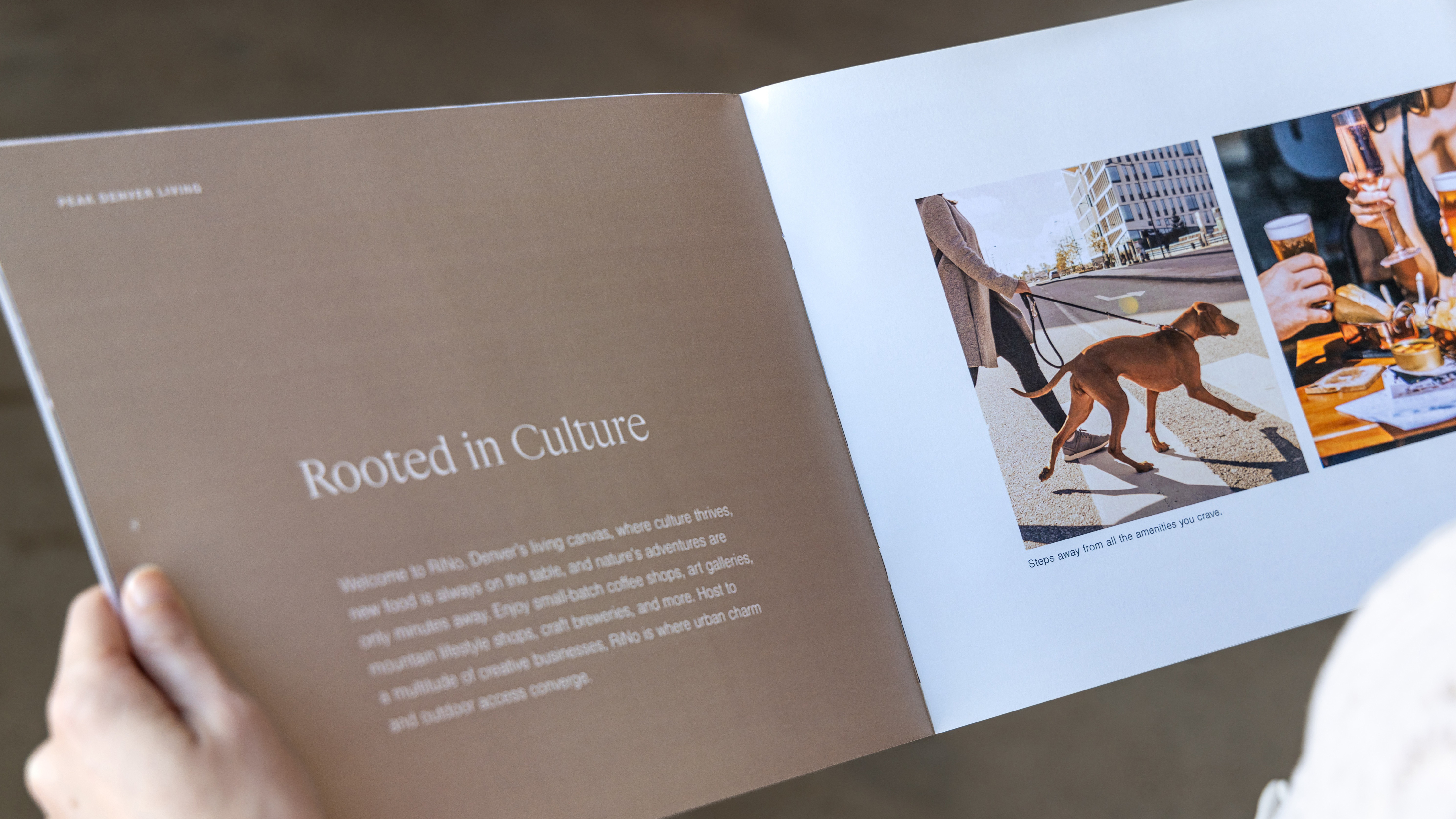
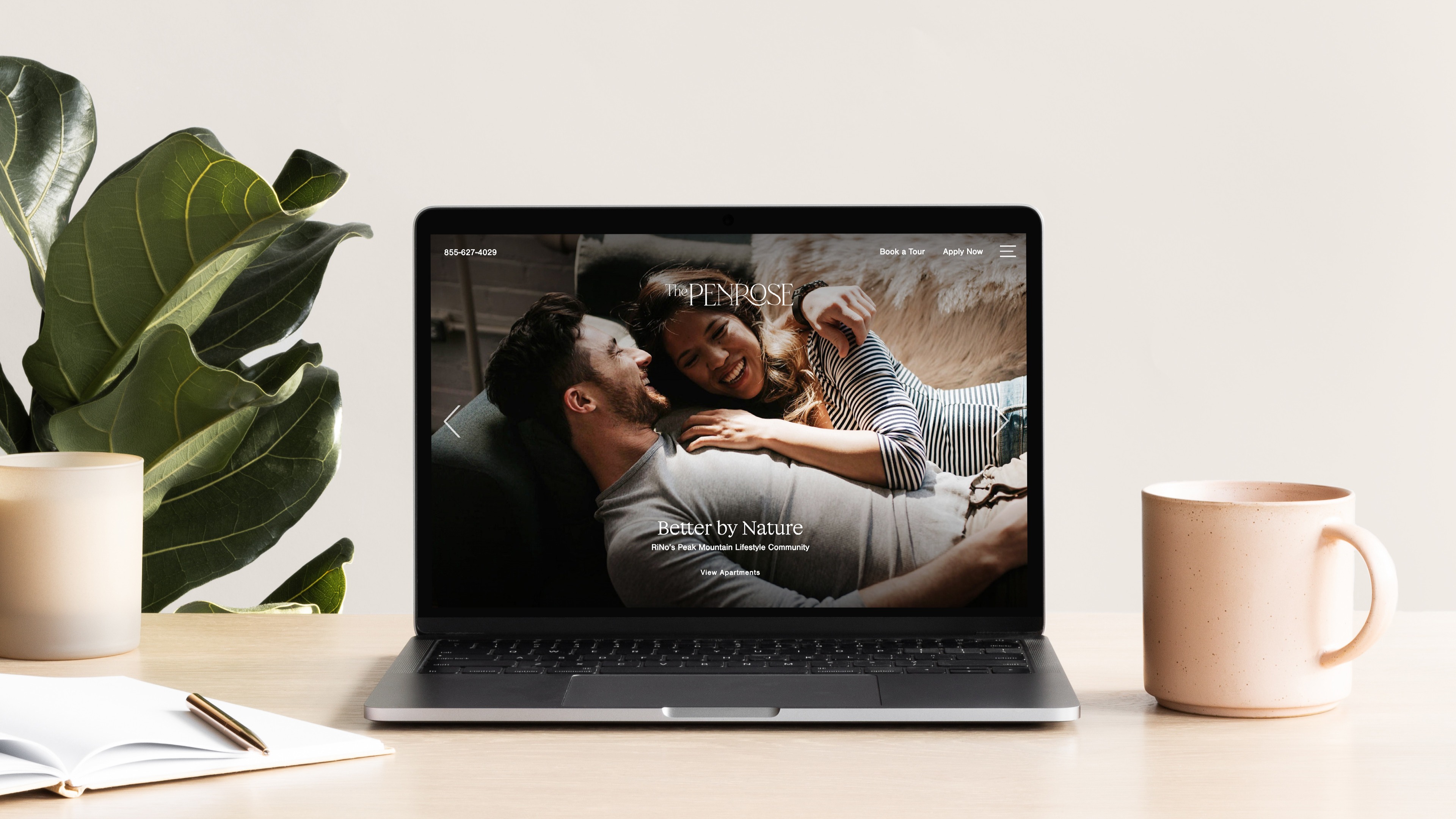
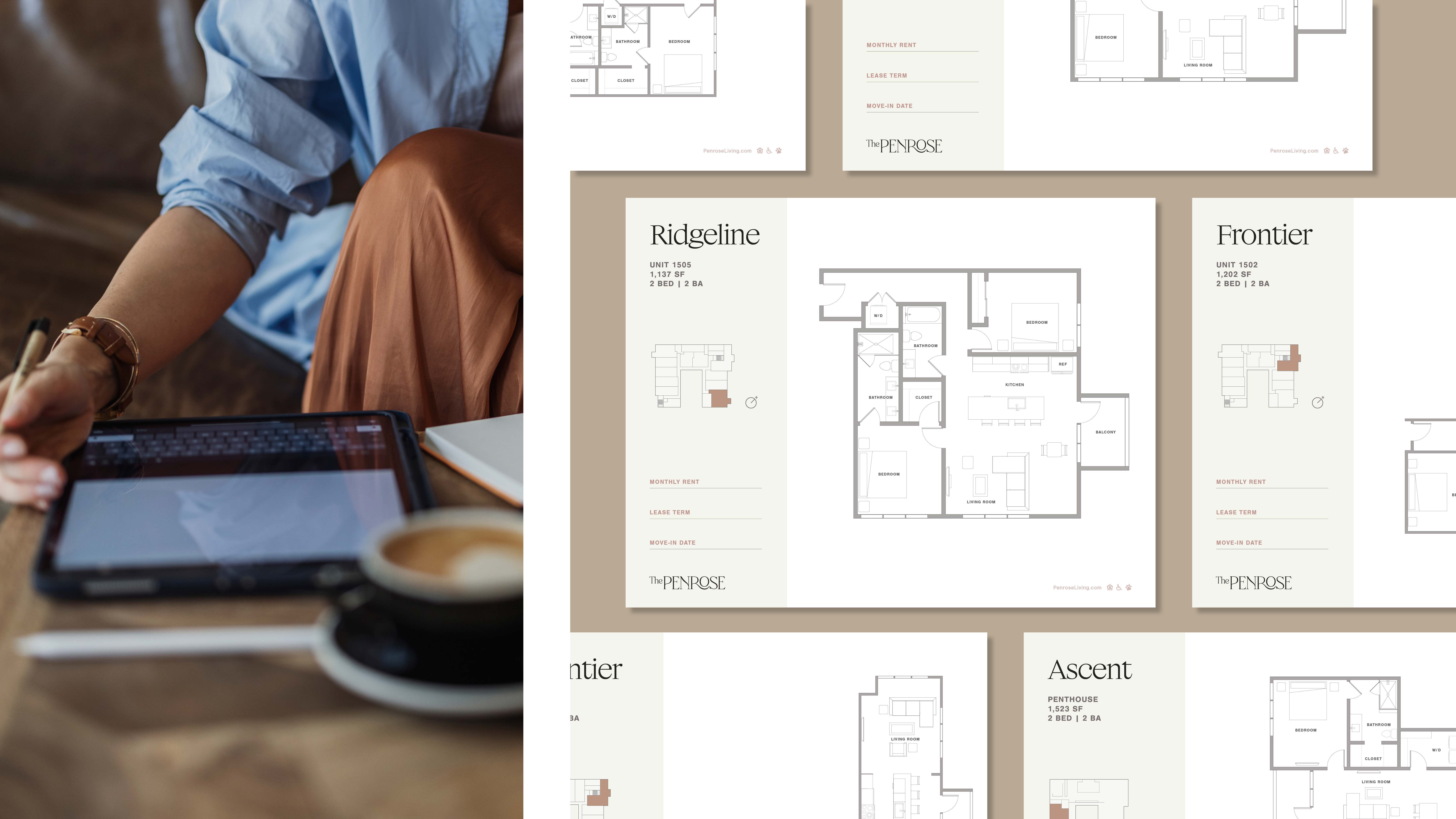
The Penrose provides an elegant sanctuary for those embracing a high-altitude lifestyle with sophistication. Designed for effortless comfort, it features resort-style spaces, revitalizing amenities, and breathtaking views that enhance every aspect of daily living.
Design at Neoscape.Inc
︎The Penrose | Snavely Group

BRAND IDENTITY
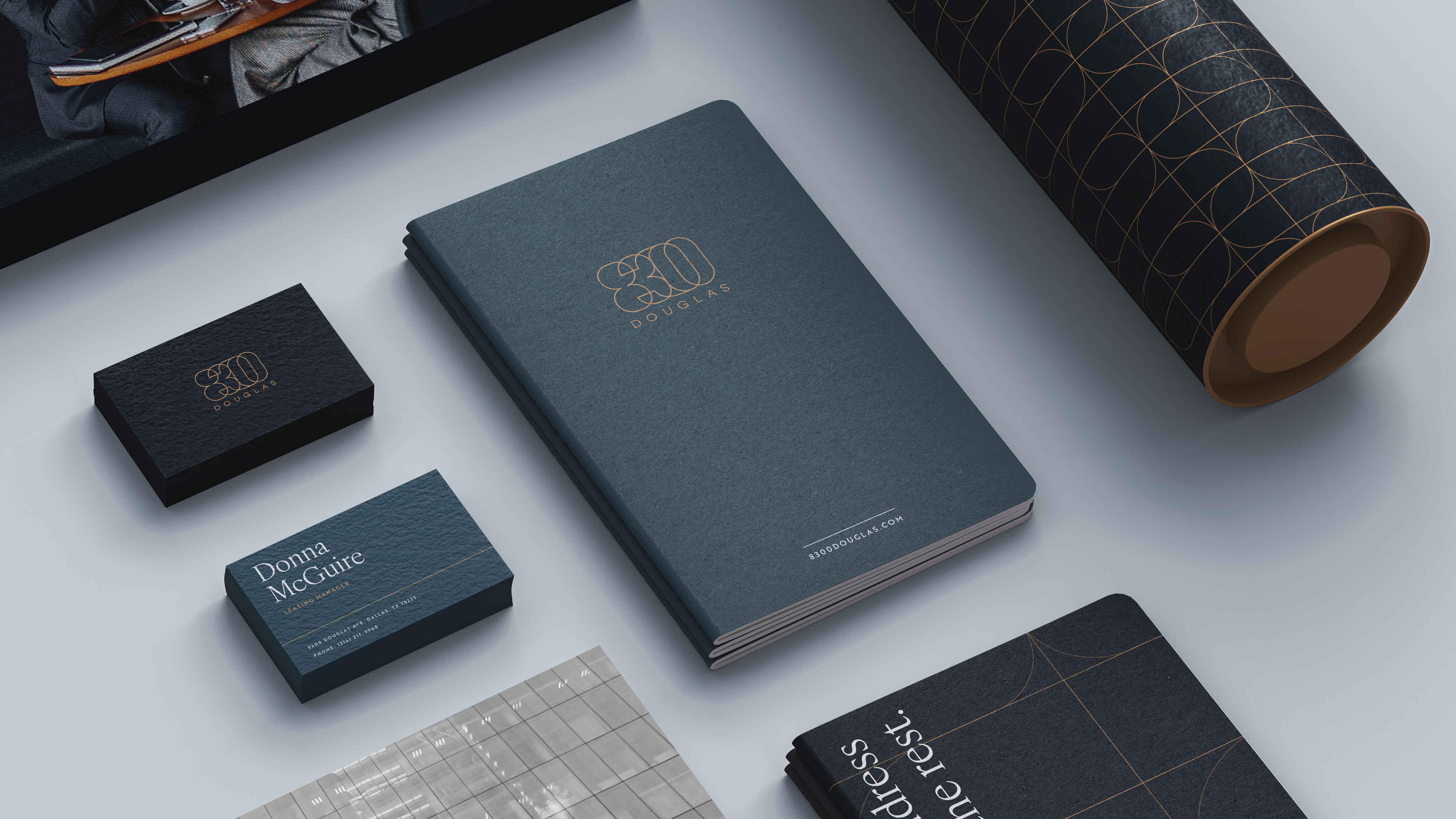
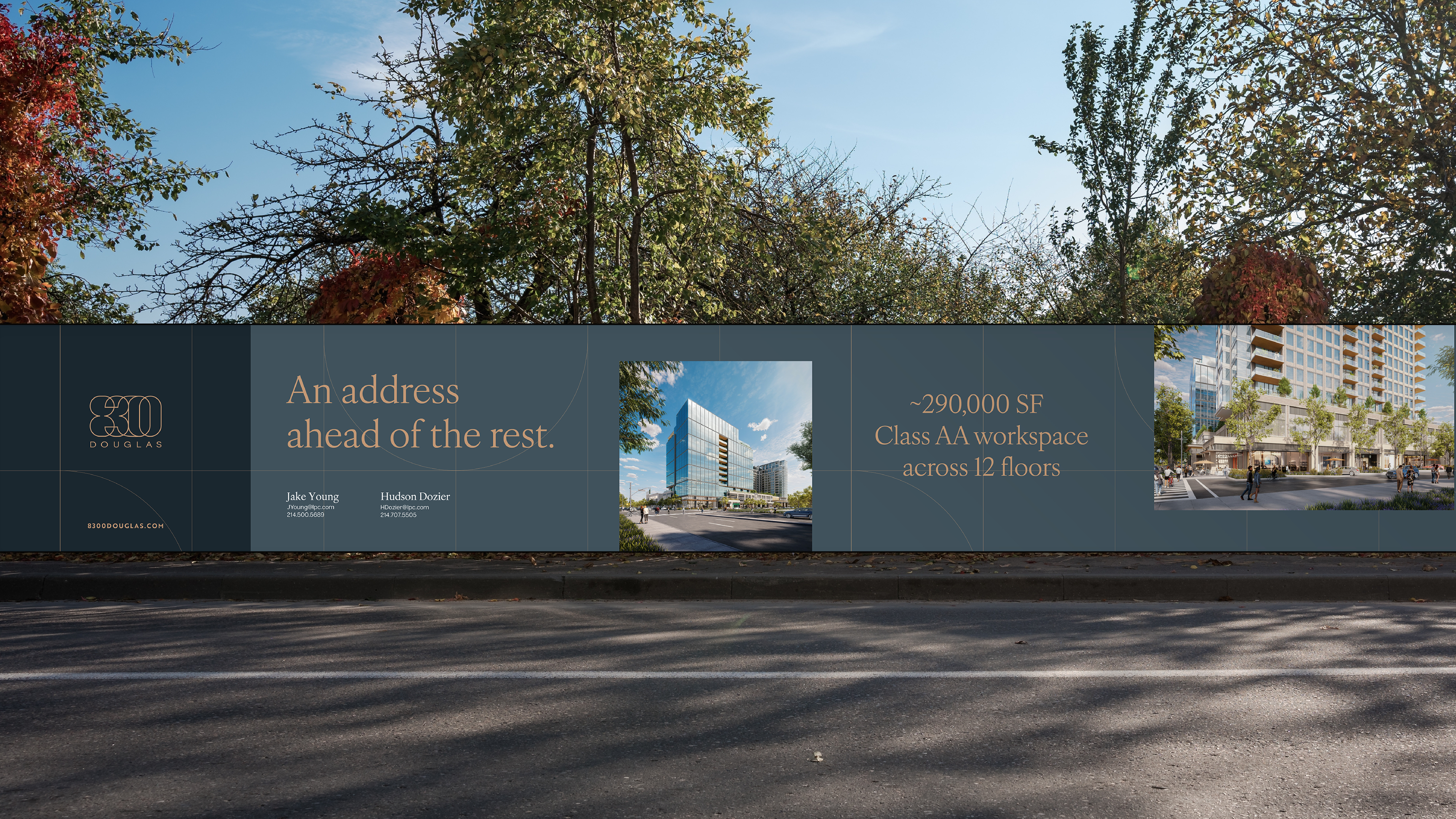
In 2025, I contributed to the visual development of 8300 Douglas, a transformative Dallas redevelopment led by Lincoln Property Company. Working closely with our interdisciplinary team, I helped shape a cohesive brand experience across identity, website design, print materials, and digital marketing.
Design at Neoscape.Inc
︎ 8300 Douglas | Lincoln Property Company


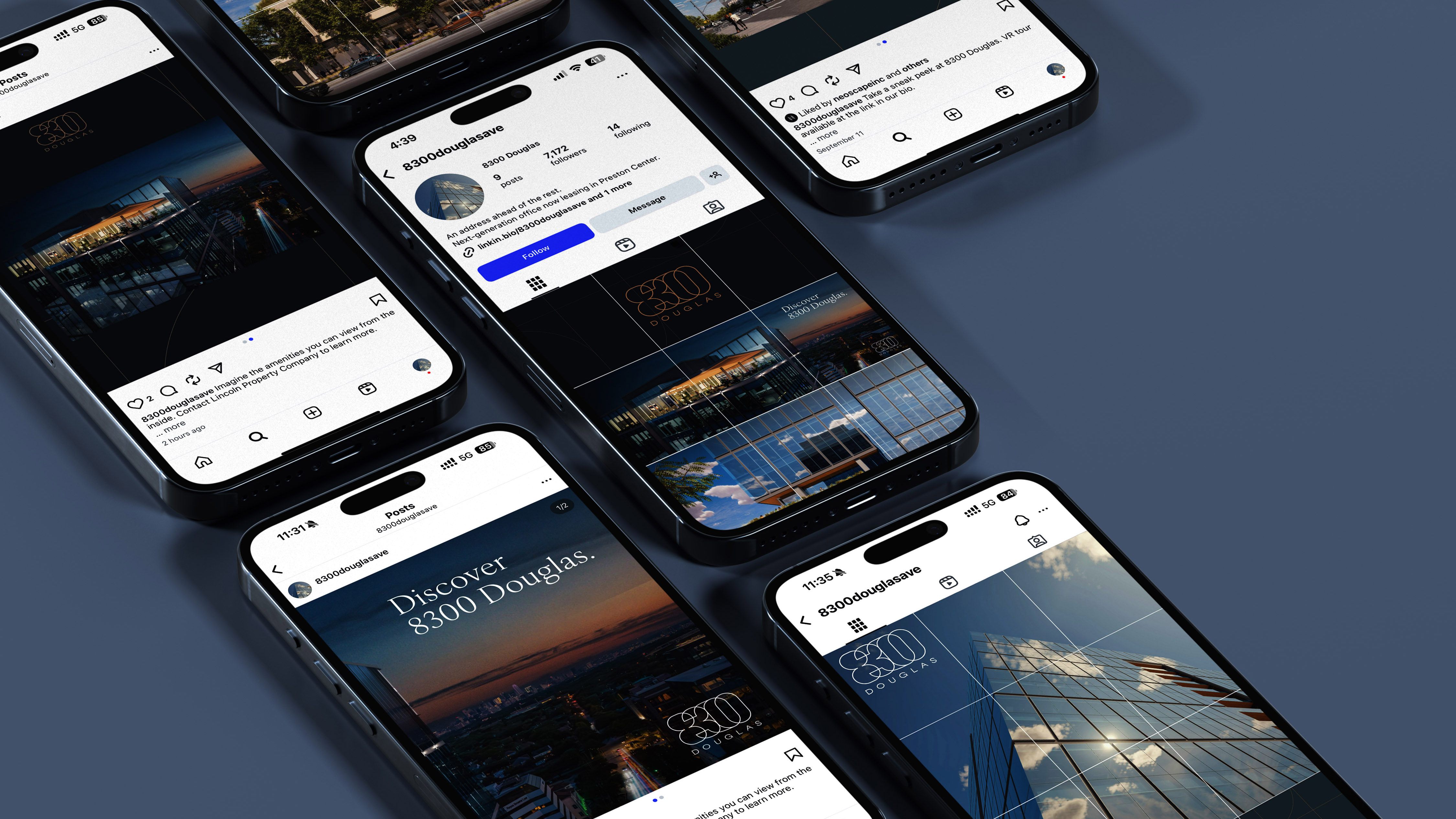

DIGITAL MARKETING
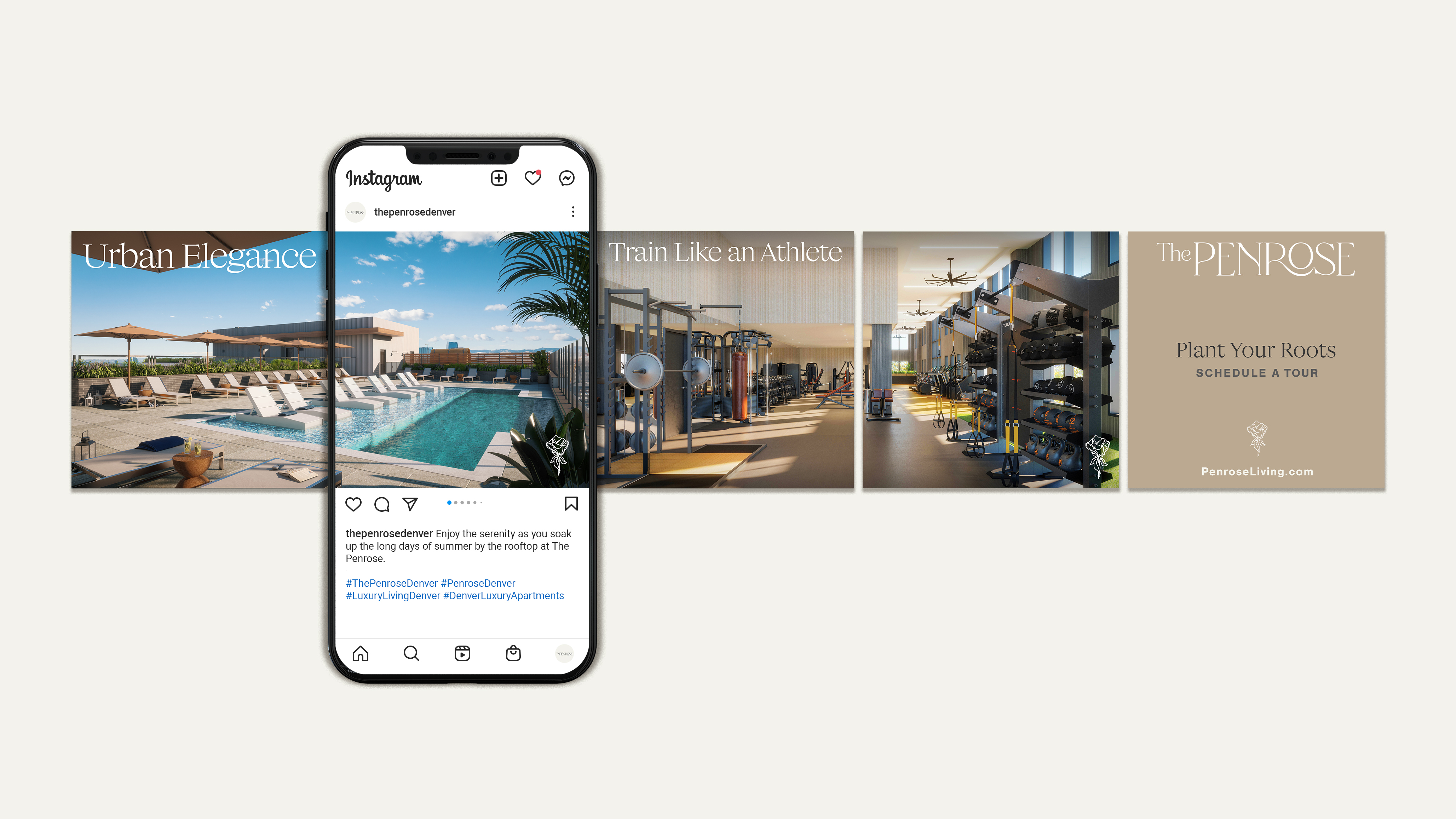
A selection of social media posts designed for The Penrose, 8300 Douglas, Allston Labworks, and SmartFlower Solar.
Design at Neoscape.Inc
︎Social Media Content Creation
PUBLICATION DESIGN
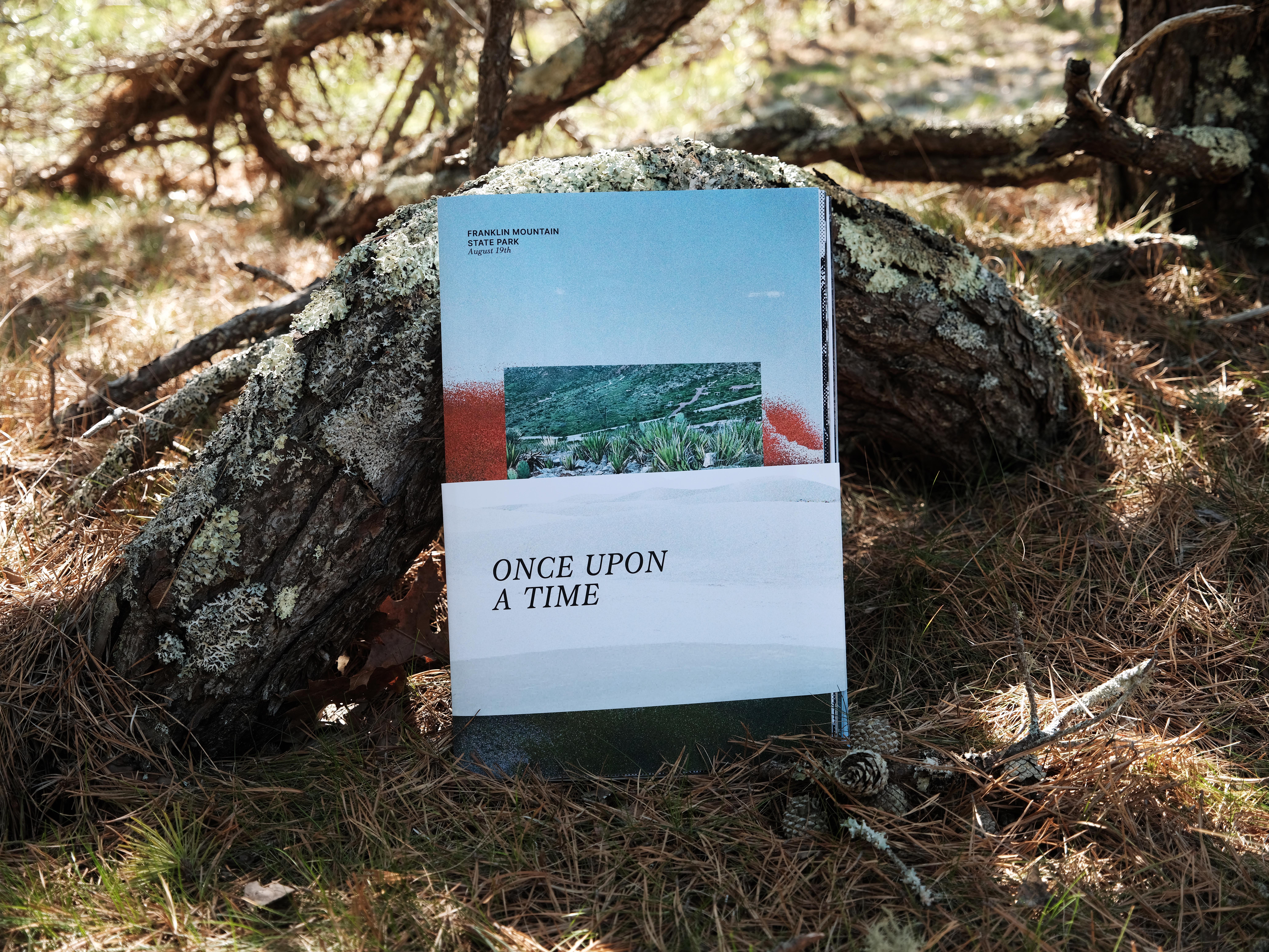
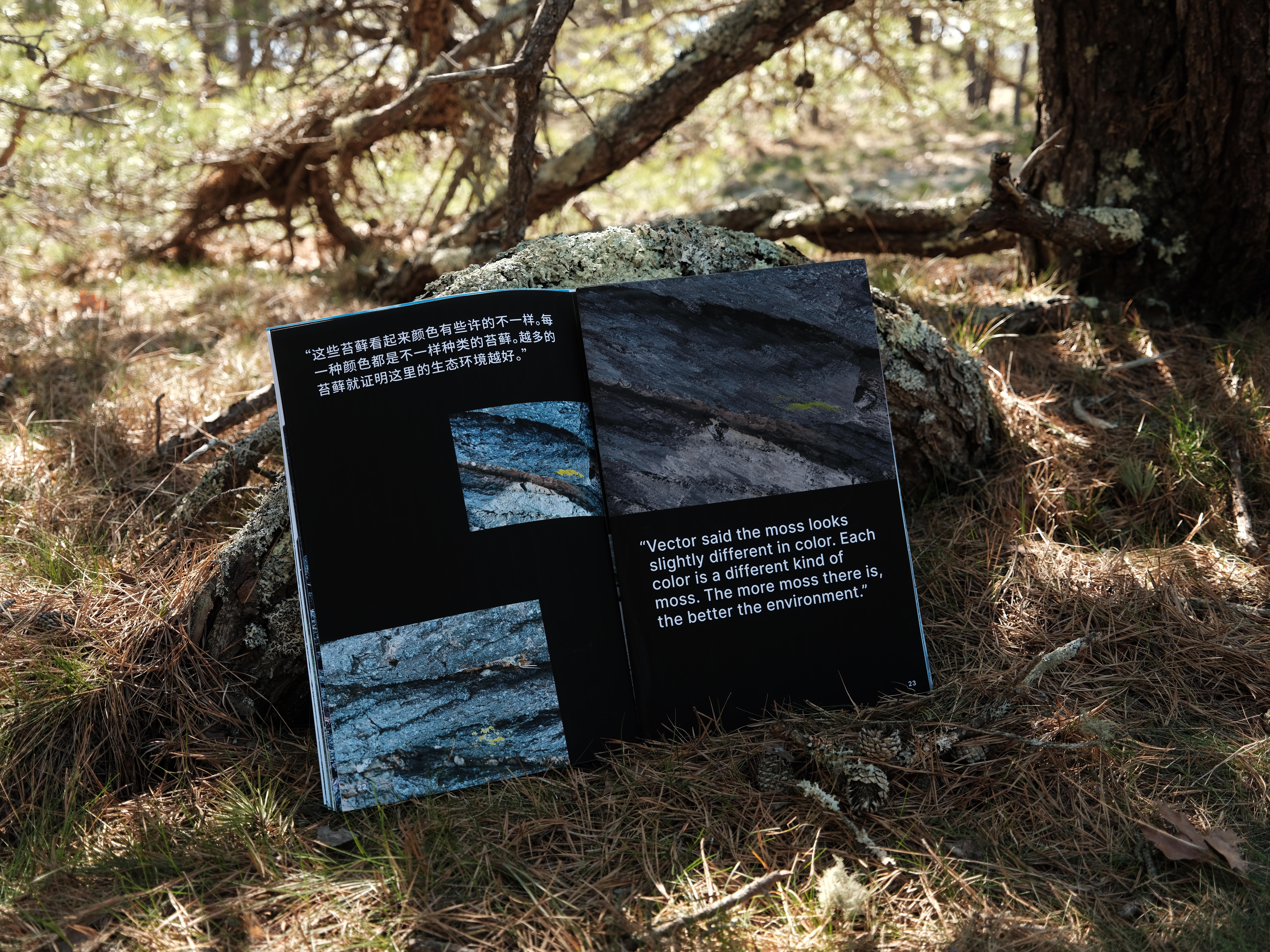
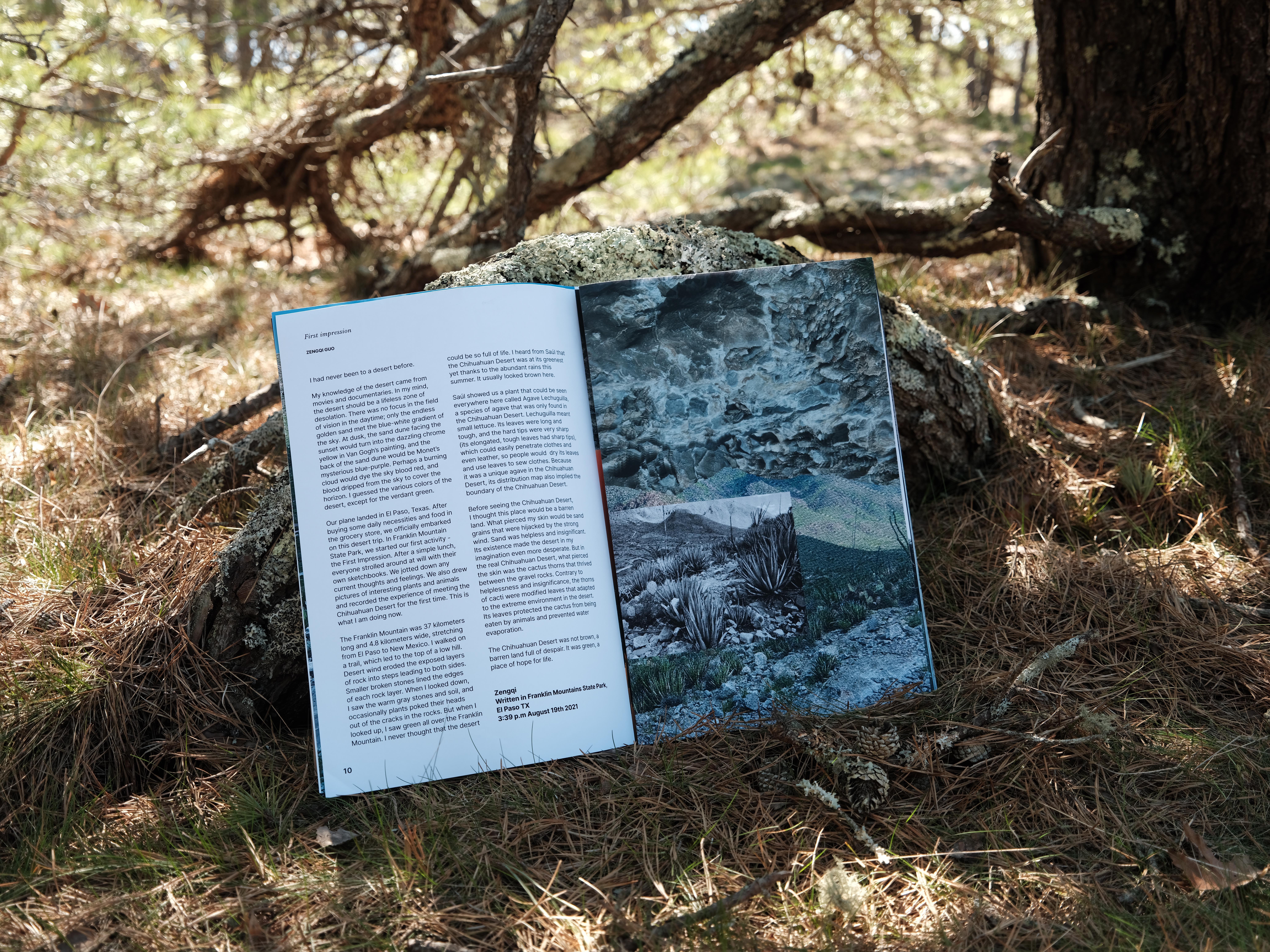
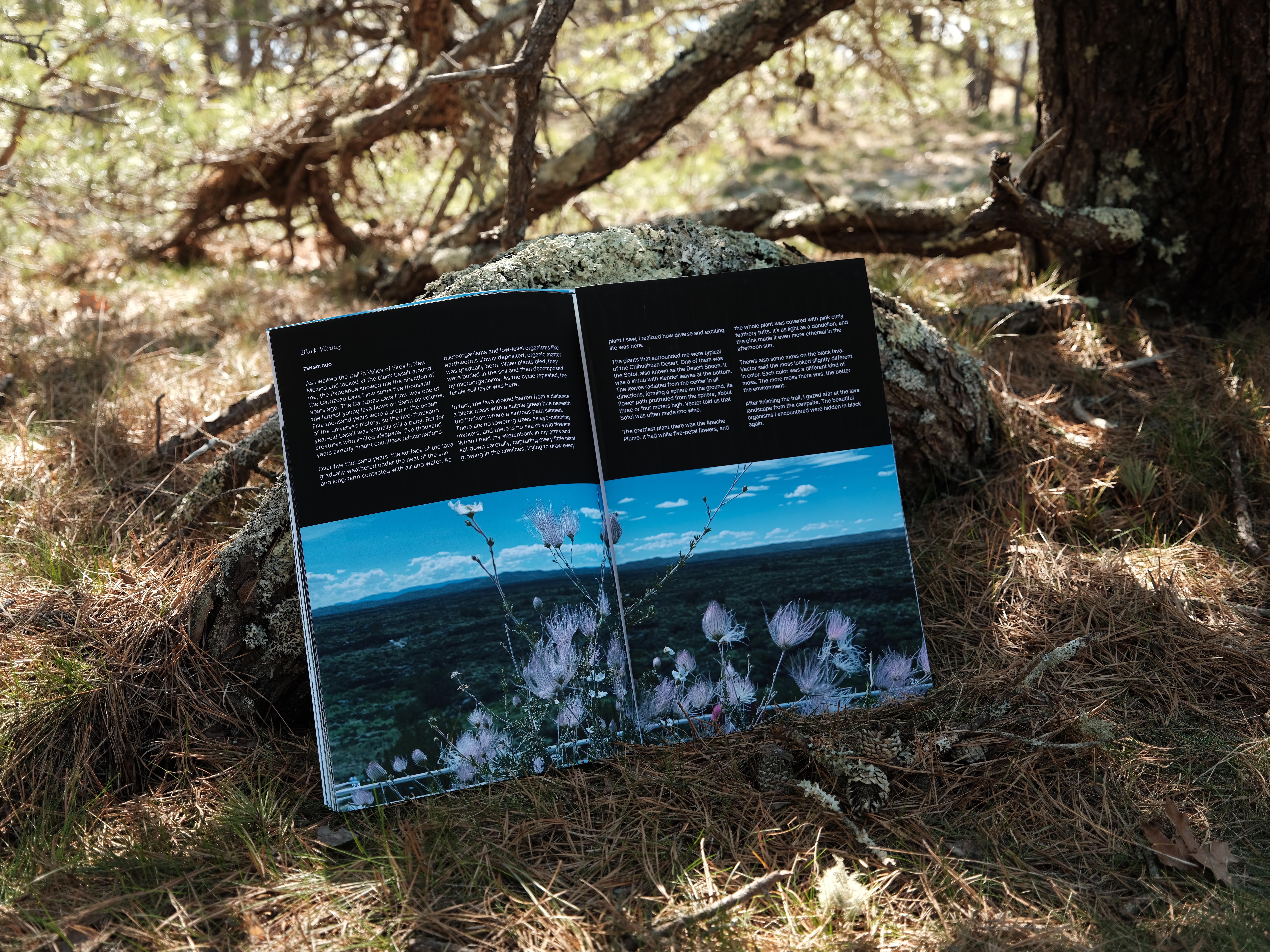
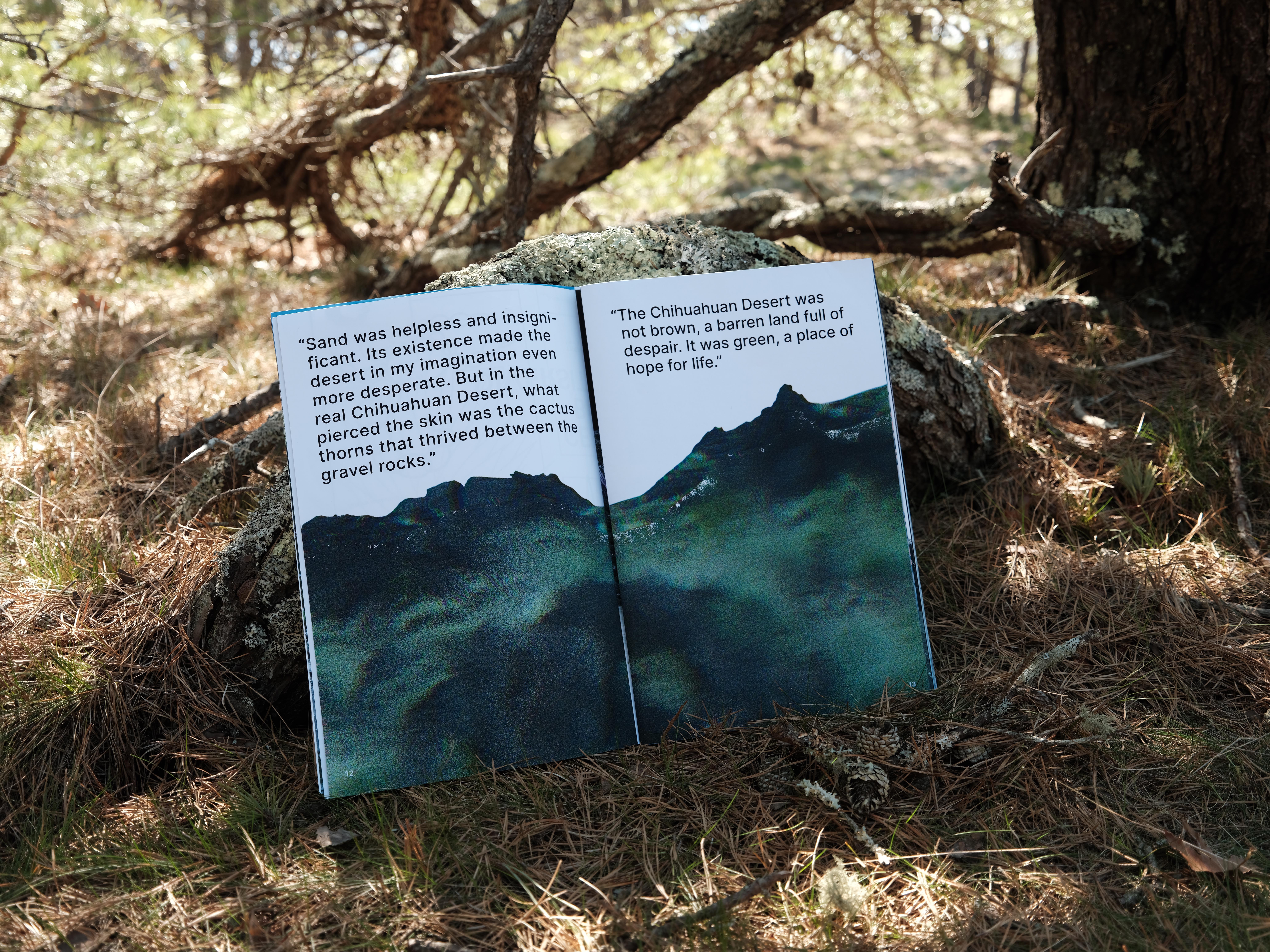
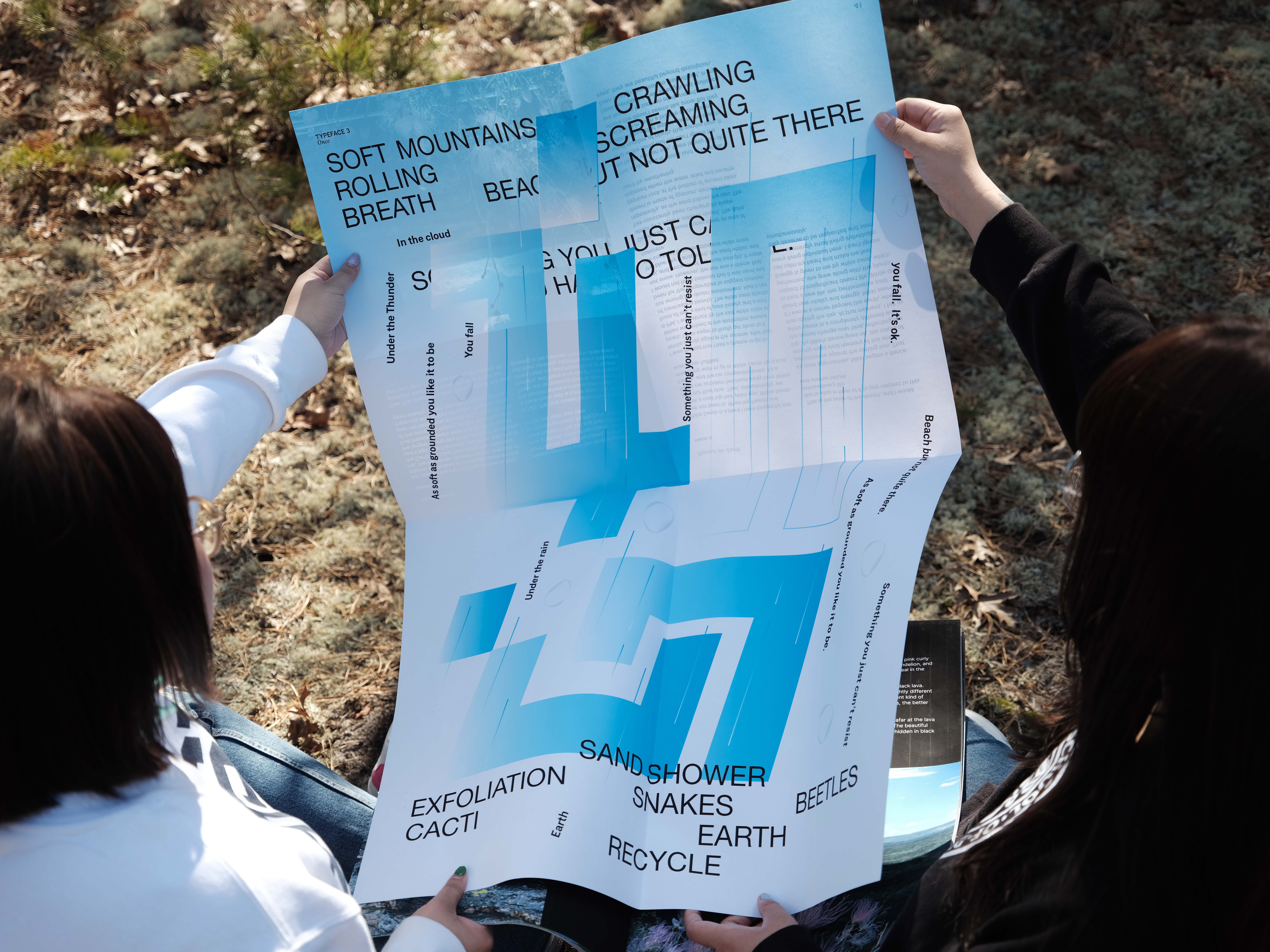
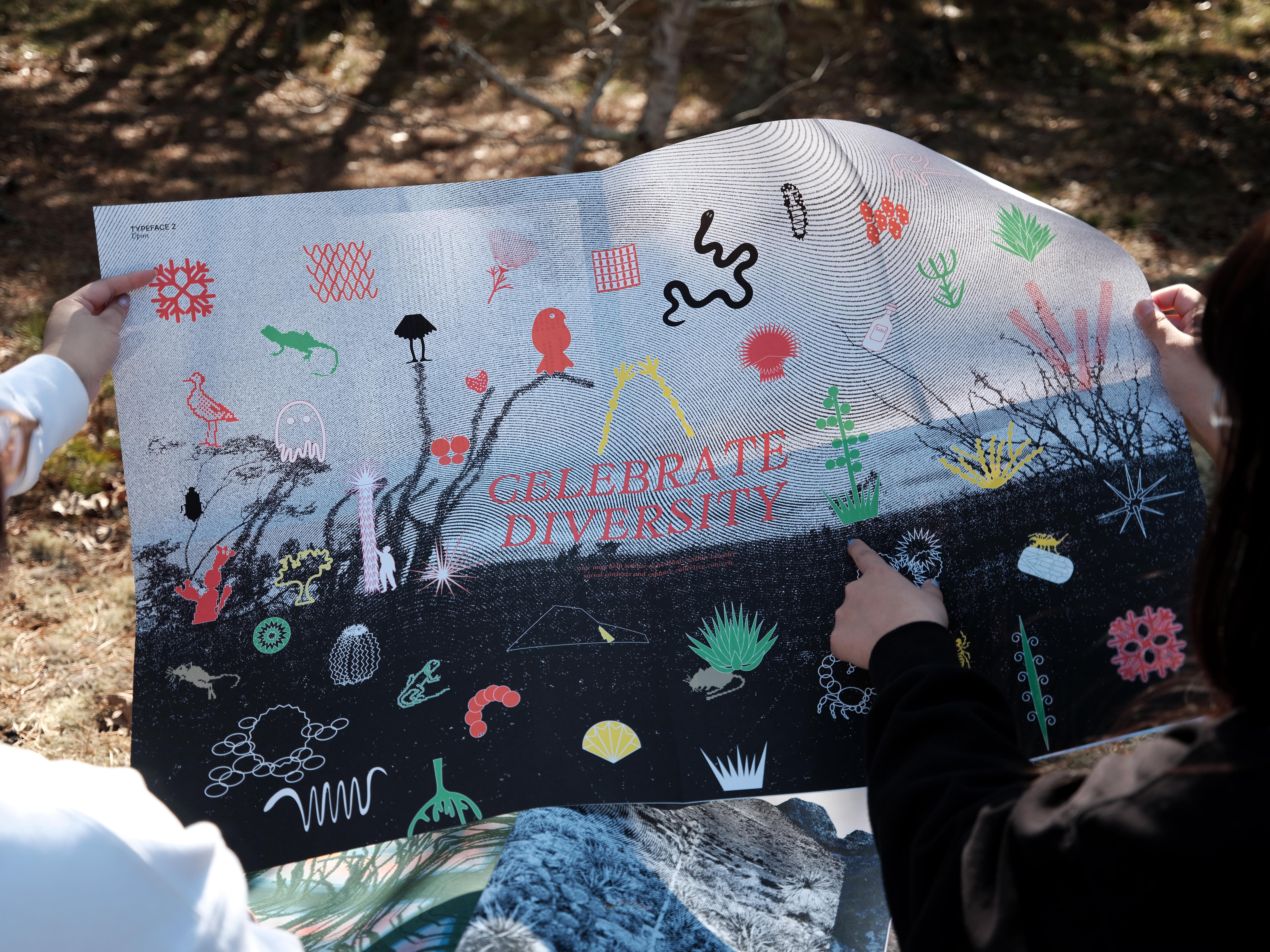
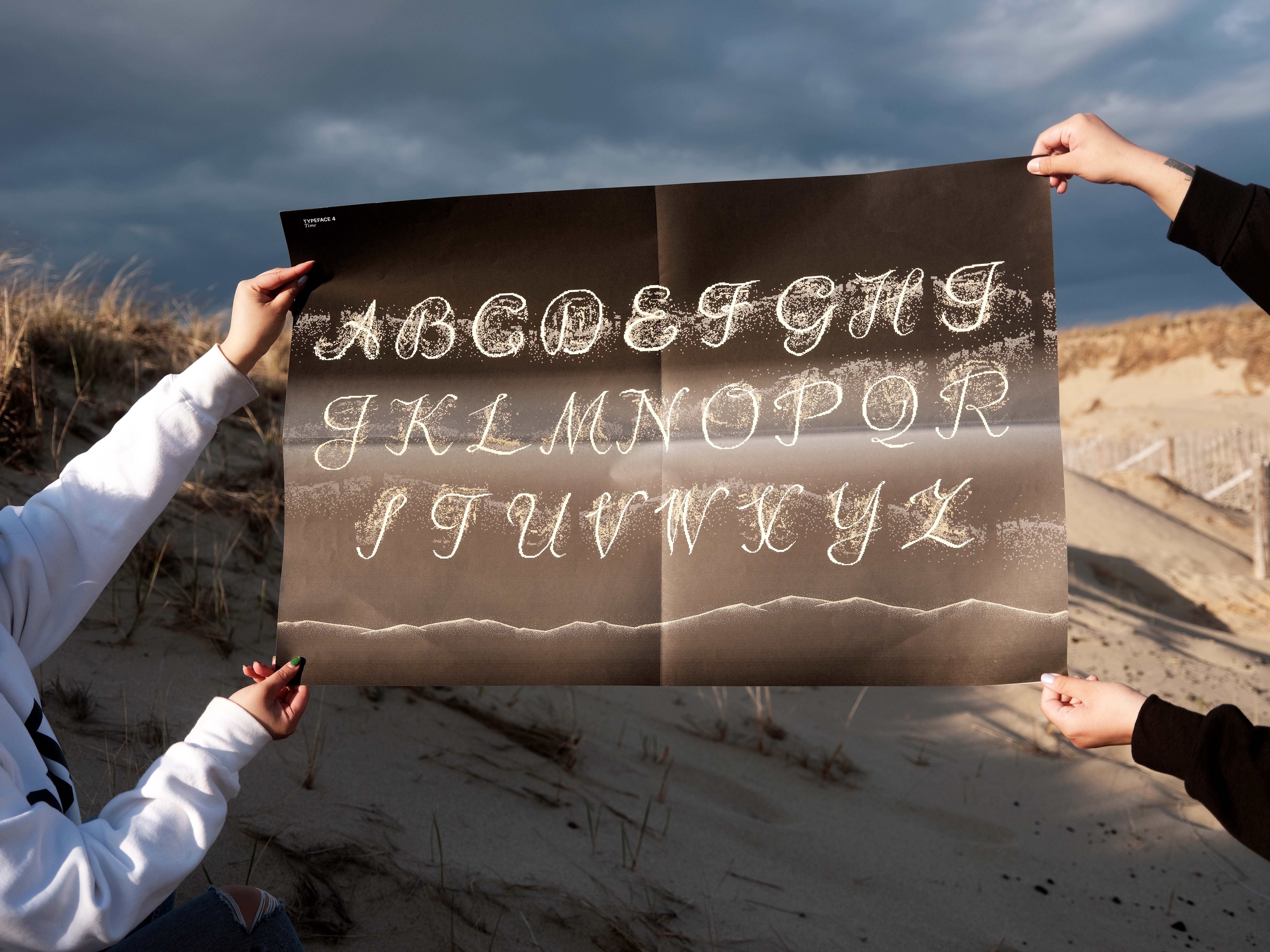
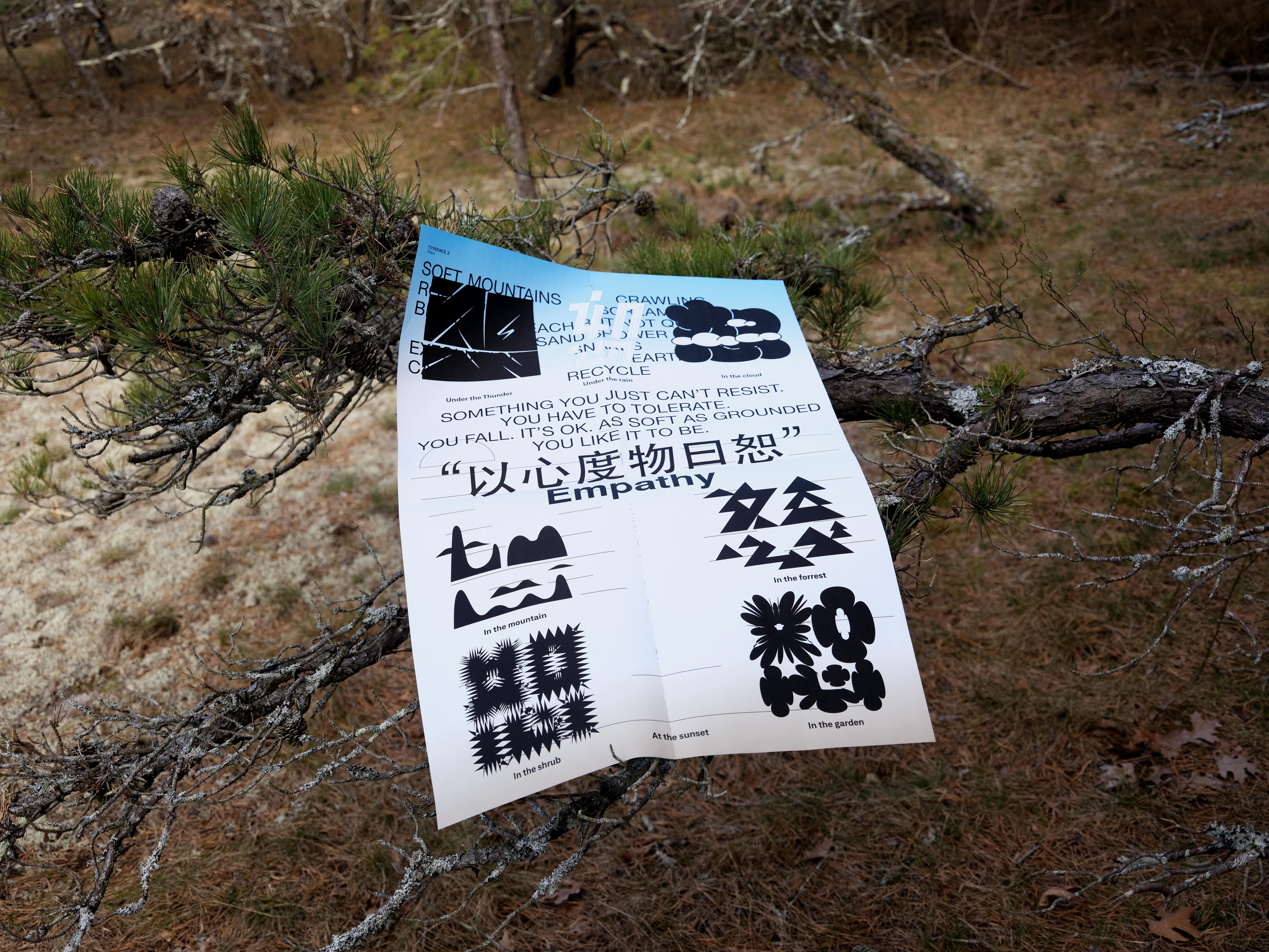
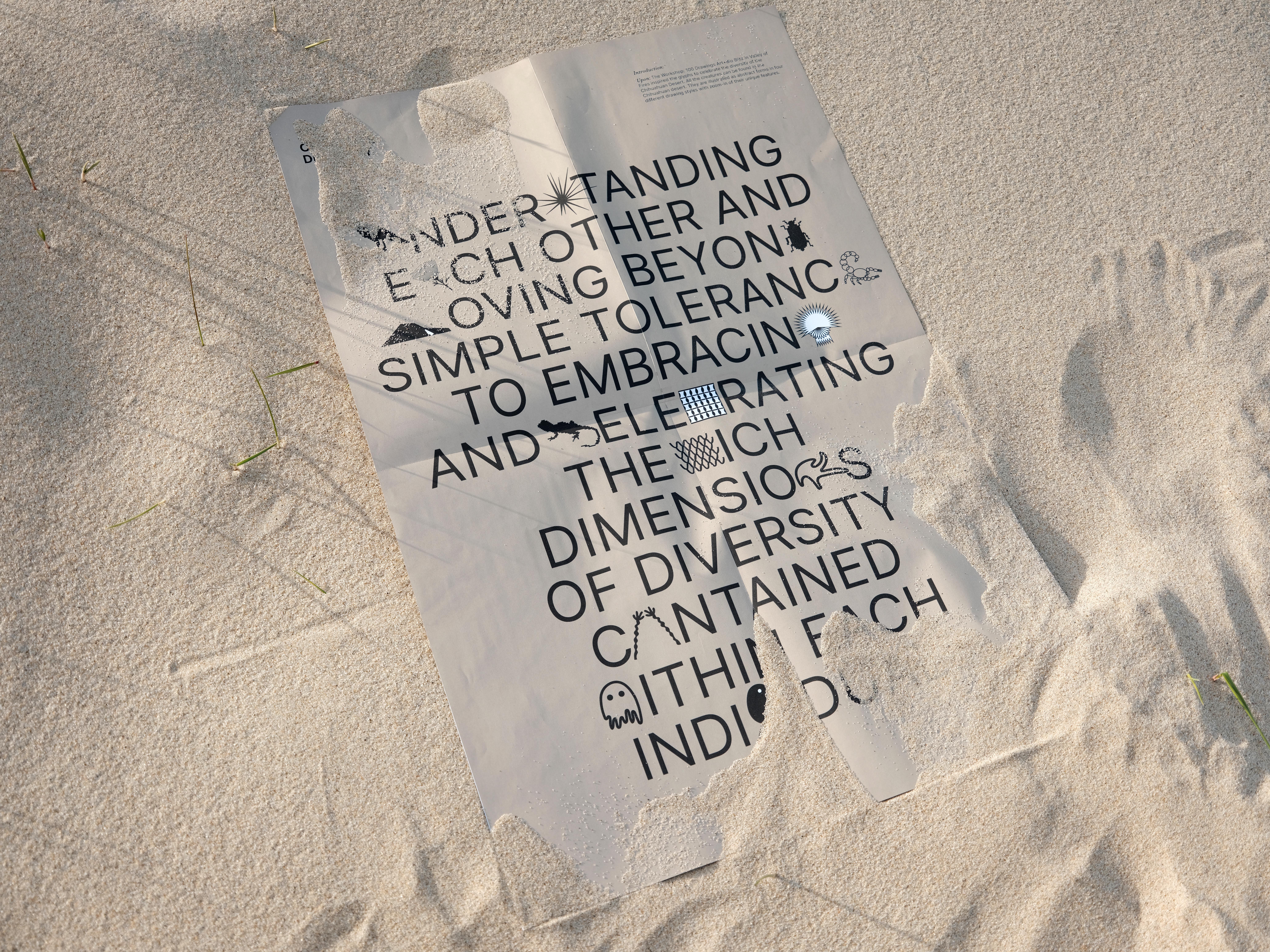
Once Upon A Time is a documentation of a trip to the Chihuahuan Desert and a specimen poster collection of four experimental typefaces inspired by this desert trip. The Desert environment is alien to most people, so this publication is dedicated to bringing familiarity to unfamiliarity while using the novel perspective to make a narrative in-between reality and illusionary unreality by using experimental typefaces to change the legibility.
Collaborator: Sabrina Ji (MFA, GD, 2022)
Photography: Zeyuan Ren (MFA, PHOTO, 2023)
︎ Once Upon A Time
